
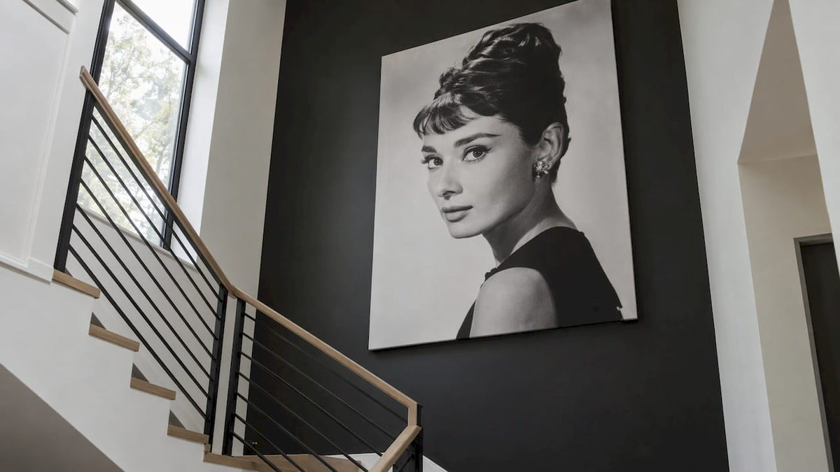
The best Audrey Hepburn wall art does one of two jobs. A black-and-white portrait grounds a room with quiet glamour. A pop art or color-washed version gives a neutral room a focal point. Choose the job first, then the style, the size and the wall. This guide walks through each decision with examples you can copy.
TL;DR
- Pick a style by room: black-and-white photography or line art for calm, minimalist spaces, and pop art or graffiti treatments for rooms that need energy.
- Match undertones rather than exact colors, and treat the print as the accent in your palette.
- Golden-age portraits suit dining rooms, powder rooms, hallways, bars and dressing rooms especially well.
- Canvas needs no frame, while prints on paper gain a lot from the right frame and mat.
- For a gallery wall, start with one large anchor image and build a story around it.
Table of Contents
- The main styles of Audrey Hepburn wall art
- Match the art to your room and palette
- Where to hang Audrey Hepburn art
- How to choose size and placement
- Frame, finish and mat choices
- Build a gallery wall around Audrey
- Our perspective on Audrey Hepburn art
- Shop Audrey Hepburn canvas art
- Five Audrey Hepburn wall art ideas to copy
- FAQ
- Sources
The main styles of Audrey Hepburn wall art
Hepburn art falls into a handful of families. Knowing them makes it easier to say what you actually want before you scroll through hundreds of thumbnails.
Black-and-white photography. These are the classic movie-moment portraits. One guide to Hepburn wall art describes the range as running from iconic black-and-white photographs of memorable film moments to vibrant modern interpretations. Some pieces focus on her eyes and signature smile, while others show her in full fashion regalia.
Minimalist line art. A few confident strokes sketch the profile, the updo, the sunglasses. It reads as graphic and modern, and it sits comfortably in neutral rooms.
Vintage movie-poster looks. Retro typography and muted tones suit mid-century and eclectic interiors. The same guide lists black-and-white posters, canvas prints, minimalist line art and vintage movie posters as the common options.
Pop art and graffiti. Saturated color, halftone effects, spray-paint textures and floral overlays turn the same face into a statement piece. This is where Hepburn meets street culture, and it is the style we know best.

Painterly portraits. Softer, more artistic, and a natural match for vintage or bohemian spaces.
An interior can use the same icon in very different ways. A Houzz feature on decorating with Audrey shows a pink-and-black print setting the tone for a room, and a photograph of her as Holly Golightly with a gallery wall around it. Her pixie look, little black dress and updo carry across very different decor schemes.
Match the art to your room and palette
Start with the mood you want
Ask what the room needs. If it already has plenty of pattern and color, a black-and-white print gives the eye somewhere to rest. If it is calm and neutral, a colorful Audrey print adds personality. That is the logic laid out in this decor guide: a colorful print can lift a neutral room, while black and white can ground bold, colorful decor.
Pairings that work
| Your room | Audrey style to try | Why it works |
|---|---|---|
| Soft whites, grays, beiges, natural wood | Minimalist line art or a quiet black-and-white portrait | Stays within the tonal range and keeps the room serene |
| Sleek, contemporary | High-contrast black-and-white photograph | Crisp contrast echoes clean lines |
| Vintage or bohemian | Painterly or poster-style portrait | Texture and softness suit layered spaces |
| Bold, colorful, eclectic | Black-and-white print | Gives the eye a place to land |
| Neutral with little color | Pop art portrait | Becomes the single color moment |
The contemporary and vintage pairings follow the advice in this Hepburn art guide: a minimalist line drawing or high-contrast photograph for a sleek look, and a more painterly piece for vintage or bohemian spaces.
Match undertones, not exact colors
If your sofa is a warm terracotta, a pop art Audrey with coral and gold will look intentional, even though no single color is identical. Pick one or two undertones from the art, then repeat them in a pillow, a vase or a throw. Designers often treat wall art as the roughly 10 percent accent in a 60-30-10 scheme, so the print is allowed to be the loudest thing in the room without taking it over.
Borrow from Audrey’s own homes
Her taste was never strictly monochrome. Her Swiss farmhouse had a library with magenta furnishings, a living room with bright white walls and sunshine-yellow sofas, and a minimalist dining room built around a 17th-century trestle table. In the film Charade, her Paris apartment is described in soft browns, blues and beiges with floral wallpaper. So there is permission for both restraint and color. A saturated pop art portrait against white walls echoes the farmhouse living room, and a soft black-and-white print suits the Charade palette.

Where to hang Audrey Hepburn art
Golden-age Hollywood portraits tend to look best in rooms where people linger and dress up. Houzz’s roundup points to dining rooms and powder rooms, and describes golden-age portraits as suiting dining rooms, bars, dressing rooms and hallways more than casual living spaces.
- Dining room. In a formal dining room, framed canvas art gives a luxe, museum-like quality, and a bright, large-scale photograph can bring a modern pop of color, according to the same Houzz piece.
- Powder room. Small rooms forgive boldness. A single dramatic portrait turns a guest bathroom into a memorable stop.
- Dressing room or walk-in closet. The fashion connection is built in. Hepburn in full couture is a natural fit here.
- Hallway. A narrow wall is ideal for a vertical portrait or a pair of matching pieces, because you pass them at a walking pace and they register as a series.
- Bedroom. Soft black-and-white or line art above the bed or a dresser keeps things elegant without feeling busy.
- Office or boutique space. For business owners, a pop art Audrey behind a reception desk signals style and personality at once. Pair her with other fashion-related pieces for a coherent look.
It is a less obvious fit for a casual family room with a big TV wall, where the art competes with a screen. If you do hang her there, give her a wall of her own, such as beside a bookcase or above a console.
How to choose size and placement
The most common mistake is buying too small. A small print on a large wall looks lost, and it reads as an afterthought rather than a decision.
A few practical rules that interior designers commonly use, offered as guidelines rather than laws:
- Fill roughly two-thirds of the furniture width. Above a sofa, console or bed, art that spans about two-thirds of the piece below feels proportioned. A single large canvas often beats several small ones.
- Hang at eye level. The center of the piece should sit near the eye line of a person standing. In a dining room, where people sit, you can hang slightly lower.
- Leave breathing room. Keep a modest gap between the art and the furniture underneath, so the two read as related but not crowded.
- Let the portrait face into the room. Where the subject looks matters. A portrait gazing toward the center of the space feels welcoming, while one looking out a door or off a wall can feel like it is leaving.
- Cut out paper templates. Tape paper at the actual size on the wall for a day. If it still looks right when you walk past, order it.
For tall, narrow spaces such as hallways and stair landings, choose a vertical orientation. For wide walls over beds and sofas, a horizontal canvas or a diptych works better. Large-scale art is especially effective in a formal dining room, where Houzz notes it can bring a modern pop of color.
Frame, finish and mat choices
Canvas and paper behave differently. A gallery-wrapped canvas is designed to hang without a frame, so it suits a clean, modern look. Houzz even notes a canvas Audrey print needs no framing. Our own canvases arrive ready to hang, which keeps the decision simple. If you want a framed look, our guide on how to frame canvas art explains the options.
For black-and-white pieces, frame color changes the whole mood, according to GalleryPlanner’s monochrome guide:
- Matte black gives a modern, bold graphic look.
- Natural wood or walnut adds warmth.
- Gold or antique gold makes prints feel like fine art.
- White or off-white works best with soft, vintage-style processing.
If you mat a print, think about tone. In one designer-led room, a color-washed lounge with an Audrey portrait used a soft tonal mat instead of bright white, which kept the focus on the artwork while connecting it to the surrounding color. In a room with strong color, try the same move.
Build a gallery wall around Audrey
Audrey works well as the hero of a grouped wall. Houzz shows her photograph standing out from the other artwork on a gallery wall, and notes that she fits right in with minimalist contemporary decor.
A simple method:
- Pick the anchor. Apartment Therapy’s gallery wall layout advice starts with one large anchor image to ground the arrangement. Make Audrey that anchor.
- Tell a story. Architectural Digest advises that a gallery wall should tell a story, with each piece fitting into a narrative. Your story might be “Hollywood glamour meets street style” or “black-and-white classics.”
- Mix media. The same Apartment Therapy piece recommends combining photographs, drawings, paintings and prints, and using a monochrome scheme with a variety of frame sizes for visual interest.
- Keep one thread. Repeat a color, a frame finish or a subject. Visual cohesion is what keeps an eclectic wall from looking random.
Ideas for the supporting cast: a fashion-magazine cover, a black-and-white landscape, an abstract piece in one of Audrey’s colors, a small line drawing. For more on combining pieces, see our guide on mixing and matching canvas art.
Our perspective on Audrey Hepburn art
We see the same pattern from homeowners, renters and designers. People want Audrey for her elegance, but they hesitate because a straight portrait can feel expected. Our answer is to treat her as pop culture and fashion, not only as nostalgia.
That is why we offer her as pop art, with bold color and graphic treatment, alongside black-and-white vintage and photography pieces. One face, two moods. The pop version suits a neutral room that needs a focal point. The black-and-white version suits a room that already has plenty of color.
Our canvases are made in the USA with archival inks and materials, and they arrive ready to hang, so the piece you choose can go on the wall the day it arrives. Our catalog covers more than 1,000 designs, so building a gallery wall around her, with photography, abstract and fashion pieces nearby, is easy to do in one place.
James
Shop Audrey Hepburn canvas art
If you already know the look you want, start with our Audrey Hepburn pop art canvas or the alternate Audrey Hepburn pop art canvas for a bold, graphic take. Prefer something quieter? Browse our black and white vintage wall art and black and white photography wall art. Every piece is made in the USA and ships ready to hang.

To build a themed wall, explore our full pop art canvas prints collection, or see everything at Luxury Art Canvas.
Five Audrey Hepburn wall art ideas to copy
- The powder room statement. One large pop art portrait on a plain wall. Nothing else needed.
- The dining room anchor. A big black-and-white portrait above a buffet, flanked by two smaller abstract pieces in the same gray tones.
- The hallway series. Three vertical pieces at matching height: Audrey, a fashion image, a minimalist print. Our framed minimalist wall art is a good starting point for the quiet one.
- The dressing room moment. A fashion-forward portrait near the mirror, with a gold frame for a boutique feel. Our Vogue black and white wall art fits the theme.
- The bedroom pair. Two coordinated black-and-white pieces above the headboard, one portrait and one photograph, such as our tennis black and white photography, for a balanced look with a sporty edge.
FAQ
What kind of Audrey Hepburn wall art looks best in a modern home?
High-contrast black-and-white photography, minimalist line art and bold pop art all suit modern interiors. Pick black and white for a calm room and pop art when you want a focal point. Keep the frame simple, or choose a gallery-wrapped canvas with no frame at all.
Which room is best for an Audrey Hepburn print?
Dining rooms, powder rooms, hallways, dressing rooms and bars are natural fits, because golden-age portraits feel at home in spaces for entertaining and getting dressed. Bedrooms and offices also work well. A casual TV room is the least obvious choice.
Can I mix Audrey Hepburn art with other pieces?
Yes. Use her as the anchor and add pieces that share a color, a frame finish or a theme such as fashion or black-and-white photography. Vary the sizes, but keep one repeating element so the wall feels cohesive.
Should I choose canvas or a framed print?
Canvas is the easier route, since it hangs without a frame and gives a clean, modern look. A framed print suits a more traditional or gallery-style wall. Black frames feel graphic, wood feels warm, and gold feels classic.
How big should the art be?
Go larger than your instinct. Over a sofa or bed, aim for art that spans about two-thirds of the furniture width. Tape a paper template to the wall first to check the scale.
Sources
- Make a Date With Audrey Hepburn (Houzz)
- Capturing the Icon: Your Essential Guide to Audrey Hepburn Wall Art
- The Secret to a Chic Home? 10 Audrey Hepburn Wall Decor Ideas
- Audrey Hepburn’s flamboyant decor at 18th-century farmhouse (Hello Magazine)
- Audrey Hepburn Design Shuffle (Studio Ten25)
- How to Choose the Right Art for a Gallery Wall (Architectural Digest)
- Gallery Wall Layout Ideas (Apartment Therapy)
- 6 Super Creative Ideas for Framing Your Home’s Art (LivingEtc)
- Designing a Black & White Gallery Wall (GalleryPlanner)
Fashion Art at Home: How to Bring Runway Style to Your Walls