Colors possess remarkable power to transform living spaces, influencing emotional states and psychological well-being in ways most people don't consciously recognize. The artwork hanging on your walls serves as more than mere decoration; it functions as a continuous visual stimulus affecting mood, energy levels, and mental clarity throughout each day. Understanding the psychological principles governing color perception empowers homeowners and designers to create intentional atmospheres through strategic art selection. Scientific research increasingly confirms what artists have intuitively understood for centuries: different hues trigger specific emotional and physiological responses in viewers. This knowledge bridges aesthetic preferences with interior psychology, allowing thoughtful curation of collections that enhance daily experiences. The intersection of color theory, artistic expression, and environmental psychology offers practical tools for transforming houses into emotionally supportive homes. By exploring how specific color families impact perception and feeling, you can harness artwork as a powerful instrument for shaping the ambiance of every room.
Understanding the Fundamentals of Color Psychology
The fundamental principles of color psychology reveal how visual stimuli communicate non-verbally with our subconscious minds, triggering automatic responses rooted in both evolutionary biology and cultural conditioning. Colors influence physiological functions including heart rate, hormone production, and neurological activity, creating measurable changes in bodily states. Warm colors like red, orange, and yellow typically generate feelings of energy, excitement, and warmth, while cool colors such as blue, green, and purple evoke calmness, relaxation, and contemplation. These associations stem partly from natural experiences with fire, sun, water, and vegetation that shaped human evolutionary responses. The art world has long recognized these psychological dimensions, with movements from Impressionism to Abstract Expressionism deliberately manipulating color to evoke specific emotional reactions. Artists working in various mediums understand that pigment choices communicate meaning beyond representational content. Scientific studies confirm that prolonged exposure to certain colors alters mood states, with wall art serving as particularly impactful because of its constant presence in living environments. Understanding these principles allows intentional selection of artwork that supports desired psychological outcomes in different spaces.
Red-Toned Artwork: Energy, Passion, and Stimulation
Red-toned artwork commands attention and stimulates powerful physiological responses, making it among the most psychologically active color choices for wall art. This bold hue increases heart rate, elevates blood pressure, and triggers adrenaline production, generating feelings of excitement, passion, and heightened energy. These biological responses make red particularly effective in dining rooms, where it stimulates appetite and encourages lively conversation among guests. Exercise spaces also benefit from red's motivational properties, as the color enhances physical performance and competitive drive. However, the intensity of red demands careful consideration regarding placement and proportion. Crimson creates dramatic focal points, while burgundy offers sophistication with slightly reduced stimulation. Artists throughout history have employed red to convey emotion, from Renaissance paintings depicting religious fervor to contemporary abstract pieces exploring passion and conflict. The color carries diverse cultural associations including power, danger, celebration, and love across different societies. Psychological research demonstrates that red environments cause time to feel like it passes more quickly, affecting perception of duration spent in spaces. Balancing red artwork with neutral surroundings prevents overstimulation while harnessing its energizing properties, creating spaces that feel dynamic without becoming overwhelming.
| Red Shade | Psychological Effect | Ideal Room Placement | Intensity Level |
|---|---|---|---|
| Bright Crimson | Maximum energy and excitement | Dining room, exercise space | Very High |
| Burgundy | Sophistication with warmth | Study, formal living room | Moderate-High |
| Terracotta Red | Grounded warmth | Kitchen, entryway | Moderate |
| Rose Red | Gentle passion | Bedroom, creative studio | Low-Moderate |
Blue-Toned Artwork: Calm, Focus, and Tranquility
Blue-toned artwork offers profound psychological benefits for creating tranquil, focused environments throughout residential and professional spaces. This cool color reduces stress markers, lowers blood pressure, and promotes feelings of security and calm that make it ideal for bedrooms where quality sleep depends on relaxation. Home offices benefit from blue's ability to enhance concentration and productivity without causing the mental fatigue associated with more stimulating colors. Bathrooms transform into spa-like retreats when adorned with blue artwork featuring water scenes or abstract compositions. The spectrum from pale sky blue to deep navy provides varying intensity levels, with lighter shades expanding perceived space and darker tones adding depth and sophistication. Research confirms that blue environments improve creative thinking and problem-solving abilities, making it valuable for any space requiring mental clarity. However, excessive use of dark blue without warming elements can evoke melancholy, requiring balance through lighting or complementary warm accents. Cultural symbolism consistently associates blue with trust, stability, intelligence, and open communication across diverse societies. Artists working with blue pigments create visual spaciousness that psychologically enlarges rooms, a technique employed in everything from traditional seascapes to contemporary minimalist canvases. The color's evolutionary associations with clear skies and clean water trigger instinctive responses of safety and abundance.
Yellow and Gold Artwork: Optimism and Mental Stimulation
Yellow and gold artwork generates psychological optimism and mental stimulation, brightening spaces while encouraging social interaction and communication. This vibrant color activates mental processes, enhances memory formation, and accelerates decision-making speed according to cognitive research. Kitchens and breakfast nooks become cheerful gathering spaces when featuring yellow artwork, as the color mimics sunlight and creates welcoming atmospheres for morning routines. Creative studios benefit from yellow's ability to stimulate imagination and reduce creative blocks that hinder artistic production. Children's play areas leverage the color's energetic, happy associations to encourage activity and learning. The spectrum from pale butter yellow to vibrant sunflower offers varying intensity, with metallic gold adding luxury and sophistication to the basic psychological profile. However, excessive yellow requires caution, as overexposure can cause anxiety, eye strain, or agitation in sensitive individuals or small spaces. The color's attention-grabbing properties make yellow artwork effective as focal points that draw eyes and conversation. Cultural meanings vary somewhat, with Western traditions emphasizing happiness and Eastern philosophies associating yellow with spirituality and enlightenment. Artists employ yellow pigments to create illusions of natural light in darker spaces, psychologically compensating for limited windows or northern exposures that receive less direct sunlight throughout the day.
Green-Toned Artwork: Balance, Restoration, and Natural Harmony
Green-toned artwork provides psychological balance and restoration, connecting interior spaces with nature's calming influence while reducing stress and visual fatigue. This versatile color occupies the middle of the visible spectrum, allowing eyes to process it with minimal strain, making it comfortable for extended viewing in any room. Green promotes equilibrium between stimulation and relaxation, supporting both concentration and rest depending on shade and context. Home offices benefit from green's ability to enhance focus without causing the mental exhaustion associated with more demanding colors. Meditation spaces and yoga studios leverage green's associations with growth, renewal, and natural harmony to support contemplative practices. The range from sage and mint to emerald and forest green offers distinct psychological profiles, with lighter shades feeling fresh and expansive while darker tones provide grounding and security. Scientific research confirms that exposure to green environments produces restorative effects similar to time spent in natural settings, triggering evolutionary responses associated with safety, resources, and well-being. Artists working with botanical subjects or landscape painting reinforce these natural associations, though abstract green compositions provide similar psychological benefits through pure color experience. Green's position between warm and cool colors makes it exceptionally adaptable to various design schemes and psychological needs across different living spaces.
| Green Shade | Psychological Association | Best Application | Complementary Effect |
|---|---|---|---|
| Sage Green | Calm sophistication | Bedroom, study | Reduces anxiety |
| Emerald | Vibrant growth | Living room, office | Energizes while grounding |
| Forest Green | Deep stability | Library, meditation room | Provides security |
| Mint | Fresh renewal | Bathroom, kitchen | Refreshes and cleanses |
Orange Artwork: Enthusiasm and Social Connection
Orange artwork generates enthusiasm and social connection, combining red's energy with yellow's happiness to create inviting spaces that encourage interaction and conversation. This warm color stimulates appetite, making it particularly effective in dining rooms and entertainment areas where gathering and sharing meals form central activities. Living rooms featuring orange-toned pieces feel welcoming and friendly, lowering social barriers and encouraging verbal communication among guests. Creative workspaces benefit from orange's ability to stimulate imagination and adventurous thinking without the intensity of pure red. The spectrum from soft peach to burnt orange and terracotta provides varying levels of stimulation, with muted tones offering warmth without overwhelming smaller spaces. Research demonstrates that orange environments encourage verbal expression and reduce social anxiety, facilitating comfortable interaction among both familiar and new acquaintances. However, moderation remains important, as excessive orange can feel overwhelming or lack sophistication if not balanced with neutral elements or complementary colors. Cultural contexts associate orange with creativity, autumn warmth, and in some traditions, spiritual significance and celebration. Artists employ orange pigments to create focal points that draw attention while maintaining approachability, unlike red's sometimes aggressive intensity. The color's psychological warmth makes spaces feel inviting and comfortable, particularly valuable in colder climates or rooms with limited natural light.
Purple and Violet Artwork: Creativity, Luxury, and Spiritual Depth
Purple and violet artwork stimulates imagination and creativity while conveying luxury, sophistication, and spiritual depth that distinguishes spaces as unique and contemplative. This complex color combines blue's calming properties with red's energy, creating psychological conditions favorable for creative thinking and problem-solving. Creative studios benefit from purple's ability to inspire innovative approaches and unconventional ideas that fuel artistic production. Meditation rooms leverage the color's associations with spirituality and higher consciousness to support contemplative practices and mindfulness. Bedrooms featuring purple artwork create sophisticated atmospheres conducive to rest while maintaining visual interest that purely neutral schemes sometimes lack. The range from lavender to deep violet and royal purple offers distinct psychological experiences, with lighter shades feeling airy and romantic while darker tones convey drama and mystery. Historical associations with royalty and wealth persist in contemporary psychology, making purple effective for communicating taste and refinement. However, darker purples can feel heavy or melancholic in smaller spaces or when used extensively without balance. Research confirms that purple environments enhance creative thinking and openness to novel experiences. Artists working with purple pigments create dramatic focal points that command attention through unusual color choice, as purple appears rarely in natural environments compared to earth tones and primary colors.
Neutral and Earth-Toned Artwork: Grounding and Timeless Elegance
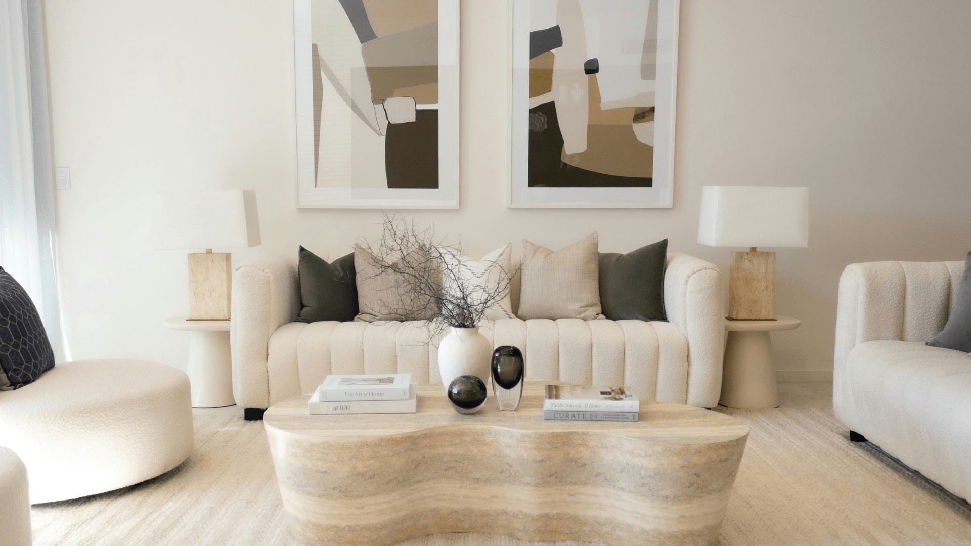
Neutral and earth-toned artwork provides psychological grounding and sophisticated simplicity, creating visual rest points that support focus and prevent cognitive overload. Colors including beige, brown, gray, and taupe offer stability and timeless elegance that adapts to any interior style from traditional to contemporary. These tones prove universally applicable across all rooms, particularly effective in minimalist designs where simplicity and clarity form primary aesthetic goals. Warm neutrals create cozy, inviting atmospheres, while cool neutrals feel crisp and modern, demonstrating how subtle temperature variations within neutral palettes produce distinct psychological effects. Artists working with neutral pigments often emphasize texture, composition, and form rather than color itself, allowing viewers to appreciate artistic technique and subject matter without chromatic distraction. Research demonstrates that neutral environments reduce visual stimulation, preventing mental fatigue during extended exposure and supporting concentration on tasks rather than environmental elements. These colors carry associations with nature, reliability, and understated elegance that communicate maturity and refined taste. Neutral artwork serves as visual anchoring that allows other design elements including furniture, textiles, and architectural features to shine without competition. The absence of strong color psychology makes neutrals psychologically safe choices for those uncertain about color commitments or seeking maximum flexibility in evolving interior designs over time.
Black and White Artwork: Timeless Drama and Clarity
Black and white artwork creates dramatic sophistication while focusing attention on form, contrast, and composition rather than chromatic psychology. Monochromatic pieces offer timeless elegance that transcends stylistic trends, maintaining relevance through changing design fashions. The absence of color reduces cognitive processing demands, allowing mental focus on subject matter, artistic technique, and compositional elements that might otherwise compete with chromatic stimulus. High contrast between black and white generates visual drama and energy, while softer gradations create contemplative, peaceful atmospheres suitable for various psychological needs. Photography, line drawings, and graphic art in monochrome prove particularly effective at conveying emotional content through composition and tonal range alone. These works function successfully across modern, traditional, and eclectic interiors, demonstrating exceptional versatility that makes them valuable in gallery-like home arrangements. Research indicates that reduced color stimulation in environments allows greater mental clarity and focus on cognitive tasks, benefiting work-from-home settings and study spaces. Cultural symbolism of black and white varies across societies but often includes associations with clarity, formality, and artistic seriousness. Monochromatic artwork serves as visual anchors that complement any existing color scheme without competing, making them psychologically comfortable additions that enhance rather than dominate spaces.
| Monochrome Style | Psychological Impact | Artistic Effect | Best Room Type |
|---|---|---|---|
| High Contrast | Drama and energy | Bold statement | Modern living room |
| Soft Gradations | Peaceful contemplation | Subtle sophistication | Bedroom, study |
| Graphic Patterns | Visual interest without color | Contemporary edge | Office, hallway |
| Photography | Emotional narrative | Documentary depth | Gallery wall, any room |
Multi-Colored and Abstract Artwork: Complex Psychological Engagement
Multi-colored and abstract artwork creates complex psychological responses depending on color relationships, dominance patterns, and saturation levels within compositions. These pieces engage viewers' imagination through personal interpretation, allowing individual connections that evolve with repeated viewing and changing light conditions. Creative spaces benefit from the visual stimulation and idea generation that colorful abstract works encourage, reducing boredom and mental stagnation. Eclectic homes leverage multi-hued pieces as unifying elements that pull together diverse design elements through shared color references. Children's areas appropriately feature bright, varied colors that support learning, imagination, and emotional expression during developmental stages. Complementary color schemes create visual vibration and energy, while analogous combinations offer harmony and flow. Triadic arrangements provide balance and interest without the intensity of complementary contrasts. Research confirms that colorful environments stimulate creative thinking and reduce the monotony that leads to decreased engagement with surroundings. The dominant color within multi-hued compositions determines overall psychological effect, while supporting colors add complexity and visual interest that rewards extended attention. Abstract expressionism and contemporary mixed media explore emotional content through pure color relationships, allowing viewers to project personal meaning onto non-representational forms that speak through chromatic language alone.
Rotating Wall Art Seasonally: Aligning With Natural Cycles
Rotating wall art seasonally provides psychological benefits by aligning interior environments with natural cycles and preventing habituation that reduces emotional engagement over time. This practice mirrors nature's transitions, supporting mental well-being through visual novelty and seasonal appropriateness. Winter months benefit from warm, energizing colors that combat seasonal affective disorder and compensate for reduced daylight hours that affect mood regulation. Spring rotations featuring fresh, vibrant colors complement renewal energy and increasing natural light after darker months. Summer displays of cooling blues and greens psychologically reduce perceived temperature, making spaces feel more comfortable during warmer weather. Autumn arrangements incorporating rich, grounding colors align with harvest themes and preparation for colder seasons ahead. Research demonstrates that environmental novelty maintains psychological engagement with living spaces, preventing the adaptation that causes familiar elements to become invisible to conscious awareness. Affordable print collections allow experimentation with colors that might feel overwhelming year-round but provide beneficial temporary effects. Gallery walls designed for easy swapping facilitate rotation without damaging walls or requiring professional installation. This approach allows testing of color psychology principles through direct experience before making permanent commitments to larger, more expensive original artwork.
Room-Specific Color Psychology Applications
Room-specific applications of color psychology require considering each space's primary function and the psychological states that best support intended activities. Bedrooms need cool, calming colors promoting rest, intimacy, and circadian rhythm regulation that supports quality sleep. Blues, soft purples, and muted greens work effectively, though personal preference remains important for spaces where individuals spend extended private time. Home offices benefit from colors enhancing focus and productivity without causing mental fatigue, making blues and greens particularly valuable. Kitchens and dining areas appropriately feature warm colors including reds, oranges, and yellows that stimulate appetite and encourage social interaction around shared meals. Bathrooms transform into spa-like retreats with calming blues and greens, though energizing morning colors can support daily routines. Living rooms require consideration of primary function, whether relaxation demands cooling colors or entertainment benefits from warming, social tones. Children's rooms need balance between stimulating colors supporting learning and play with calming elements enabling rest and emotional regulation. Entryways benefit from welcoming colors creating positive first impressions for visitors and returning family members. Traffic flow, natural light levels, room dimensions, and existing color schemes influence optimal selections. Multi-functional spaces require balanced color psychology serving different needs throughout daily use cycles.
| Room Type | Primary Function | Recommended Colors | Psychological Goal |
|---|---|---|---|
| Bedroom | Rest and intimacy | Cool blues, soft purples | Promote relaxation |
| Home Office | Focus and productivity | Blues, greens | Enhance concentration |
| Dining Room | Social gathering | Warm reds, oranges | Stimulate appetite and conversation |
| Bathroom | Personal care | Spa blues, greens | Create calm retreat |
| Living Room | Varied activities | Balanced warm/cool | Support multiple functions |
Individual Color Preferences and Personality Traits
Individual color preferences reflect personality traits and life experiences, creating unique psychological responses that sometimes differ from general color psychology principles. While research identifies broad patterns, personal associations and cultural background significantly influence individual reactions to specific hues. Introversion correlates with preferences for cooler, softer tones that support internal reflection and solitude, while extroversion associates with warmer, brighter colors facilitating social interaction and external engagement. Personality research demonstrates that color choices predict temperament traits including openness to experience, conscientiousness, and emotional stability. Authentic connection with artwork enhances psychological benefits beyond theoretical color effects, making personal resonance more important than rigid adherence to general principles. Life experiences create individual associations that may contradict typical patterns, such as negative memories linked to otherwise positive colors. Age influences preferences, with younger individuals often preferring brighter, more saturated colors while mature adults gravitate toward muted, sophisticated tones. Therapeutic approaches assess color preferences to understand emotional states and psychological needs. Self-reflection exercises before purchasing artwork help identify personally meaningful colors. Testing pieces through temporary display allows experiencing psychological responses before permanent commitments, ensuring selections genuinely support well-being rather than following theoretical prescriptions that may not apply individually.
Subject Matter and Its Interaction With Color Psychology
Subject matter interacts with color psychology to create layered emotional impacts that combine chromatic effects with narrative content and symbolic meaning. Representational artwork adds dimensions beyond pure color response, with landscapes, portraits, abstracts, and symbolic imagery each contributing distinct psychological elements. Blue ocean scenes evoke different feelings than blue geometric abstracts despite sharing basic color psychology, demonstrating how content modifies chromatic effects. Figurative art's emotional storytelling capacity amplifies or contradicts color principles depending on depicted subjects and compositional choices. Cultural and personal symbolism in subject matter creates meaning that can overshadow color psychology or work synergistically with it. Research confirms that combined effects of color and content on emotional responses exceed either element alone, creating richer psychological experiences. Abstract artwork allows pure color psychology to dominate viewer experience, while representational pieces balance chromatic effects with narrative interpretation and recognition processes. Botanical subjects reinforce green's natural associations through both color and content alignment. Urban scenes create energy regardless of color palette through subject dynamism. Portraits establish human connection that transcends color psychology through facial recognition and empathetic responses to depicted emotions and expressions.
Practical Implementation: Bringing Color Psychology Into Your Home
Practical implementation of color psychology principles requires systematic approaches balancing theoretical knowledge with personal preferences and spatial realities. Begin by identifying desired emotional outcomes for each space before considering aesthetic preferences or existing decor. Mood boards combining paint samples, fabric swatches, and artwork examples help visualize color relationships and ensure cohesive schemes. Testing placement using temporary hanging methods or digital room visualizers prevents costly mistakes and allows adjustment before permanent installation. Lighting dramatically alters color perception and psychological impact, requiring consideration of both natural and artificial sources throughout daily cycles. Larger artworks create stronger psychological effects than smaller pieces, demanding more careful color selection to avoid overwhelming spaces. Framing and matting choices enhance or moderate artwork color intensity, providing tools for adjusting psychological impact without changing pieces themselves. Gradual implementation allows psychological adjustment and prevents overwhelming environments with too much visual stimulus introduced simultaneously. Budget strategies including affordable prints, emerging artists' works, and rotating collections make color psychology accessible without significant financial investment. Consulting color psychology resources and interior design principles provides theoretical grounding, though trusting personal intuitive responses to potential purchases remains equally important for ensuring selections genuinely support individual well-being and aesthetic satisfaction.
Key Implementation Steps:
- Identify the primary emotional outcome desired for each room before considering specific artwork
- Create visual mood boards combining proposed artwork with existing room elements
- Test color responses by temporarily displaying print versions before purchasing expensive originals
- Consider how natural light changes throughout the day affect color perception and psychological impact
- Balance bold color choices with neutral surroundings to prevent visual overwhelm
- Rotate seasonal collections to maintain psychological engagement and align with natural cycles
- Trust personal responses alongside theoretical principles when making final selections
| Implementation Step | Purpose | Practical Approach | Expected Outcome |
|---|---|---|---|
| Define goals | Clarify desired mood | List emotional outcomes per room | Targeted selection |
| Research colors | Understand psychology | Study color effect patterns | Informed choices |
| Create mood boards | Visualize relationships | Combine samples digitally or physically | Cohesive planning |
| Test temporarily | Experience before committing | Use prints or digital visualization | Confident decisions |
| Implement gradually | Prevent overwhelm | Add pieces over time | Comfortable adjustment |
Conclusion: Transforming Spaces Through Color-Conscious Art Selection
The psychology of wall art colors represents a powerful tool for transforming living spaces into environments that actively support emotional well-being, productivity, and quality of life. Understanding how specific hues influence mood, energy levels, and mental states empowers intentional creation of atmospheres aligned with personal needs and functional requirements. From red's energizing stimulation to blue's calming focus, each color family offers distinct psychological benefits applicable to different rooms and purposes. The art market provides endless options across styles, mediums, and price points, making strategic color selection accessible regardless of budget constraints. Contemporary artists and historical masters alike have explored color's emotional power, creating collections that serve both aesthetic and psychological functions. Galleries, museums, and online platforms offer resources for discovering works that resonate personally while supporting desired emotional outcomes. The intersection of artistic expression, interior design, and psychological research creates practical frameworks for selecting wall art that enhances daily experience. By considering color psychology alongside personal preferences, spatial characteristics, and intended functions, anyone can curate collections that transform houses into homes supporting mental health, emotional balance, and authentic self-expression through thoughtfully chosen visual art.
How to Decorate a Living Room That Feels Luxurious (Even on a Budget)
Self-Portrait Background Ideas for Unique Paintings