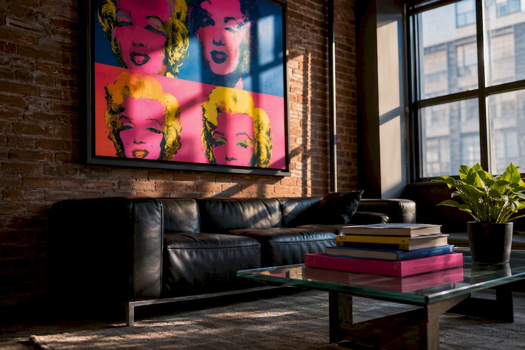
Get the Andy Warhol look by picking one bold pop-art focal piece, either an archival four-panel canvas portrait or an LED neon accent, and scaling it to fill roughly the width of your furniture below it. Measure your wall before you shop, decide whether you want a custom portrait or a ready-made piece, and match your accent colors to the print. Luxury Art Canvas produces U.S.-made archival canvases built for exactly this kind of focal statement.
Table of Contents
- What Makes Andy Warhol Style Decor Recognizable?
- Where Should You Hang Warhol-Style Art In Each Room?
- How Do You Commission Or Create A Warhol-Style Portrait?
- Which Materials Give You The Truest Warhol Colors?
- What Styling Mistakes Ruin A Pop-Art Look?
- Why Museum-Quality Reproductions And US-Made Canvas Matter
- How Do You Source Museum-Licensed Warhol Reproductions?
- How Do You Blend Warhol-Style Art Into An Existing Room?
- What Should You Budget For Warhol-Style Decor?
- Can You Mix Warhol-Style Art With Other Decor Styles?
- The Rule I Give Every First-Time Buyer
- Get The Warhol Look With Luxury Art Canvas
- Sources
What Makes Andy Warhol Style Decor Recognizable?
Warhol built his visual language on a handful of repeatable moves, and once you know them, you can spot a genuine pop-art scheme from a room that just has “colorful art” in it. The palette runs bold and saturated: hot pink, electric blue, acid yellow, not the muted tones most furniture stores default to. Photographic detail gets flattened into simple graphic shapes, so a portrait reads more like a screen print than a photograph.
Repetition is the signature move. The four-panel portrait, where the same face repeats across a grid in different color combinations, is the most recognizable motif tied to Warhol-inspired decor, and it works because the eye reads the grid as pattern before it reads the individual images. Subject matter leans pop culture and commercial imagery, soup cans, celebrity faces, flowers, giving the whole aesthetic a lighthearted, almost mass-produced feel that contrasts with “serious” fine art.
To keep it tasteful rather than kitsch:
- Edit ruthlessly. One strong statement piece beats five competing prints.
- Respect scale. A four-panel portrait sized for a gallery wall looks cramped on a small accent wall.
- Anchor it with neutrals. Charcoal, white, or gray furniture lets the art carry the color.
Where Should You Hang Warhol-Style Art In Each Room?
Placement makes or breaks a pop-art scheme, and the right approach shifts depending on the room’s function and traffic.
- Living room. Center a four-panel portrait or a single oversized canvas over the sofa, sized to roughly two thirds of the sofa’s width. Architectural Digest’s coverage of Warhol works in interiors repeatedly shows the piece placed above a console or sofa as the room’s clear visual anchor, not competing with other art nearby.
- Home office or workspace. A single bold panel near eye level injects personality without undercutting professionalism, especially paired with white or chrome furniture.
- Bedroom. Go smaller and more restrained. A muted-palette Warhol-style print above a headboard reads calm rather than loud.
- Kid’s room or playroom. This is where you can go bigger on color. Multiple small panels in bright, mismatched hues suit a space meant to feel playful rather than curated.
- Entryway. A compact, high-contrast piece near the door sets the tone for the whole home in the three seconds guests spend there.
Color strategy matters as much as placement. A single-hue accent (one dominant color repeated in pillows or a rug) reads sophisticated. A multi-panel color riot works best when the surrounding furniture stays neutral so the art doesn’t have to compete.
Pro Tip: Pull one color straight from the artwork and repeat it in a throw pillow or a vase nearby. It ties the piece to the room instead of leaving it looking bolted on.
How Do You Commission Or Create A Warhol-Style Portrait?
The DIY route works if you’re comfortable with basic photo editing: pick a high-contrast, front-facing photo, posterize it into three or four flat color layers using an editor’s threshold or posterize tool, then arrange four color variants into a grid. This mimics the classic silkscreen effect without a screen press, though the result usually looks more like a poster than a museum piece.
Commissioning a custom canvas gets you closer to gallery quality, and it’s worth knowing what to ask before you order:
- File resolution: request at least 300 dpi for large-format printing so the enlarged grid doesn’t pixelate.
- Color profile: confirm sRGB or CMYK depending on the printer, since this affects how saturated your final colors come out.
- Proof rounds: ask how many digital proofs you get before printing, and whether color adjustments are included.
- Framing and border: decide between a clean gallery wrap or a framed border before production starts, since it’s harder to change after printing.
Vendors that offer personalized four-panel portraits typically work best from headshots or waist-up photos with clear facial features and strong lighting contrast, according to pop-art print services that specialize in this format. Turnaround and cost scale with size, canvas depth, and how much customization you request, plus shipping for oversized pieces. Archival inks and licensed reproductions cost more up front, but they hold their saturation for years instead of fading within a couple of seasons.
Which Materials Give You The Truest Warhol Colors?
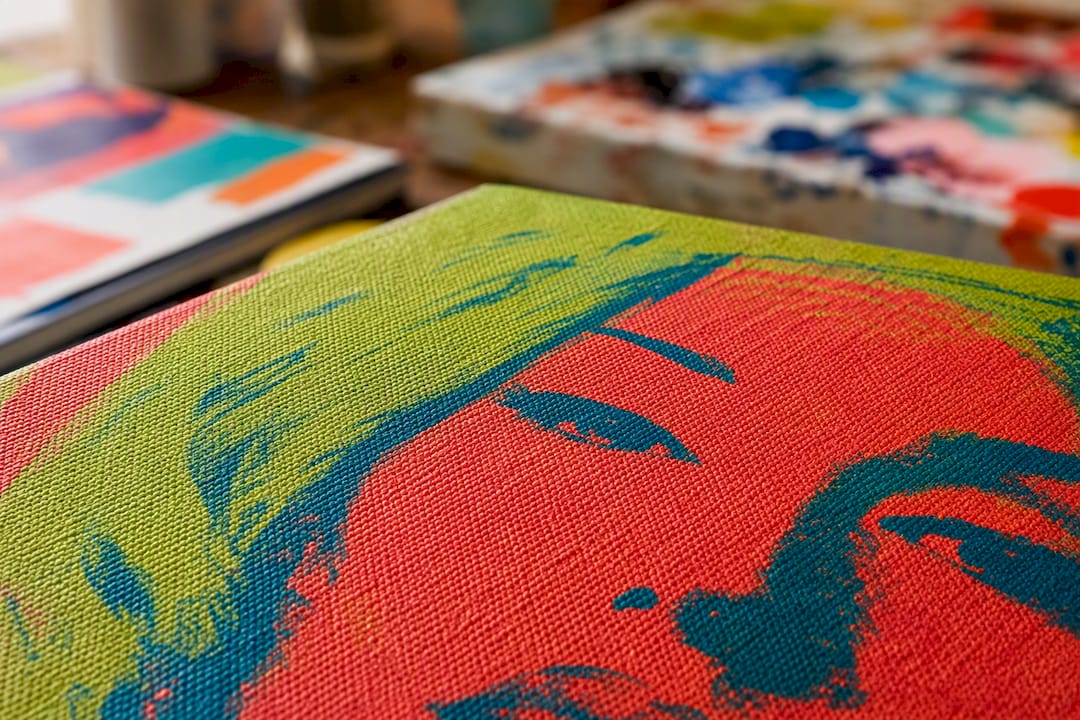
Material choice is where a lot of pop-art decor quietly fails. A cheap inkjet print on thin paper stock loses saturation within a year or two under normal window light. Archival canvas with pigment-based inks holds Warhol’s signature saturated color far longer, and the canvas texture adds a subtle depth that flat giclée prints on paper don’t have.
LED neon on acrylic backers has become a genuinely good alternative to traditional glass neon for pop-art accents. It’s lighter, more durable, and easier to mount. The MoMA Design Store’s Andy Warhol Flowers neon sign illustrates the format well: these signs typically measure between medium and large sizes suitable for wall mounting and are light enough to hang using a standard wall anchor rather than structural framing.
A few practical notes on display:
- Large canvases need proper picture-hanging hardware rated for their actual weight, not just a nail.
- Neon and acrylic pieces are lightweight enough for adhesive mounts in most cases, but check the manufacturer’s spec sheet.
- Skip warm incandescent bulbs directly on the piece. They wash out cool tones and shift the whole palette yellow.
- Adjustable LED picture lights or indirect spotlighting preserve the true color balance better than a ceiling fixture ever will.
What Styling Mistakes Ruin A Pop-Art Look?
The most common mistake is piling on too many saturated pieces at once. One or two strong statements read as curated; five competing prints read as clutter. Edit down before you hang anything.
Low-resolution photos are the second killer, especially for enlarged four-panel work where pixelation becomes obvious at scale. Headshots with clear contrast and simple backgrounds convert into clean graphic panels far more reliably than busy or dim source photos.
- Don’t mix three different saturated palettes in one sightline.
- Do pull one dominant hue from the art into a rug or pillow for cohesion.
- Do consider a dark accent wall behind a single bold piece. Designers use this trick specifically because darker walls visually recede, letting saturated colors pop harder than they would against white.
Pro Tip: Use the dark-wall trick on one wall only. Applied to an entire room, it flattens the contrast that made the art pop in the first place.
Why Museum-Quality Reproductions And US-Made Canvas Matter
Licensed reproductions and archival printing aren’t just marketing language, they’re the difference between colors that hold and colors that fade within a year. Luxury Art Canvas manufactures every canvas in the USA across more than 1,000 designs, backed by reviews from over 10,000 customers, using archival inks built to keep Warhol’s saturated palette accurate for years, not months.
How Do You Source Museum-Licensed Warhol Reproductions?
Museum shops and licensed print partners are the most reliable route if color accuracy and authenticity matter to you. The MoMA Design Store sells officially licensed Warhol pieces, including the neon sign format, and lists exact dimensions and materials up front, which is worth comparing against any print vendor’s claims before you buy.
Outside museum retail, ready-made pop-art canvases give you the visual without a commission timeline. This is the faster path for most homeowners and renters: you’re choosing from an existing catalog rather than waiting on proofs. Luxury Art Canvas’s pop art canvas category and its Warhol-inspired self-portrait designs both fall into this ready-made bucket, sized and framed for immediate hanging rather than custom production.
A practical way to decide between the two: if you want Warhol’s actual imagery (his soup cans, his flowers, his own self-portraits), licensed reproductions are the only route that’s legally and artistically accurate. If you want the style, the color-blocked, repeated-grid, pop-culture aesthetic, applied to your own photo or a different subject entirely, a custom or ready-made pop-art print from a specialty canvas retailer gets you there without licensing complications. Retail-friendly motifs like Campbell’s Soup-inspired canvases sit comfortably in a kitchen nook or over a console, echoing the original without claiming to be it.
Either way, check the fine print on materials. A print described as “museum quality” should specify archival inks and canvas or paper stock, not just use the phrase as a label.
How Do You Blend Warhol-Style Art Into An Existing Room?
Start with what’s already working in the room rather than replacing everything for the sake of the art. Take stock of your current color palette and pick a Warhol-style piece that pulls at least one color already present, a red sofa pairs naturally with a red-and-black four-panel portrait, for instance.
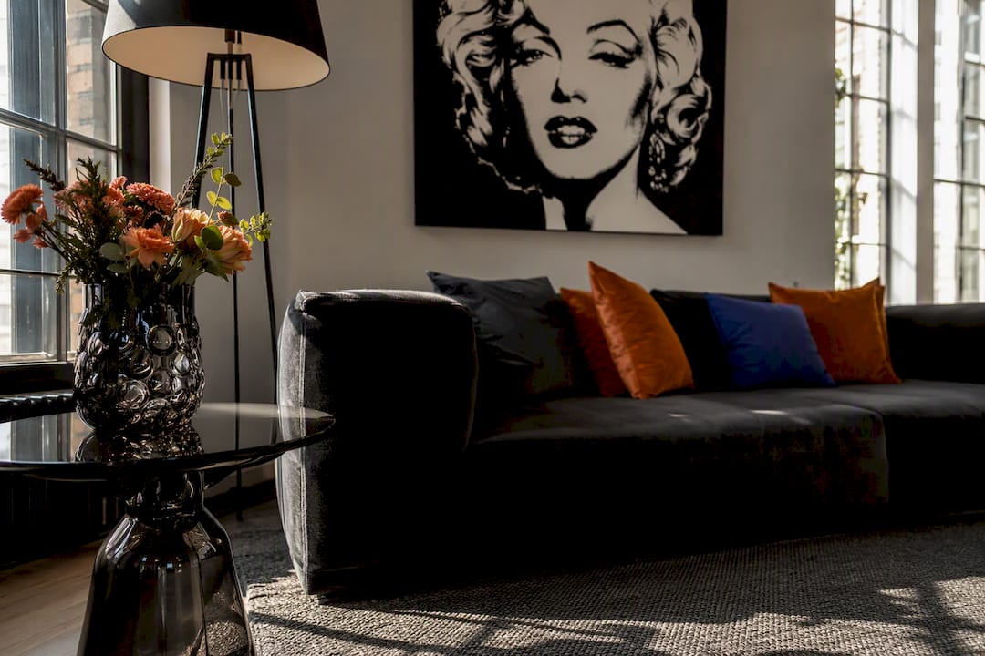
Next, address scale before color. Measure the wall space and the furniture beneath it first; a piece that’s too small looks like an afterthought no matter how bold its colors are. For an over-sofa placement, aim for roughly two thirds of the sofa’s width.
Then layer in supporting elements gradually:
- Hang the anchor piece first and live with it for a few days before adding anything else.
- Pull one accent color from the art into a single textile, a pillow or throw, not several at once.
- Assess whether the room needs more pop-art support or if one piece is enough. Often it is.
- Adjust lighting last, since the right spotlight or picture light can make a mediocre placement look intentional.
This sequence matters because pop art tends to get added impulsively, then the room ends up feeling disjointed. Treating it as a phased addition, rather than a wholesale redecoration, keeps the existing bones of the room intact while giving the new piece room to actually stand out. If your space already leans traditional or transitional, a single Warhol-style canvas against a wall of classic millwork or paneling creates the kind of contrast Houzz’s coverage of polished pop interiors highlights as the whole appeal: formality loosened by one playful, oversized statement.
What Should You Budget For Warhol-Style Decor?
Ready-made pop-art canvases span a wide range depending on size, material, and whether the design is a stock print or a licensed reproduction. Smaller accent pieces sit at the affordable end, while large-format four-panel portraits sized for a living room wall cost meaningfully more, largely because you’re paying for four separate print runs assembled as one piece rather than a single image.
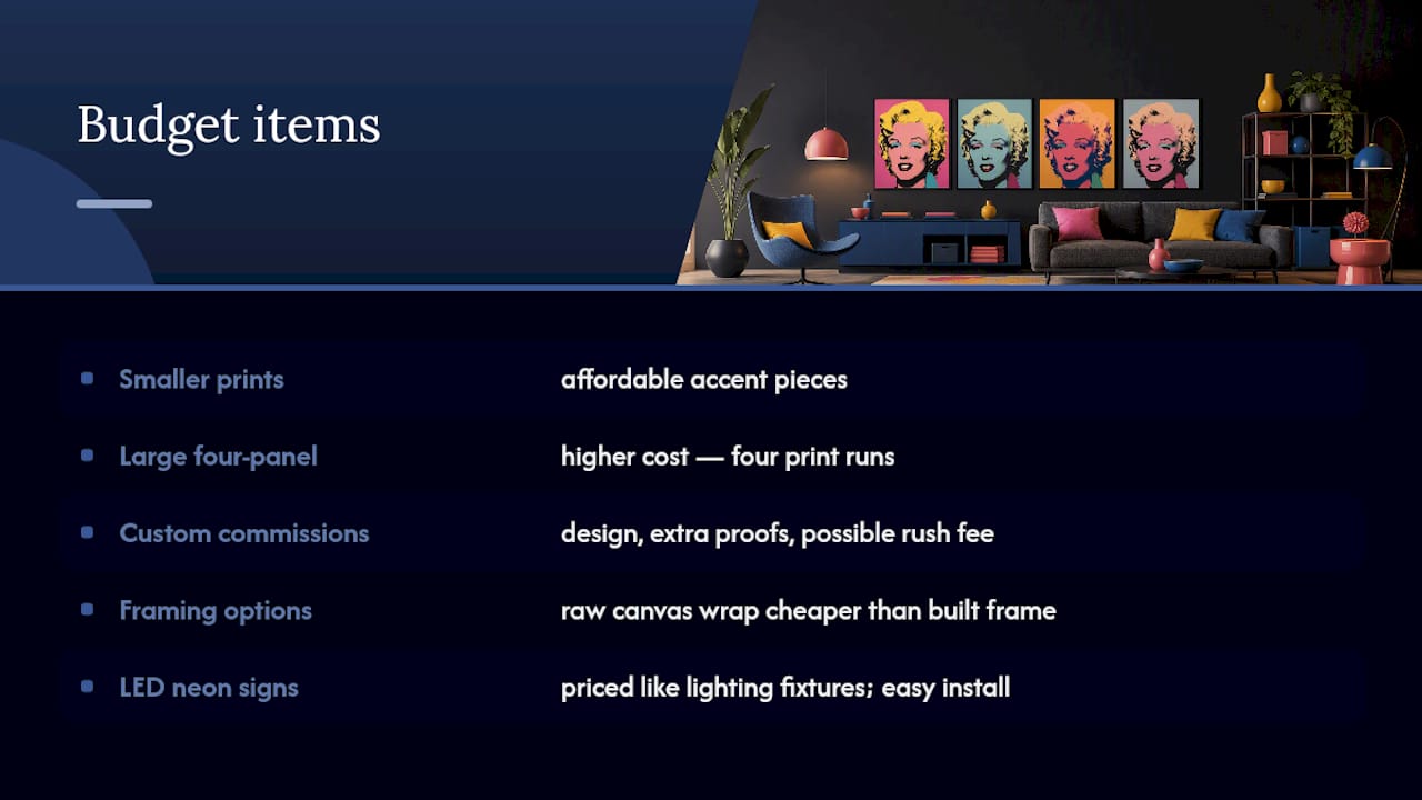
Custom commissions add cost on top of a standard print for a few specific reasons: the design work to posterize and color-separate your photo, additional proof rounds if you want revisions, and often a rush fee if you need a fast turnaround. Framing adds another variable. A raw canvas wrap costs less than a piece finished with a built frame and border.
LED neon signs occupy a different budget category entirely. They’re priced more like a lighting fixture than a piece of framed art, and the MoMA neon example shows that even licensed, museum-branded neon comes in a manageable size and weight range that doesn’t require an electrician for installation in most homes.
A sensible way to budget: decide your anchor piece first and spend the bulk of your budget there, then keep any supporting textiles or accent pieces modest. One well-made four-panel canvas will carry a room further than three cheaper prints spread across multiple walls, and it avoids the color-clash problem that comes from mixing print quality and saturation levels in the same sightline.
Can You Mix Warhol-Style Art With Other Decor Styles?
Pop art doesn’t require a pop-art room to work. Some of the most effective interiors pair one bold Warhol-style piece against a completely different backdrop, mid-century modern, traditional, even farmhouse, and let the contrast do the work.
The key is texture discipline. Designers pair pop art with higher-end finishes, think white upholstery, chrome or brass accents, glass tables, specifically to keep the room from tipping into costume territory. A saturated four-panel portrait against a sleek, restrained backdrop looks curated. The same piece surrounded by busy patterns and clashing colors looks chaotic.
If your existing decor leans traditional, hang one Warhol-style piece as a deliberate contrast point rather than trying to theme the whole room around it. If your style is already minimalist, the art becomes the room’s only source of color and pattern, which is often the strongest version of this pairing since nothing competes for attention.
Avoid mixing multiple bold art styles in the same room. A gallery wall combining graffiti-style pieces, abstract prints, and Warhol-style panels usually needs a unifying thread, a shared color, a consistent frame style, a repeated subject, or it reads as random rather than curated. Pick one dominant style per room and let secondary pieces support it quietly.
The Rule I Give Every First-Time Buyer
Pick your scale first, your color second. Buyers consistently size art too small for the wall, then compensate by adding more pieces instead of going bigger on the one they already have. The rooms that actually look like considered design, not a poster sale, are the ones where someone measured the wall before falling in love with a photo.
— James
Get The Warhol Look With Luxury Art Canvas
If you’ve decided a four-panel portrait or a bold pop-art accent is the move, Luxury Art Canvas gives you a faster path than sourcing museum licensing or waiting on a custom screen-print studio. Every canvas is manufactured in the USA on archival materials built to hold saturated color, not the printer-paper fade you get from budget poster sites, and the catalog runs past 1,000 designs across pop art, graffiti, and high-fashion motifs.
Start with the pop art canvas collection if you want a ready-made piece shipped without a design back-and-forth, or the self-portrait four-panel designs if you want that classic repeated-grid format without commissioning it from scratch. For a fashion-forward pairing in the same bold palette, the Louis Vuitton wall art collection works well alongside pop-art pieces in a room that mixes street culture with high fashion. Custom sizing requests and proofing questions go through customer support before you order, and lead times vary by size and customization, so ask early if you’re working against a deadline. Visit Luxury Art Canvas to browse the full catalog and start your order.
Sources
- The Work of American Icon, Andy Warhol, in AD
- In the Mood For: Andy Warhol Inspired Home Decor — The House That Lars Built
Canvas Sizes Guide: How to Pick the Right Dimensions
Room by Room Black and Gold Wall Art with Lighting Tips