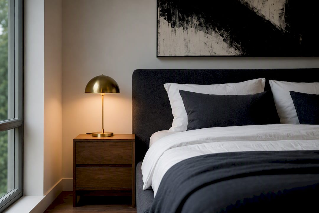
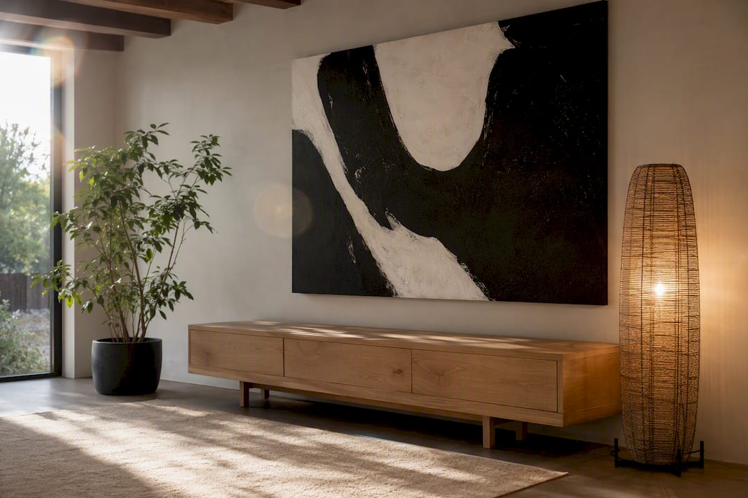
For minimalist homes, decisive high-contrast pieces deliver the most drama with the least clutter. A large black-and-white abstract, a single jewel-tone print on white, or a graphic line drawing will do more for a room than three smaller pieces ever could. Here’s the short list worth acting on:
- Black-and-white abstract or photography — reads as refined, never busy, because it works within the same restrained palette your furniture already uses.
- Oversized monochrome photo — one large-format image creates a focal point without needing a gallery wall to back it up.
- Single jewel-tone piece on white — a controlled pop of emerald, cobalt, or garnet against a white mat gives you contrast without abandoning restraint.
- Minimalist line art — a couple’s portrait or figurative sketch in thin black lines adds warmth and personality without visual noise.
- A pop or street art accent, used sparingly — one bold graphic piece can anchor a room if everything around it stays quiet.
Whatever you pick, the finish and the light hitting it matter as much as the image itself.
Key Takeaways
The most effective high-contrast art for minimalist homes pairs a single bold piece, sized to 60 to 75 percent of the wall, with archival materials and warm lighting to avoid a sterile feel.
| Point | Details |
|---|---|
| Choose one focal piece | A single oversized black-and-white or jewel-tone piece outperforms multiple smaller ones on a minimalist wall. |
| Size to the wall | Cover roughly 60 to 75 percent of the wall width above furniture for correct visual balance. |
| Prioritize archival materials | Fade-resistant pigment inks and archival canvas keep contrast sharp for years, not months. |
| Warm up the contrast | Repeat one warm material, like brass or walnut, and use directional lighting to avoid a cold look. |
| Shop with intent | Luxuryartcanvas offers archival-grade minimalist prints and line art sized for exactly these placement rules. |
Table of Contents
- High-Contrast Art Styles That Work With Minimalist Design
- Sizing High-Contrast Art for a Minimalist Wall
- Materials and Finishes That Keep Contrast Sharp for Years
- Keeping High Contrast Warm Instead of Cold
- Why Luxury Art Canvas Fits This Approach
- Common Mistakes to Avoid When Choosing High-Contrast Art
- How High-Contrast Art Affects Mood in a Minimalist Room
- What Actually Matters in a High-Contrast Room
- Bring the Right Piece Into Your Home
- Sources
High-Contrast Art Styles That Work With Minimalist Design
Minimalist rooms don’t have much room for error. Every piece on the wall either earns its place or fights the space around it, so the style you choose has to match the job that wall is doing.
- Black-and-white abstract and photography. These stay refined because they share the same tonal range as your walls and furniture. An oversized black-and-white cityscape or a cropped architectural photo in an entryway sets a tone before a guest even reaches the living room.
- Single-color jewel tones on white. A deep emerald or burgundy composition on a stark white ground gives you a controlled pop instead of visual chaos. This works especially well in a bedroom, where you want calm with one deliberate accent.
- Minimalist line and figurative prints. A minimalist line art couple piece or a simple figurative sketch adds intimacy to a hallway or reading nook without competing with furniture lines.
- Street or pop pieces, used sparingly. One graphic, high-contrast pop art print can serve as the single loud note in an otherwise quiet room, often in a home office or a stairwell where it won’t overwhelm daily sightlines.
- Textured canvas vs. flat paper. Canvas holds up better in busy living spaces and adds a slight tactile quality that softens stark contrast; flat paper prints, usually framed under glass, suit smaller, quieter rooms like a home office where reflections are less of a concern.
Each of these does a different job. Pick based on the room’s function, not just what looks good in a product photo.
Sizing High-Contrast Art for a Minimalist Wall
Scale is where most high-contrast art either works or falls flat. A piece that’s too small on a large wall looks like an afterthought; too large in a tight room and it overwhelms the negative space that makes minimalism feel calm in the first place.
- Aim for the artwork to cover a significant portion of the available wall width above a sofa, console, or bed. A sofa of typical size generally pairs well with a proportionally large piece or grouping.
- Choose one oversized piece over a cluttered grouping when the wall is a single focal point, like above a fireplace or a bed headboard. Reserve triptychs or balanced grids for longer walls, hallways, or staircases where a single canvas would look stranded.
- Think in ratios, not just inches. An 80/20 black-to-white composition reads as bold and graphic; a 50/50 split feels more balanced and works better in smaller rooms where too much dark mass can make walls feel closer.
- In small rooms, favor lighter grounds with smaller areas of deep contrast. High ceilings can handle a taller vertical piece or a stacked pair; open-plan spaces often benefit from one large anchor piece rather than several smaller ones competing across sightlines.
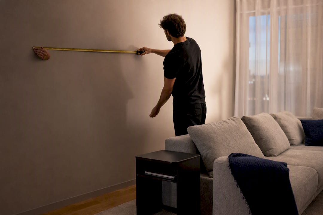
Measuring the wall and marking out the piece’s dimensions with painter’s tape before buying saves more return shipments than any style guide.
Materials and Finishes That Keep Contrast Sharp for Years
The image matters, but the substrate is what determines whether that image still looks sharp in five years. Archival-grade canvas holds pigment ink far better than standard paper stock, and fade-resistant inks are the difference between deep blacks staying deep and slowly turning gray under window light. Archival canvas paired with pigment-based printing is often rated for decades of display without noticeable fading, which matters most in rooms that get direct sun.
Statistic callout: Manufacturers who use archival canvas and pigment inks commonly rate their prints for long-term display without significant color shift, a meaningful difference from budget dye-based prints that can visibly fade within a couple of years in sunlit rooms.
- Matte finishes reduce glare and suit rooms with big windows or overhead lighting, keeping contrast crisp without reflections washing it out.
- Satin finishes offer a middle ground, adding subtle depth to blacks without the glare of true gloss.
- Gloss finishes intensify contrast dramatically but can throw distracting reflections in bright rooms, so reserve them for walls without direct light exposure.
- Gallery wrap canvases, stretched over the frame edge with no visible border, are the cleanest option for minimalist walls since they skip a frame entirely.
- Floater frames hold the canvas slightly inset for a shadow-box effect that adds definition without ornamentation.
- Slim metal or wood frames work for paper prints when you want a defined edge but nothing decorative.
Dust with a dry microfiber cloth and keep pieces out of direct, unfiltered sunlight when possible. A simple French cleat or a properly rated D-ring and wire setup rated for the canvas weight prevents the slow tilt that plagues heavier pieces hung on a single nail.
Keeping High Contrast Warm Instead of Cold
Stark black and white can tip into sterile fast if the lighting and surrounding materials don’t work with it. Architectural Digest recommends thinking beyond flat black-and-white pairings and adding reflective surfaces and natural textures so dramatic contrast reads as glamorous rather than cold.
Directional lighting, like an adjustable picture light or a warm-toned floor lamp angled toward the piece, does more for a high-contrast canvas than any overhead fixture. Dimmers let you shift the mood from daytime crispness to evening warmth without changing anything on the wall.
Designer Windsor Smith’s approach is worth borrowing directly: repeat one warm material, whether that’s brass hardware, cognac leather, or warm wood, across the room so the eye has an anchor besides the art. A single piece of black-and-white art next to a warm walnut console reads intentional; the same piece next to cold gray laminate reads clinical.
Leave real breathing room around the piece, at least the width of the frame itself on either side, so it doesn’t compete with nearby furniture lines.
Pro Tip: If your room already has a mirror or glossy surface, angle your art lighting so it doesn’t bounce directly into that reflection. Two competing highlights fight each other and cancel out the drama you’re trying to create.
Why Luxury Art Canvas Fits This Approach
Everything above points to the same conclusion: the right high-contrast piece depends on scale, finish, and how it sits against your existing materials. Luxuryartcanvas builds its collections around exactly that logic, with museum-quality canvases produced in the USA using archival-grade materials and fade-resistant inks.
- Minimalist Drawing Wall Art covers the line-art category discussed above, including couple portraits and figurative sketches.
- Minimalist Art Prints and Minimalist Prints span black-and-white abstracts and single-tone compositions sized for standard wall widths.
- Living Room Minimalist Wall Art is built for the single-focal-point placement described in the sizing section above.
More than 10,000 customers have reviewed pieces across these collections, and the practical next step is simple: measure your wall, decide on gallery wrap or a slim frame, then browse the collection that matches your room’s function.
Restraint and boldness aren’t opposites in minimalist design. The right high-contrast piece, sized correctly and lit well, is what makes restraint feel deliberate instead of empty.
Pro Tip: Before ordering, tape the exact dimensions of your chosen piece onto the wall for 24 hours. If you stop noticing the tape by day two, the scale is right.
FAQ
Does high-contrast art work in a small minimalist room? Yes, as long as you favor a lighter overall ground with one area of deep contrast rather than a piece that’s dark across most of its surface.
Can I mix black-and-white art with color accents elsewhere in the room? Yes. A monochrome piece pairs well with a single warm-toned accent, like a rust throw pillow or a wood side table, without breaking the minimalist feel.
How many high-contrast pieces should one room have? Usually one, occasionally two if they’re placed on separate walls. Multiple bold pieces competing on the same sightline undercuts the calm minimalism is built on.
Is canvas or framed paper better for humid rooms like bathrooms? Canvas generally handles humidity better than framed paper prints, which can warp behind glass over time.
What wall color works best behind high-contrast art? White or very light gray walls let the piece’s contrast do the work; darker walls need a piece with enough tonal range to still stand out.
Common Mistakes to Avoid When Choosing High-Contrast Art
The most common mistake is buying based on the image alone and ignoring scale. A striking 16x20 print looks impressive online and disappears on a 10-foot wall. Measure first, choose second.
The second mistake is stacking too many bold pieces in one sightline. Minimalist design relies on restraint, and one loud piece surrounded by open wall reads far more sophisticated than three loud pieces fighting for attention. If you’re drawn to more than one bold print, spread them across separate rooms rather than one wall.
A third mistake is choosing gloss finishes for rooms with heavy window light, which creates glare that actually reduces visible contrast rather than enhancing it. Matte or satin holds up better in bright rooms.
Fourth, skipping archival materials to save money often backfires. A budget print that fades unevenly within a couple of years costs more in replacement than paying for pigment inks and archival canvas upfront.
Finally, some buyers forget to plan lighting alongside the art itself. Even the sharpest black-and-white composition falls flat under a single harsh overhead bulb. Homes & Gardens notes that designers increasingly balance saturated contrast with warm neutrals and single accent moves specifically to avoid this flat, uninviting effect.
How High-Contrast Art Affects Mood in a Minimalist Room
High-contrast art does more than fill wall space. It gives the eye a resting point in a room that otherwise has few visual cues, and that resting point shapes how calm or stimulated the space feels.
A single bold piece against an otherwise quiet wall tends to read as confident and grounding, similar to how one strong statement in a conversation carries more weight than a dozen scattered comments. This is part of why minimalist rooms with one striking focal piece often feel more settled than rooms with several competing decorations, even when the overall color palette is identical.
Too much contrast packed into a small space, on the other hand, can push a room from “striking” into “restless.” Several jewel-tone or black-and-white pieces clustered together create visual tension rather than calm, since the eye has no clear place to land. Practical guidance on mixing textures and adding warm lighting exists largely to counter this effect, softening contrast just enough that it energizes a room instead of overstimulating it.
The goal isn’t to eliminate tension entirely. A little visual tension is what makes a room memorable rather than forgettable. The skill is calibrating how much, and where, so the room feels deliberate rather than chaotic.
What Actually Matters in a High-Contrast Room
The advice that gets repeated most about high-contrast art, that black and white “always works” in a minimalist space, is only half true. It works when the scale is right and the room has warmth built in somewhere else. Without that, it just looks unfinished.
What’s underrated is restraint in quantity, not boldness in choice. Homeowners often assume minimalism means playing it safe with art, so they either go too timid with a small, forgettable print or overcorrect with too many bold pieces at once. The better move, based on everything designers from Windsor Smith to Gray Malin actually recommend, is one confident piece sized correctly, paired with one repeated warm material in the room.
If you’re deciding where to start, start with the wall measurement, not the art. Everything else, finish, frame, color intensity, follows from that single number.
Bring the Right Piece Into Your Home
Luxuryartcanvas is the practical next step for readers who’ve read this far and want a piece that actually fits the rules above, not a generic print scaled to guesswork. Every canvas is produced in the USA on archival-grade material with fade-resistant pigment inks, so the contrast you choose today still looks sharp years from now.

Beyond the minimalist prints and line art covered earlier, the catalog also includes bolder statement pieces, from Louis Vuitton wall art to graphic pop art canvas prints, for anyone who wants one loud accent piece in an otherwise quiet room. With over 1,000 designs and reviews from more than 10,000 customers, the collection gives you real options instead of a single style locked to one aesthetic.
Measure your wall, decide on gallery wrap or a slim frame based on the guidance above, then browse the minimalist art prints collection to find the piece that matches your room’s scale and finish needs.
Sources
- How to create a high-contrast, high-glamour space (Architectural Digest)
- Windsor Smith decorating ideas (One Kings Lane)
- Designers on how to create a high-contrast color scheme (Homes & Gardens)
Refresh Your Home's Art Every Season, Room by Room
What Is a Gallery Wrapped Canvas? Definition and Buying Guide