A statement wall does more than fill empty space. It defines how a room feels and how you express yourself within it. Whether you are a homeowner refining your interior style or a renter working within limitations, a thoughtfully designed statement wall allows you to showcase personality without overwhelming the entire space.
The key lies in intentional choices, from artwork selection to layout and color coordination.
By combining visual storytelling with practical design strategies, you can create a wall that feels cohesive, expressive, and uniquely yours.
What Makes a Statement Wall Truly Personal
A truly personal statement wall goes beyond aesthetics. It reflects your experiences, preferences, and the way you want your space to feel on a daily basis.
Moving Beyond Trends to Express Individual Style
Trends can provide inspiration, but relying on them too heavily often leads to spaces that feel generic. A statement wall should instead be rooted in what resonates with you personally, whether that is travel memories, creative passions, or a love for bold design.
Start by identifying what naturally draws your attention. Do you prefer clean, minimal visuals or layered, expressive compositions? Your answers should guide your design decisions rather than what is currently popular.
Personal style becomes more compelling when it feels authentic rather than curated for appearance alone. This approach ensures your wall remains meaningful long after trends fade.
How Visual Elements Tell Your Story
Every element on your wall contributes to a larger narrative. Artwork, color choices, and even spacing communicate something about your personality and lifestyle.
Photography can reflect places you have been or aspire to visit. Abstract art may express creativity or emotional depth. Graphic prints can showcase interests, from music to motorsports.
When combined intentionally, these elements create a visual story that feels cohesive rather than random. The goal is not perfection, but connection. Each piece should feel like it belongs in your space.
Choosing a Theme That Reflects Your Personality
A strong theme provides direction and prevents your statement wall from feeling disjointed. It acts as a foundation for all design decisions moving forward.
Minimalist, Eclectic, or Bold: Finding Your Direction
Different design approaches create different emotional effects:
- Minimalist: Clean lines, neutral tones, and limited pieces for a calm, focused atmosphere
- Eclectic: A mix of styles, colors, and textures that feel collected over time
- Bold: High-contrast colors, oversized art, and dramatic compositions that command attention
Your choice should align with how you want the room to feel. Minimalist walls promote relaxation, while bold designs energize the space and draw immediate focus.
Blending Interests, Hobbies, and Memories Into One Concept
A meaningful theme often comes from combining multiple aspects of your life. For example, a travel-inspired wall might include maps, photography, and cultural artwork. A creative theme could blend typography, sketches, and mixed media.
For example, if you are passionate about motorsports, incorporating F1 posters displaying track layouts can add both visual structure and personal relevance. These types of pieces not only look striking but also reflect a specific interest in a clean, graphic format.
The key is balance. Ensure all elements connect through a shared color palette, subject, or visual style.
Selecting Artwork That Resonates With You
Artwork is the centerpiece of any statement wall. Choosing pieces that genuinely resonate ensures your wall feels personal rather than decorative.
Mixing Different Art Styles and Mediums
Combining various art styles adds depth and visual interest. Consider mixing:
- Photography with abstract prints
- Canvas pieces with framed illustrations
- Typography with graphic designs
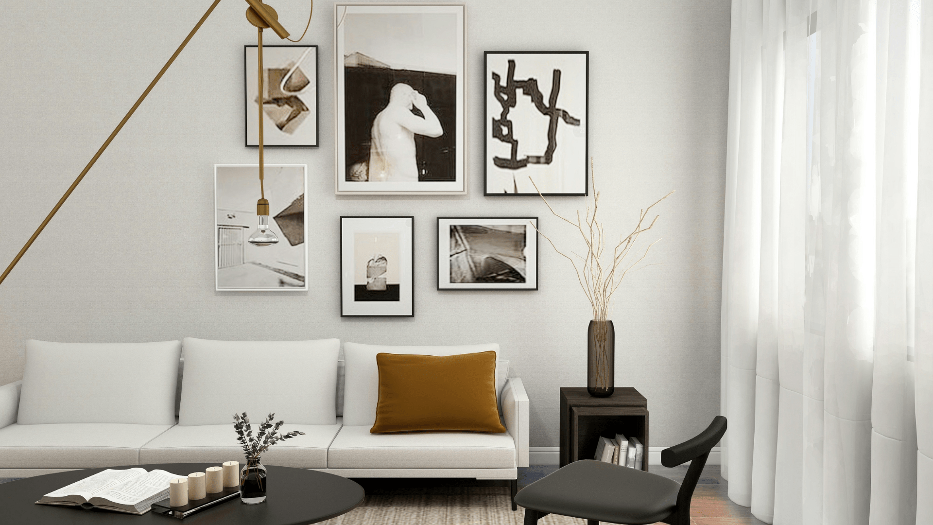
This layered approach creates a curated, gallery-like effect without feeling overly structured.
Incorporating woven textile pieces alongside abstract or minimalist prints introduces contrast while maintaining a cohesive theme. The textures of the fabrics add warmth and depth, creating a tactile focal point that complements both contemporary and eclectic interiors.
Balancing Large Focal Pieces With Smaller Accents
Every statement wall benefits from a clear focal point. Larger pieces anchor the design, while smaller accents provide supporting detail.
A well-balanced arrangement might include:
- One oversized artwork as the centerpiece
- Medium-sized pieces to frame the focal point
- Smaller accents to fill gaps and add texture
Avoid treating every piece equally. Visual hierarchy ensures the wall feels intentional rather than cluttered.
Designing Layouts That Create Impact
Layout determines how your wall is perceived at first glance. Even the best artwork can feel ineffective if poorly arranged.
Symmetrical vs Asymmetrical Arrangements
Each layout style creates a different visual effect:
- Symmetrical layouts: Structured, balanced, and calming
- Asymmetrical layouts: Dynamic, creative, and visually engaging
Symmetry works well in formal spaces, while asymmetry suits more relaxed, expressive environments.
When designing your layout, start by mapping out placement on the floor or using paper templates on the wall. This prevents unnecessary holes and helps refine spacing before committing.
Gallery Walls vs Single Statement Pieces
Choosing between a gallery wall and a single statement piece depends on your style and space.
- Gallery walls allow for storytelling through multiple pieces
- Single statement pieces create bold impact with minimal effort
Gallery walls work best when there is a unifying element, such as consistent framing or color palette, while single pieces rely on scale and placement for impact.
Incorporating Color to Reinforce Personality
Color plays a crucial role in shaping how your statement wall feels and functions within the room.
Choosing a Palette That Reflects Mood and Energy
Different color palettes evoke different emotional responses:
- Warm tones create energy and social warmth
- Cool tones promote calm and focus
- Neutral palettes offer flexibility and timeless appeal
Select colors that align with the room’s purpose. A living room might benefit from warm, inviting tones, while a bedroom may call for softer, calming hues.
Using Contrast to Draw Attention
Contrast helps define focal points and adds visual interest. This can be achieved through:
- Light artwork on dark walls or dark artwork on light walls
- Mixing bold and muted tones
- Combining different finishes and materials
Strategic contrast ensures your statement wall stands out without overwhelming the space.
Adding Dimension With Materials and Decor
A flat wall can feel incomplete without variation in texture and depth. Incorporating different materials enhances the overall design.
Layering Textures Through Frames, Shelves, and Objects
Texture adds richness even within a limited color palette. Consider combining:
- Wood and metal frames
- Matte and glossy finishes
- Fabric elements like wall hangings
Floating shelves can also introduce depth, allowing you to layer artwork with decorative objects.
Combining Art With Functional Decor Elements
Blending aesthetics with function creates a more practical and personalized space. Examples include:
- Wall-mounted lighting to highlight artwork
- Shelves for books and small decor
- Hooks or rails for flexible displays
This approach ensures your statement wall remains both beautiful and useful.
Avoiding Common Statement Wall Mistakes
Even well-intentioned designs can fall short without attention to detail.
Overcrowding vs Under-Designing
Too many elements can create visual chaos, while too few may feel unfinished. Aim for balance by editing your selection carefully.
A helpful guideline:
- Leave space between pieces for breathing room
- Avoid filling every inch of the wall
- Focus on quality over quantity
Ignoring Scale and Proportion
Scale is one of the most common mistakes in wall design. Small artwork on large walls feels disconnected, while oversized pieces can overwhelm tight spaces.
As a rule of thumb:
- Artwork above furniture should span about two-thirds of its width
- Maintain consistent spacing between pieces, 2 to 4 inches works well
Proper proportion creates a polished, intentional look.
Evolving Your Statement Wall Over Time
A statement wall should not feel static. As your tastes and experiences evolve, so should your space.
Rotating Pieces to Keep the Space Fresh
Swapping artwork periodically keeps your wall engaging and aligned with your current style. This could mean seasonal updates or simply rotating pieces you already own.
Affordable prints and interchangeable frames make this process easy without requiring major investment.
Updating Layouts as Your Style Changes
As you acquire new pieces or refine your aesthetic, revisit your layout. Small adjustments, like repositioning artwork or introducing new accents, can dramatically transform the overall look.
Treat your statement wall as an ongoing project rather than a finished product. This mindset allows your space to grow with you, ensuring it always reflects who you are.
Self-Portrait Background Ideas for Unique Paintings
Why Canvas Prints Outlast Wall Posters for Good