A self-portrait rarely begins with the face.
What comes first is the space around it, the part that is easier to avoid and harder to justify. A background can stall, hesitate, or insist. It can feel unfinished on purpose, overloaded without explanation, or stripped down to a single color because anything more would distract from something unresolved. These choices are rarely neutral.
In self-portrait painting, the background absorbs what cannot be placed in the features themselves. It carries tension, fatigue, memory, sometimes refusal. A clean backdrop may suggest control, but it can also signal distance. A chaotic one might read as expressive, or simply honest. Long before a viewer studies the eyes or the mouth, the atmosphere has already shaped the encounter.
This is why the background matters as much as the likeness. It frames the figure psychologically, not decoratively. Whether figurative, abstract, or barely defined, it becomes the place where uncertainty settles, the silent part of the portrait that says what the subject does not.
What a Background Should Do (and Not Do)
Keep the face as the focal point (priority #1)
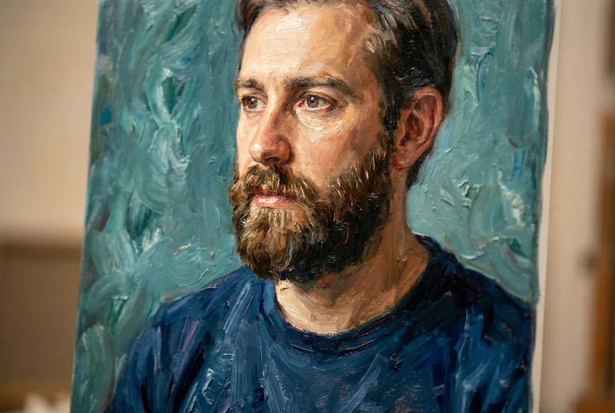
In self-portraiture, the most critical task of the background is to ensure that the viewer’s attention lingers on the face or primary features of the subject. Regardless of whether the backdrop is minimalist or ornately detailed, it serves as the visual frame that highlights the psychological core of the self-portrait; the face, the expression, the gaze. For example, Frida Kahlo employed detailed natural and symbolic motifs, but always orchestrated them so that her facial features commanded immediate attention. Where artists falter, however, is when distractions in the background, a sharp contrast, a bold texture, or a competing color; divide the viewer’s gaze and dilute the emotional impact. To prevent this, composition, value control, and edge treatment become vital tools. When placed strategically, these elements draw the eye back to what matters most, making the face not just present but unforgettable. In sum, the background must act as a stage, not the star of the show.
Add mood + story without “stealing the show”
Rather than upstaging the subject, an effective background sets the mood, supports the psychological temperature, and quietly extends the narrative. This could mean suggesting isolation with a fogged glass pane, hinting at memory with half-erased wallpaper, or layering abstract color fields that resonate with the sitter’s emotional state. Painters often walk a tightrope; too much complexity or symbolism can lead to storytelling overload, muddling the intended message. The trick lies in subtlety: a single window can signal openness or yearning, a muted color wash can evoke nostalgia, and patterned shadows might suggest duality or mystery. For instance, Lucian Freud’s famously spare rooms cultivate a sense of intimacy and reality, their silence encouraging viewers to look deeper into the subject’s psyche. By refraining from explicit storytelling, backgrounds become open-ended spaces for emotional resonance and interpretation.
The golden rule: background supports values and edges
One consistent principle among master self-portraitists is the careful management of values and edges between background and subject. The “values”, the range from light to dark, either separate the figure (pushing it forward with contrast) or merge it into the ground, enhancing ambiguity or atmospheric unity. Edges, meanwhile, may be crisp where you need clarity (such as the line of the jaw), or soft where subtlety or movement is desired (perhaps dissolving around hair or shoulders). By harmonizing background values and edge softness, artists unify the figure and the environment, or impose deliberate tension. In the works of Egon Schiele, sharp value contrasts electrify the sitter’s presence; in others, such as Gwen John, the figure drifts into a nearly seamless field. The background should be treated as an active, responsive partner to the figure, never as a passive afterthought.

Quick Wins: Background Ideas That Always Work
Soft gradient / vignette (classic, never wrong)
For artists seeking a reliable formula, a soft gradient or vignette remains a timeless choice. This technique involves blending a single color or tonal field from light at the center (near the head) to darker, or more muted, edges. Not only does this subtly direct the viewer’s gaze towards the subject, it eliminates distractions and bolsters a sense of unity. Vignettes evoke the aura of classical portraiture yet remain adaptable to modern sensibilities. When rendered with gentle brushwork or glazes, the soft transition can evoke daydreams, memories, or evoke an atmosphere of introspection. Consider how John Singer Sargent framed his subjects with vaporous transitions, the face always glowing from within a restful haze. This approach also sidesteps common pitfalls like visual clutter or competing detail.
Muted complement color field (easy harmony)
A single muted complementary color field can lend a sense of harmony and intentional contrast with minimal risk of overpowering the figure. For example, a background of desaturated teal behind warm skin tones delivers sophisticated balance, a hallmark of modern abstract wall art. This method borrows from color theory: complements (red/green, blue/orange, yellow/violet) vibrate against each other, but muting them through grey or white keeps the energy subtle, not aggressive. Many contemporary artists favor this approach for its calm, integrated atmosphere. It builds a gentle bridge between the figure and the ground, while still suggesting taste and design acumen.
Simple brushstroke halo (circle/oval behind the head)
Echoing religious iconography and folk motifs, the brushstroke halo is a visual device with enduring power. A loosely painted circle or oval, perhaps in gold, deep blue, or pale grey, placed right behind the sitter’s head gives symbolic weight without narrative overload. It can represent self-awareness, insight, or introspection, signaling the portrait as an object of contemplation. Halos can be expressive, energetic, tight, or diffuse, lending a focal point that reinforces the face as the psychological epicenter. In contemporary art, playful spins on this motif can reference tradition while asserting individuality, especially when paired with unexpected colors or rough, gestural marks. It’s a fast way to imbue the painting with depth, ritual, and meaning.
One prop + minimal setting (chair, table, doorway, window)
For those seeking quick narrative density, introducing a single prop into a pared-down setting is remarkably effective. A battered chair, slim table, open doorway, or glowing window offers instant context while remaining visually manageable. Minimal props can embody themes, support, containment, transition, openness, and serve as compositional anchors linking subject to scene. The presence of a window, for example, might signify hope, exploration, or self-reflection, cues frequently employed by artists examining personal change or uncertainty. When used sparingly, such props create layers of story and symbolism; the background does its job while never threatening to upstage the face.

How to Choose Colors for Portrait Backgrounds
Start with one quiet color (then adjust)
Color selection is foundational for any background and often sets the atmosphere for the entire self-portrait. Many artists begin by laying down a single, muted hue, something “quiet” like dusty blue, sage green, warm grey, or ochre, to establish a calm baseline. From here, the painter can systematically adjust temperature (warmer, cooler), value (lighter, darker), or saturation (muted, vibrant) in conversation with the tones of the subject’s face and clothing. This approach keeps the process manageable, preventing overcomplication and muddy color relationships. If the original wash feels too dull, a thin glaze of a warmer or contrasting tone can lift the mood without jeopardizing harmony. Ultimately, starting with restraint paves the way for deliberate refinements and expressive flourishes as the portrait evolves.
Muted complements vs muted analogs (when to use each)
Knowing when to employ muted complementary colors versus muted analogs shapes both emotion and design. Muted complements involve colors opposite on the color wheel, toned down with grey or white; muted analogs rely on adjacent colors, softly shifting through small variations.
Use complements when you want a background that offers gentle tension, energizing the portrait with a subtle edge, think a cool shadowy background behind a warm, rosy face. Opt for analogs if you prefer a seamless, tranquil effect, as in greens melting into blues or oranges sliding into rusty reds. Contemporary masters of Abstract Wall Art deftly explore these relationships, blending muted pairs or gentle transitions for maximum mood control.
Warm vs cool backgrounds (how to control mood)
The emotional temperature of the background has an outsized impact on the painting’s story. Warm backgrounds (ochres, golds, clay, coral) tend to convey intimacy, comfort, or nostalgia, perfect for self-portraits delving into memory or connection. Cool backgrounds (blue-greys, viridian, smoky purple) evoke quietude, introspection, or even detachment. The artist can tune the mood with subtle inflections, glazing a warm background to suggest sunset, or cooling a field to hint at early morning melancholy. Importantly, “warm” and “cool” are only relative; their effects depend on surrounding tones and the emotional narrative you wish to communicate.
Avoid “flat” color: 2–3-value shift is enough
Flat color fields risk turning the background into a static void, undermining depth and liveliness. Professional painters introduce gentle value modulations, shifting two or three steps lighter or darker within the same color field, to add complexity and dimension without distraction. This might mean feathering a nearly invisible gradient, dabbing varied tints with a dry brush, or softly erasing areas with a rag for broken color. Even small variations mimic how light behaves, enhancing realism and inviting viewers to take a psychological “walk” into the space behind the face. The rule of thumb: let the background breathe by avoiding monochrome slabs, but don’t overdevelop details that compete with the focal point.
Values & Edges: The Pro Trick That Makes Backgrounds Look Pro

Value contrast to pop the subject (light vs dark)
The most potent tool for separating subject from background is value contrast: that is, positioning light areas against dark, or vice versa. For example, placing a luminous face amid a shadowy field launches it forward, commanding attention. Conversely, a shadowed head against a bright wall can stir drama or psychological tension. Artists use this technique to script where viewers look and how they feel. Rembrandt’s chiaroscuro, where heads seem to glow from within velvety darkness, remains a classic demonstration. Yet even in modern self-portraits, shrewd value contrast conveys vitality and structure, a tactic shared by top practitioners of modern abstract wall art.
Similar values to “lose edges” (depth + realism)
While strong contrasts clarify forms, merging values between subject and background can create “lost edges” that imply depth, softness, or psychological ambiguity. These transitions, where hair melts into a shadow, or a shoulder blends with a midnight blue, encourage the viewer’s eye to move fluidly, discovering the portrait in waves rather than in a single snapshot. The result is often a greater sense of realism and emotional subtlety. John Currin, for example, uses nearly imperceptible changes between apparel and environment, underscoring the porous boundary between “self” and “setting.”
Where to sharpen vs soften around the head/shoulders
Strategic edge control is essential for managing the rhythm and hierarchy of a self-portrait. Sharpen edges just behind the chin or jaw to define structure, or where dramatic light carves out the profile. Conversely, soften and blur transitions along the back of the head, shoulders, or hairline, allowing the figure to dissolve into the background. This duality generates contrast where needed, but leaves room for the eye to wander. The result is both visual clarity and an organic sense of atmosphere.
Keep background detail lower-contrast than the face
To maintain focus, ensure that no texture, line, or pattern in the background exceeds the contrast of the features. If architectural elements or patterning seems to jostle for attention, attenuate them with gentle glazes, soften the brushwork, or fade outlines into a “veil” of color. It is through this deliberate restraint that backgrounds remain rich yet unobtrusive, supporting the overall narrative with nuanced echoes rather than loud statements.
|
Background Technique |
Effect on Mood |
How to Execute |
|---|---|---|
|
Soft Gradient |
Calm, introspective |
Feather color from light (center) to dark (edges) with wide brush |
|
Muted Complement |
Subtle tension, harmony |
Layer desaturated complements; blend edges softly |
|
Simple Prop |
Quick story, identity hint |
Paint single object with minimal setting; let it “breathe” |
|
Lost Edges |
Atmosphere, realism |
Merge similar values between figure and background |
Step-by-Step: Paint a Background Without Overthinking
Step 1: Decide the intent (mood / story / purely design)
The first and most important step before laying down paint is to clarify your intent. Is your background meant to evoke a specific feeling, melancholy, nostalgia, serenity, or to ground the figure in a narrative environment? Or is it a purely formal device to balance colors and shapes? Reflecting on your personal context can serve as a crucial guide; for painters exploring memory, perhaps a misty abstract window suggests longing. Using approaches aligned with visual journaling can help clarify the story you wish to tell before brush ever touches canvas.

Step 2: Block 1–2 big shapes behind the silhouette
Resist the temptation for early detail. Instead, start with one or two large shapes, color fields, a patch of light, the gentle form of a window or prop, blocked in with generous, direct brushwork. This approach frames the figure, sets up the composition, and helps visualize balance. Controlling scale early is essential: a too-large prop can overwhelm the subject, while too fine a pattern may fizzle into noise. This method works regardless of whether you later build an illusionistic or abstract setting.
Step 3: Add a subtle gradient + temperature shift
Once your major shapes are established, overlay a gentle gradient or introduce a touch of warm or cool pigment to steer mood. Perhaps the upper background shifts slightly cooler, hinting at north-facing studio light, while the lower area glows faintly warmer, evoking hearth or memory. Even minimal temperature shifts can inflect emotion, linking figure and ground in a dynamic dance.
Step 4: Re-cut the silhouette (clean edges where needed)
After the basic environment settles, return to the outline of the face, neck, and props. Now is the moment to “re-cut” critical edges, cleaning up where hair meets background, reinforcing jaw structure, or clarifying the transition between hands and object. This reinforces focal points and helps prevent unintended blending, especially vital when working with loose, gestural brushwork.
Step 5: Final pass: reduce contrast, simplify, stop
The last step is about restraint. Survey the whole painting and gently mute any digits, lines, or areas that feel competitive with the face. Often, this means gently brushing a slightly transparent color wash across background elements or lightly dragging a dry brush to diffuse texture. By simplifying and reducing contrast, artists allow the narrative to hover around the subject, not battle with it. Knowing when to stop is an art; trust subtlety to let the background breathe.
|
Step |
Key Action |
Tips |
|---|---|---|
|
1 |
Clarify intention |
Use words or quick sketches to storyboard feeling or story |
|
2 |
Block shapes |
Start big; refine later |
|
3 |
Add gradient/shift |
Work wet-in-wet for soft transitions |
|
4 |
Sharpen silhouette |
Switch to finer brush, adjust values for separation |
|
5 |
Simplify, finish |
Minimize background contrast; step back often |
Mini Cheat Sheets
10 background prompts (fast ideas for any self-portrait)
-
Window with rain: Suggests introspection, change, seclusion.
-
Abstract color field: Modern, psychological, ambiguity.
-
Wallpaper pattern fading: Memory, nostalgia, layering of time.
-
Mirror reflection: Duality, self-awareness, fragmenting identity.
-
Bookshelf with personal objects: Storytelling, biography, status.
-
Shadow play on wall: Mood, subtle movement, emotional weight.
-
Architectural arch or doorway: Transition, openness, passage.
-
Neutral fog or mist: Dreamlike, isolation, soft focus.
-
Textured, scraped walls: Rough history, memory, survival.
-
Single object in focus: Simplicity, symbolic anchor.
5 reliable palettes (warm, cool, neutral options)
-
Warm: Ochre, burnt sienna, dusty rose, olive green
-
Cool: Cerulean blue, payne’s grey, lavender, sage green
-
Neutral: Warm grey, ivory, soft blush, muted taupe
-
Contrasting: Pale orange-pink with deep teal
-
Earthy: Terracotta, olive, sand, cream
A simple decision tree (detail vs minimal vs narrative)
Not sure how to design your background? Start here:
-
If you want to explore memory, emotion, or identity, choose textures, layered patterns, or familiar objects as a base.
-
If mood is the priority, opt for a tonal gradient, subtle color field, or soft haze.
-
If you aim for psychological or symbolic impact, use mirrors, windows, or ambiguous abstract forms.
-
To avoid clutter, minimize detail, chunk shapes, limit palette; let gestures do the talking.
How do I decide if my background should be realistic or abstract?
Consider your self-portrait’s narrative intent. Realistic backgrounds ground the subject in personal or cultural context, spotlighting memory, profession, or daily life. Abstract backgrounds focus on mood, emotion, or internal states, allowing for greater psychological ambiguity. Start with what you wish to communicate, then use sketches to test both approaches.
What if my background is too busy or distracting?
Simplify by glazing over details with a muted tone or gently scrubbing out high-contrast elements. Reassess which details truly support your story. It’s often better to understate the background and let one or two elements carry symbolic weight than to risk confusion.
How do mirrors, windows, and other reflective elements affect self-portraits?
Reflective and transitional elements such as mirrors or windows intensify the psychological resonance of self-portraits. They introduce duality, fragmentation, or transformation, often compelling the viewer to consider layers of identity or perception. These elements can also manipulate light and composition, creating both visual depth and narrative intrigue.
How can backgrounds be used to amplify symbolism in a self-portrait?
Backgrounds can echo, counter, or reinforce symbols within the portrait, mirroring colors from clothing, repeating motifs that reflect personal themes, or introducing objects that anchor the artist’s story. Intentional choices, even with seemingly mundane elements, enrich the painting’s narrative complexity.
Is it possible to completely change the mood of a finished self-portrait by reworking the background?
Yes. Painters often use overpainting, glazing, or even erasure to adapt backgrounds. Changing color temperature, simplifying detail, or introducing new shapes can reframe the narrative, deepen psychological impact, or shift the emotional register of the entire self-portrait. The background is always a mutable, active partner in painted storytelling.
The Psychology of Wall Art Colors: How Art Changes the Mood of a Room
How to Create a Statement Wall That Reflects Your Personality