
Most people choosing wall art focus on the image itself and completely miss what actually controls how that art feels in a room. The role of canvas finish in wall decor appeal is one of the most underestimated decisions in interior decorating. Finish, the surface coating applied over a printed or painted canvas, determines how light bounces off your wall, how colors register to the eye, and whether a piece reads as calm or electric. Canvas wall art transforms interiors with texture, depth, and gallery quality that posters simply cannot replicate. But two canvases with the same image and different finishes will produce strikingly different rooms.
Table of Contents
- Key takeaways
- The role of canvas finish in wall decor appeal
- How finish shapes mood in a room
- Matching finish to artwork type and decor style
- Practical tips for selecting the right finish
- My take on finish as a design decision
- Finish-forward canvas art from Luxuryartcanvas
- FAQ
Key takeaways
| Point | Details |
|---|---|
| Finish controls mood | Matte finishes create calm, reflective finishes create vibrancy. The same image reads differently based on its surface. |
| Lighting changes everything | Natural and artificial light interact with finish differently. Match your finish choice to your room’s actual light source. |
| Art type guides finish | Photography and detailed prints often favor semi-gloss; painted and abstract work usually performs better in matte. |
| Finish works with depth and edge | Finish, depth, and edge style combine to control how well a canvas integrates with its room. |
| Quality of materials matters | The canvas substrate and coating composition directly affect how a finish holds up and how accurately colors appear over time. |
The role of canvas finish in wall decor appeal
Before comparing finish types, it helps to understand what finish actually is in technical terms. In the print and canvas industry, surface coating or topcoat is the standard term for the layer that determines how a canvas print looks and performs. The informal term “finish” refers to the same thing. Both terms describe the protective and aesthetic layer applied after printing, and understanding that distinction matters when you’re reading product specs or talking to a designer.
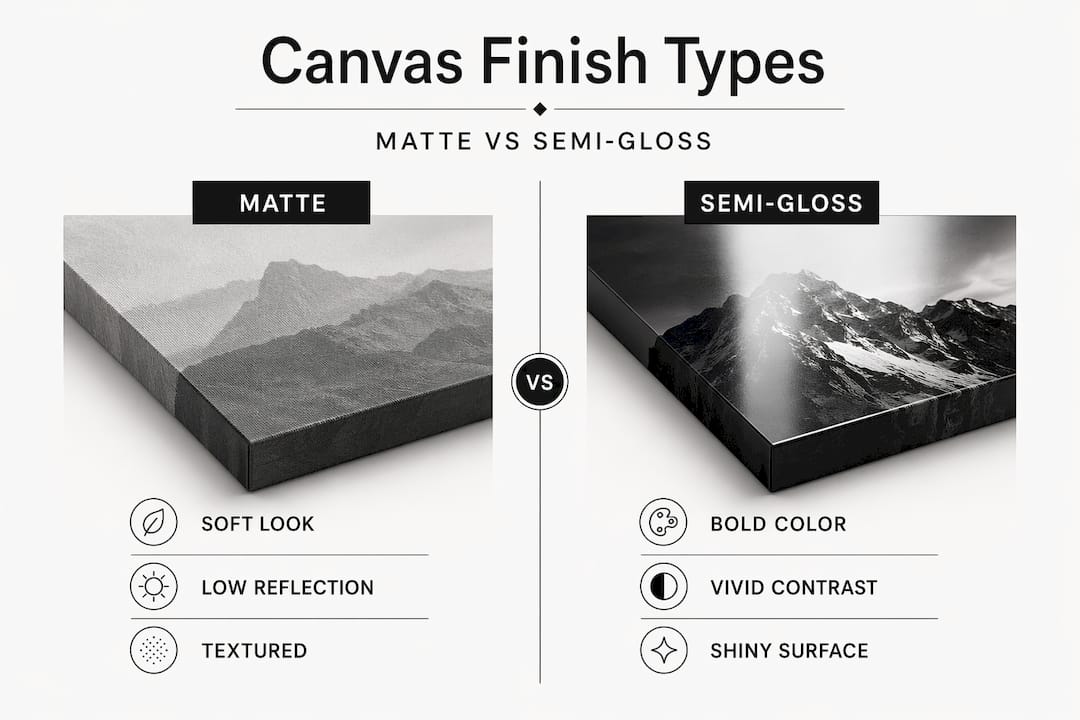
Canvas prints mainly come in matte or semi-gloss finishes, and the difference between them is far more significant than most buyers expect.
Matte finish
A matte topcoat uses a flat coating that scatters light rather than reflecting it back directionally. The result is a soft, non-reflective surface that emphasizes texture over sheen. Matte canvas feels closer to a traditional oil or acrylic painting. You can view it from almost any angle without glare interference. The trade-off is a slight reduction in color saturation. Blacks appear slightly softer, and very vibrant colors may look more subdued than on screen.
HP’s artist matte canvas uses a slightly textured surface with over 99% opacity and instant-dry, water-resistant properties, which illustrates how quality matte materials support durable, natural-looking wall art.
Semi-gloss finish
Semi-gloss topcoats contain light-reflective particles that amplify color depth and contrast. The surface still retains a canvas texture but delivers noticeably richer color payoff. Fredrix semi-gloss canvas combines cotton and polyester with a coating that delivers rich color and a crack-resistant surface without requiring additional varnishing. That matters for longevity in high-humidity or high-traffic spaces.
Here is a quick reference on how the two finishes compare across the characteristics that matter most:
| Characteristic | Matte finish | Semi-gloss finish |
|---|---|---|
| Reflection | Minimal | Moderate |
| Color vibrancy | Softer, subdued | Rich, enhanced |
| Texture appearance | Pronounced | Subtle |
| Glare in bright rooms | Virtually none | Possible at angles |
| Best for | Calm spaces, painted art | Bold art, well-lit rooms |
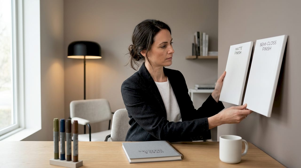
Pro Tip: Request physical samples from your supplier before committing to a large canvas. On-screen previews cannot accurately show how a finish interacts with your specific room lighting.
How finish shapes mood in a room
This is where canvas finish moves from a technical choice into a genuine design tool. Choosing a finish is an intentional way to shape how a room feels, not just how it looks.
Matte finish aligns with calming, painted looks suited to bedrooms and minimalist spaces. It keeps the visual weight light and lets the eye rest. A bedroom gallery wall with matte black-and-white photography pulls viewers in without competing with the need for the space to feel restful. The absence of reflection creates what designers describe as “visual quiet.”
Semi-gloss operates on the opposite end. Semi-gloss finish boosts vibrancy and detail, fitting bold artwork in well-lit rooms like living areas. In a living room with track lighting or large windows, a semi-gloss canvas with a pop art design becomes actively dynamic. The surface shifts slightly as you move around the room, which is exactly the kind of life and energy that space demands.
“Canvas finish selection aligns with intended room mood and function, making it a subtle yet powerful interior design tool.” — Mommy Kat and Kids
Room function is the clearest guide you have. Consider these pairings as a starting point:
- Bedroom: Matte finish, soft imagery, minimal contrast. The goal is rest, not stimulation.
- Living room: Semi-gloss or matte depending on lighting. Bold art thrives with semi-gloss here.
- Home office: Matte prevents screen glare competition. Motivational or architectural imagery works well.
- Dining room: Either finish works. Consider whether you want the room to feel intimate (matte) or celebratory (semi-gloss).
- Hallway: Semi-gloss can make a narrow corridor feel more alive, especially with colorful prints.
Pro Tip: If your room has multiple light sources that shift throughout the day, test your chosen artwork under both natural daylight and your evening lighting setup before committing to a finish.
Matching finish to artwork type and decor style
Not every piece of art performs equally across finishes. This is where many buyers make an avoidable mistake: choosing a finish based on personal preference without considering what the art actually needs.
Photography is the strongest case for semi-gloss. The coating amplifies tonal contrast and brings out fine detail in shadows and highlights. A portrait photo on matte canvas can look flat compared to the same image on semi-gloss. Landscape photography with rich greens and blues particularly benefits from the color enhancement a semi-gloss topcoat provides.
Painted-style art and abstract designs generally favor matte. The texture of the canvas becomes part of the visual language of the piece, and a matte finish preserves that texture. Adding a semi-gloss topcoat to a heavily textured abstract can create uneven sheen that draws attention to the coating rather than the art itself.
Finish, depth, and edge style combine to control artwork’s integration into the room. A gallery-wrap canvas with a thick stretcher bar and matte finish reads as a standalone object, almost sculptural. A thinner profile with semi-gloss reads as a window, pulling the viewer toward the image. Neither is wrong; they are just different spatial statements.
Here is how finish tends to align with common decor styles:
| Decor style | Recommended finish | Why it works |
|---|---|---|
| Minimalist | Matte | Keeps surfaces quiet, emphasizes negative space |
| Modern luxury | Semi-gloss | Adds richness and depth to bold graphic work |
| Rustic / bohemian | Matte | Honors natural texture, avoids synthetic sheen |
| Industrial | Matte or semi-gloss | Depends on whether warmth or contrast is the goal |
| Contemporary / pop art | Semi-gloss | Color saturation is central to the style |
Pieces like Versace canvas wall art illustrate the point perfectly. Luxury branded art with sharp graphic detail and high-contrast design benefits from a semi-gloss topcoat that keeps the colors punchy and the lines crisp. Pairing that same design with a matte finish would dull the visual impact the artwork is built around.
Common pitfalls to avoid:
- Applying matte finish to photographic art expecting it to look like a printed photo. It will not.
- Choosing semi-gloss for a space with strong direct lighting without checking for glare at seating level.
- Ignoring edge style when selecting finish, since the two interact visually.
- Selecting finish based on the digital preview alone, which displays uniformly regardless of topcoat.
Practical tips for selecting the right finish
Making the final call on finish comes down to four factors: lighting, room size, art type, and personal comfort with maintenance. Work through them in order.
-
Assess your room’s lighting first. Direct sunlight or strong artificial spotlights amplify any reflective quality in a semi-gloss finish. If your wall gets hit with direct light at specific times of day, matte is the safer starting point unless you deliberately want that glare-free reflection effect.
-
Consider room size and ceiling height. Semi-gloss finishes make art feel more present and forward-facing. In smaller rooms, this can feel claustrophobic. Matte finishes recede slightly, which is useful when you want art to contribute without dominating.
-
Match the finish to what the art requires. Go back to the photography versus painted art distinction. Let the artwork’s visual character guide the coating choice rather than forcing a personal preference onto it.
-
Factor in maintenance and durability. Semi-gloss surfaces are generally easier to clean and more resistant to moisture absorption. For kitchens, bathrooms, or spaces with children, that extra protection can extend the life of the piece significantly.
-
Think about the emotional effect you want. This is the factor most buyers skip. Ask yourself whether the room should feel energized or settled, bold or contemplative. That answer should point directly to your finish.
Pro Tip: For gallery walls with multiple pieces, use a consistent finish across all canvases even if the images vary. Mixed finishes on a single wall create visual inconsistency that undermines the cohesion of the whole arrangement.
My take on finish as a design decision
I’ve watched hundreds of clients spend serious money on art and then undermine the entire purchase with a default finish choice. The image gets all the attention. Finish gets treated like a checkbox. That’s a mistake I keep seeing, and it’s completely avoidable.
Here’s what I’ve learned from watching designers work: the best ones treat finish as the last 20% of a decision that changes 80% of the final result. I’ve seen the same pop art print look generic in matte and genuinely jaw-dropping in semi-gloss when the lighting was right. The image didn’t change. The room didn’t change. Just the surface coating.
What galleries understand, and most homeowners don’t, is that finish controls visual distance. A matte piece invites you to stand close, to examine texture, to feel the quietness of the surface. A semi-gloss piece commands attention from across the room, which is exactly what you need in a large living area or a commercial space trying to make a statement.
My advice: stop treating finish as an afterthought. Before you decide on a piece, decide on the mood you want. Then let that mood guide the finish, the art type, and even the edge depth together as a single decision rather than three separate ones. The spaces that feel intentional always have that alignment working beneath the surface.
— Mark
Finish-forward canvas art from Luxuryartcanvas

Luxuryartcanvas takes finish seriously because they know it’s what separates wall art that looks placed from wall art that looks designed. Every piece in their collection is crafted in the USA with quality canvas materials built to hold color and texture over time. Whether you need the visual punch of semi-gloss for a bold Louis Vuitton wall art canvas in your living room or the quieter richness of matte for a bedroom gallery, the collection covers both with over 1,000 distinct designs. Their colorful Louis Vuitton wall art is a strong example of how a semi-gloss finish amplifies the color richness these designs are built around. If you know the mood you’re after, Luxuryartcanvas makes it straightforward to find the finish and design that deliver it.
FAQ
What is the difference between matte and semi-gloss canvas finish?
Matte finish scatters light and minimizes reflection, creating a calm, painted look. Semi-gloss finish reflects more light and enhances color depth, making it better suited for bold, vibrant artwork in well-lit rooms.
Which canvas finish works best in a bedroom?
Matte finish is generally the best choice for bedrooms because it reduces glare, emphasizes texture, and creates the relaxed, restful atmosphere most people want in a sleeping space.
Does canvas finish affect how long a print lasts?
Yes. Semi-gloss coatings tend to offer better moisture resistance and are easier to clean, making them more durable in high-humidity environments. Matte finishes provide excellent color stability but may require more careful handling.
Can I use semi-gloss canvas in a room with lots of natural light?
You can, but position the canvas so that direct light hits it at a flat angle rather than a sharp one. Semi-gloss surfaces in strong direct light can produce glare at seated viewing height, which reduces the visual impact of the art.
How does canvas finish interact with edge and depth choices?
Finish, stretcher bar depth, and edge style work as a system. A thick gallery-wrap in matte reads as an object in the room; a thinner semi-gloss piece reads more like a window into the image. Matching these three elements together produces a more intentional final result.
Oversized Wall Art Placement Best Practices Guide
Affordable Canvas Art for Renters: 9 Smart Picks