
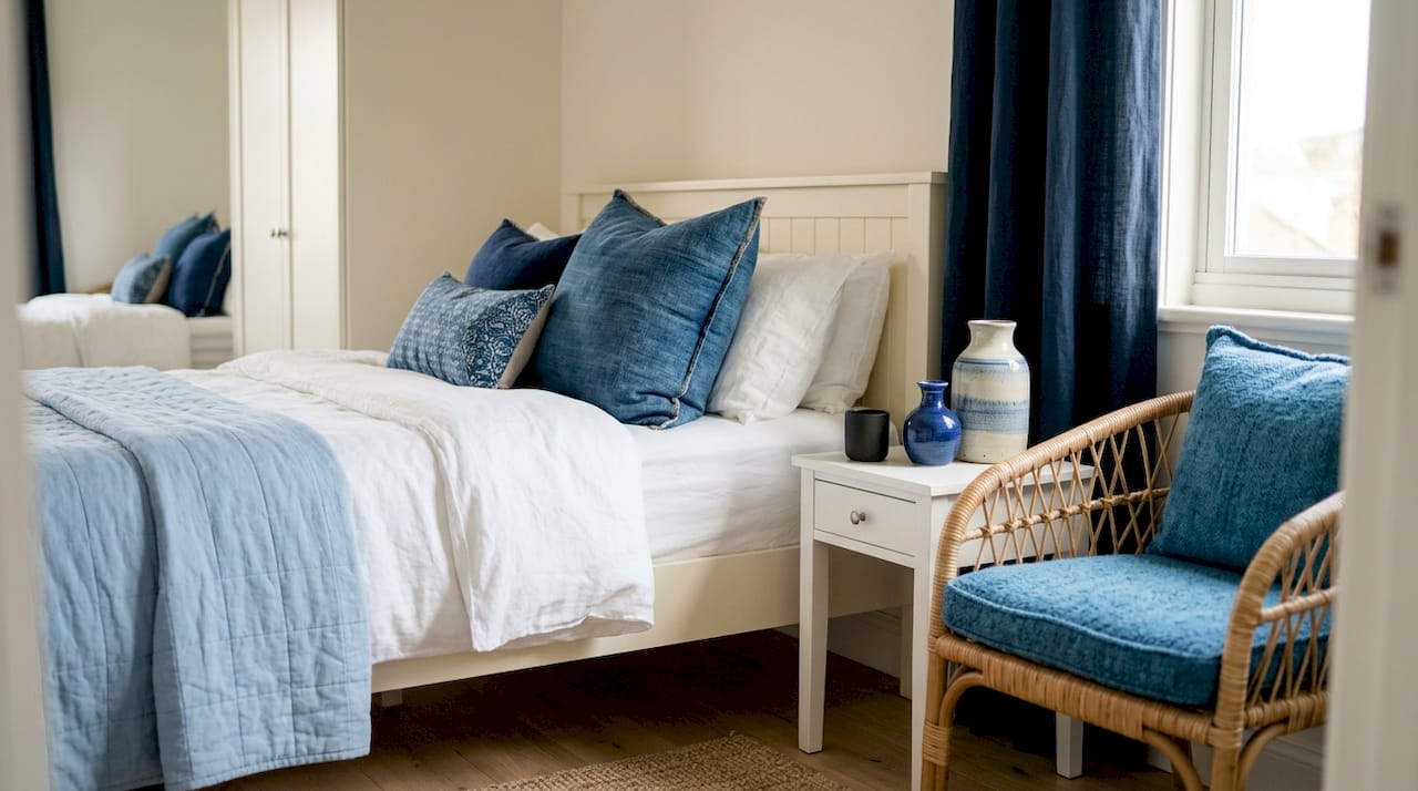
Blue and white is defined as the most enduring two-tone color scheme in interior design, built on the contrast between cool blue tones and the clean neutrality of white. This combination appears in everything from coastal living rooms to minimalist home offices, and it works because the pairing is both calming and visually sharp. Whether you favor deep navy and white for drama or soft light blue and white for airiness, the blue white color scheme adapts to nearly every room and style. The key is knowing how to layer shades, mix patterns, and add the right accents so the result feels alive rather than flat.
1. Blue and white decorating: the core principles
The most effective blue and white decor starts with one rule: never use just one shade of blue. A room painted in a single blue tone with white accents reads as flat and uninspired. The real depth comes from stacking navy, cobalt, sky blue, and powder blue together, letting each shade play off the others.
Layering multiple shades of blue with varied textures is the single most reliable way to keep a blue and white interior feeling fresh rather than dated. Think a navy sofa paired with a powder blue throw, a cobalt ceramic vase, and white linen curtains. Each element reads as part of the same family while adding its own visual weight.
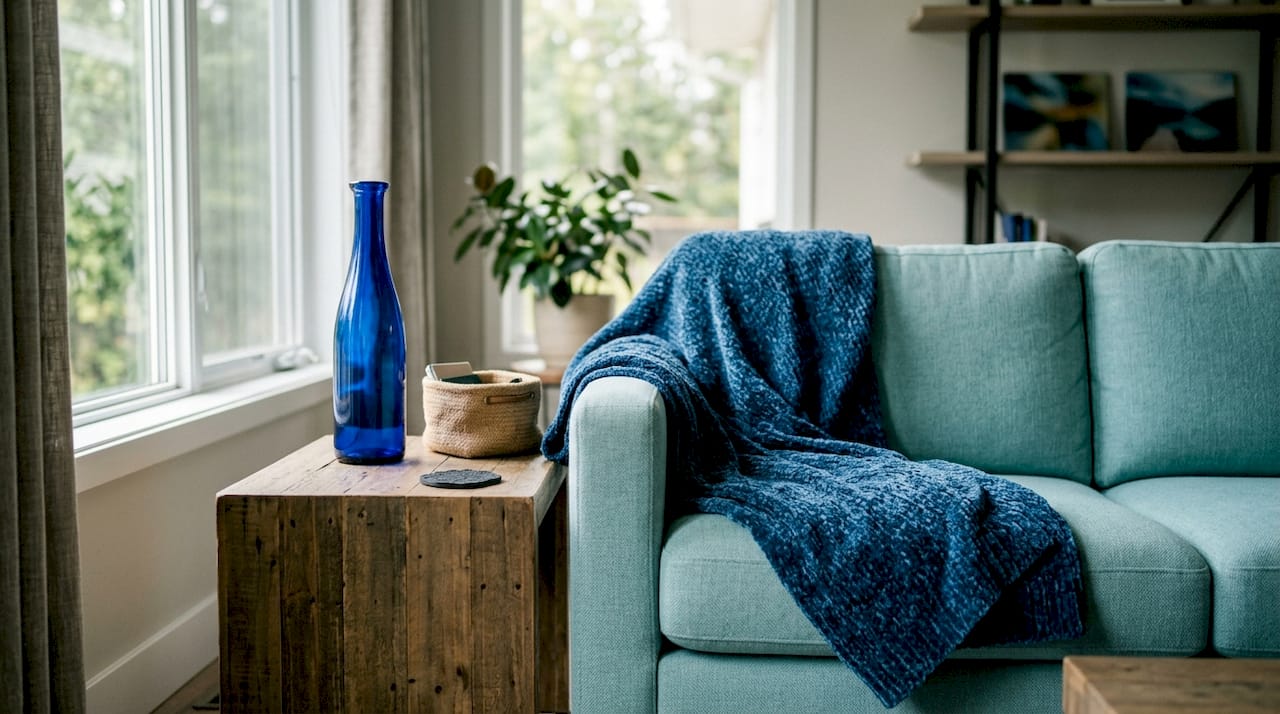
White acts as the reset button between blue tones. It prevents the room from feeling heavy and gives the eye a place to rest. The ratio matters: most well-balanced rooms lean toward more white than blue, using blue as the accent that draws attention.
2. How to mix patterns without creating chaos
Mixing pattern scale is the key to successful blue and white decorating. Pair one large floral pattern with a smaller geometric stripe, and the two coexist without competing. Use the same two colors across both patterns, and the room reads as intentional rather than accidental.
Stripes are the most forgiving pattern in this palette. Blue and white stripes create a rhythmic, meditative calm that works especially well in minimalist spaces. Vertical stripes draw the eye upward and make ceilings feel taller. Horizontal stripes widen a space visually.
The mistake most decorators make is mixing too many patterns at the same scale. Three different medium-scale prints in the same room create visual noise. The fix is simple: anchor the room with one dominant large-scale pattern, add one medium, and keep the third pattern small and subtle.
Pro Tip: Lay all your fabric swatches and print samples on a white surface before committing. If they compete for attention at equal volume, swap one for a smaller or simpler pattern.
- Use no more than three patterns per room
- Vary scale deliberately: one large, one medium, one small
- Keep the same two base colors across all patterns
- Let solid textiles (linen, cotton, velvet) act as visual breaks between prints
3. Blue and white wall art trends for every room
Minimalist blue and white wall art is the dominant trend in 2026 for home offices and bedrooms. Soft vertical stripe wall hangings in light blue and white produce a tranquil visual effect that reduces visual clutter without making a wall feel empty. Prices for wall hangings start around $40, making this one of the most accessible ways to introduce the palette into a room.
The room you hang art in should shape the style you choose. Bedrooms benefit from soft, pastel blue and white prints that promote calm. Home offices respond well to graphic, high-contrast navy and white pieces that feel focused and structured. Living rooms can handle bolder compositions with more color variation.
- Bedroom: Soft watercolor prints, pastel stripe hangings, or abstract washes in powder blue and white
- Home office: Geometric navy and white prints, typographic art, or architectural line drawings
- Living room: Larger format pieces, mixed media, or bold graphic prints with navy, cobalt, and white
Minimalist art prints in blue and white are widely available at accessible price points, offering softness and rhythm without overwhelming a space. Luxuryartcanvas carries a curated selection of these prints, crafted in the USA with materials built for long-term visual impact.
Pro Tip: Hang art at eye level, which is typically 57–60 inches from the floor to the center of the piece. Going higher is the most common hanging mistake, and it disconnects the art from the furniture below.
4. Combining blue and white with other colors and textures
The navy and white combination is a timeless high-contrast formula that works across environments, but it needs warm-tone accessories to prevent a sterile look. Without warmth, a room in only navy and white feels clinical, like a waiting room rather than a home.
Wood is the most effective warm-tone addition. A light oak coffee table, a walnut bookshelf, or rattan side chairs all soften the cool contrast of blue and white without introducing a competing color. Wicker baskets, jute rugs, and linen throws serve the same purpose at a lower cost.
Cream-white paired with navy creates a warmer, more sophisticated result than stark white. Cream reads as intentional and refined. Stark white reads as sharp and casual. For living rooms and bedrooms where comfort matters, cream is the better white.
Plants add a third dimension that neither blue nor white can provide on their own. A fiddle-leaf fig in a white ceramic pot, or a trailing pothos on a navy shelf, introduces organic texture and a color that naturally complements both tones. Green and blue sit close together on the color wheel, so the pairing feels effortless.
Pro Tip: Add one cognac or dark brown leather element, such as a throw pillow, a tray, or a small stool, to any blue and white room. Cognac leather prevents the space from reading as too cold, and it grounds the palette without introducing a new dominant color.
- Pair with cream, beige, or soft gray instead of stark white for warmth
- Use wood, wicker, or rattan to add natural texture
- Introduce plants for organic color and dimension
- Add one cognac or oxblood leather accent to anchor the palette
- In winter, layer heavier textiles like wool and velvet; in summer, switch to linen and cotton
5. Layering ceramics and textiles for depth
Grouping blue and white ceramics by varying height and shape builds dimensional layers that flat arrangements cannot achieve. Place a tall ginger jar next to a medium-height vase and a small plate or bowl. The varying silhouettes create visual movement across the shelf or table.
Textiles work the same way. A navy velvet pillow next to a light blue linen pillow next to a white cotton throw creates texture contrast that makes a sofa feel considered and layered. Each fabric catches light differently, which adds depth even when the colors are similar.
The rule for grouping objects is odd numbers. Three ceramics read as a composition. Two read as a pair. Four read as a row. Group in threes or fives, vary the heights, and keep the color palette consistent across the group.
6. Seasonal adaptability of the blue white color scheme
The blue white color scheme is one of the few palettes that shifts naturally across all four seasons without requiring a full room overhaul. The base stays the same. The textiles and accents do the seasonal work.
In spring and summer, light blue and white combinations feel airy and fresh. Swap heavy drapes for sheer white linen panels. Replace wool throws with cotton blankets in soft blue. Add fresh white flowers in a cobalt vase for a seasonal touch that costs almost nothing.
In fall and winter, the palette deepens. Navy and charcoal blue replace sky blue. Velvet and wool replace linen. Warm amber candles and cognac leather accents shift the mood from breezy to cozy without changing the fundamental color story of the room.
7. Common mistakes in blue and white decorating
The most common mistake is using only one shade of blue throughout a room. A single blue tone with white reads as flat and unfinished. The fix is to introduce at least two additional blue shades, even in small doses through pillows, ceramics, or art.
Repeating blue and white accents throughout a room ties the space together and creates visual flow. A blue vase on the bookshelf, a blue pillow on the sofa, and a blue print on the wall connect the room without making it feel themed or overdone. Without repetition, the palette feels scattered.
Forgetting warm-tone breaks is the second most common error. A room in only cool tones feels cold and unwelcoming regardless of how well the blues are layered. One warm element, whether wood, leather, or a warm-toned textile, resolves this immediately.
- Using only one shade of blue: add at least two more tones in small doses
- Skipping warm accents: include wood, leather, or warm-toned textiles
- Mixing too many same-scale patterns: vary the scale deliberately
- Ignoring color repetition: echo blue and white elements across the room
- Overloading with pattern: balance busy prints with solid textiles
Pro Tip: Before buying new pieces, walk through your space and identify what you already own in blue or white. Rearranging existing ceramics, pillows, and art into deliberate groupings often solves the flatness problem without spending anything.
Key takeaways
A blue and white color scheme stays fresh and timeless only when you layer multiple blue shades, add warm-tone accents, and repeat the palette deliberately across the room.
| Point | Details |
|---|---|
| Layer multiple blue shades | Use navy, cobalt, and powder blue together to build depth and avoid a flat look. |
| Add warm-tone accents | Cognac leather, wood, or rattan prevents a blue and white room from feeling clinical. |
| Vary pattern scale | Pair one large pattern with a smaller one to keep mixed prints balanced and intentional. |
| Repeat the palette | Echo blue and white elements across shelves, sofas, and walls to create visual flow. |
| Adapt textiles seasonally | Swap linen for velvet and wool in cooler months to shift the mood without repainting. |
Why blue and white never actually goes out of style
I have worked with this palette more times than I can count, and the question I hear most often is: “Will it still look good in five years?” The answer is yes, but only if you treat it as a layering exercise rather than a color-matching exercise.
The decorators who get bored with blue and white are the ones who bought everything in the same shade of navy and called it done. The ones who stay excited about it are the ones who keep adding. A new ceramic here, a different blue print there, a linen throw in a shade they had not tried before. The palette rewards that kind of ongoing attention.
What I find most useful is treating blue and white as the foundation rather than the statement. Let the structure of the room be blue and white, then use art, plants, and warm-tone objects to tell the actual story. That approach means the room can evolve without ever feeling like it needs to be rebuilt from scratch.
The other thing I always tell people: do not underestimate what a single well-chosen piece of wall art does for this palette. One strong print in navy and white can anchor an entire room and make every other element feel like it belongs. That is the kind of impact that justifies spending a little more on the right piece.
— James
Wall art that makes the blue and white palette work harder
The right wall art does more than fill empty space in a blue and white room. It sets the tone for every other element around it. Luxuryartcanvas carries over 1,000 designs crafted in the USA, including bold graphic prints and minimalist pieces that work directly with this palette.

Browse the minimalist prints collection for soft, rhythm-driven pieces that complement navy and white rooms without competing with existing decor. For a bolder statement, the graffiti canvas wall art range includes high-contrast designs that bring energy to any blue and white space. Every piece ships with quality materials built for lasting visual impact, backed by reviews from more than 10,000 satisfied customers.
FAQ
What colors go best with blue and white?
Wood tones, cream, soft gray, and cognac leather all complement a blue and white palette. These warm-tone additions prevent the scheme from feeling too cool or clinical.
What is the difference between navy and white versus light blue and white?
Navy and white creates high contrast and a more formal, structured look. Light blue and white reads as softer and more casual, making it better suited for bedrooms and relaxed living spaces.
How many shades of blue should I use in one room?
Use at least two to three shades of blue in a single room. Combining navy, a mid-tone blue, and a soft powder blue adds depth and prevents the palette from looking flat.
Can blue and white work in every room of the house?
Yes. Light blue and white suits bathrooms, bedrooms, and kitchens for an airy feel. Navy and white works well in living rooms, home offices, and dining rooms where a sharper contrast is appropriate.
How do I keep a blue and white room from looking too cold?
Add at least one warm-tone element such as a wood surface, a cognac leather accent, or a jute rug. Repeating these warm touches in small doses across the room balances the cool tones effectively.
Decorating Studio Apartments with Large Canvases
What Is Mixed Media Canvas Art: A Beginner's Guide