
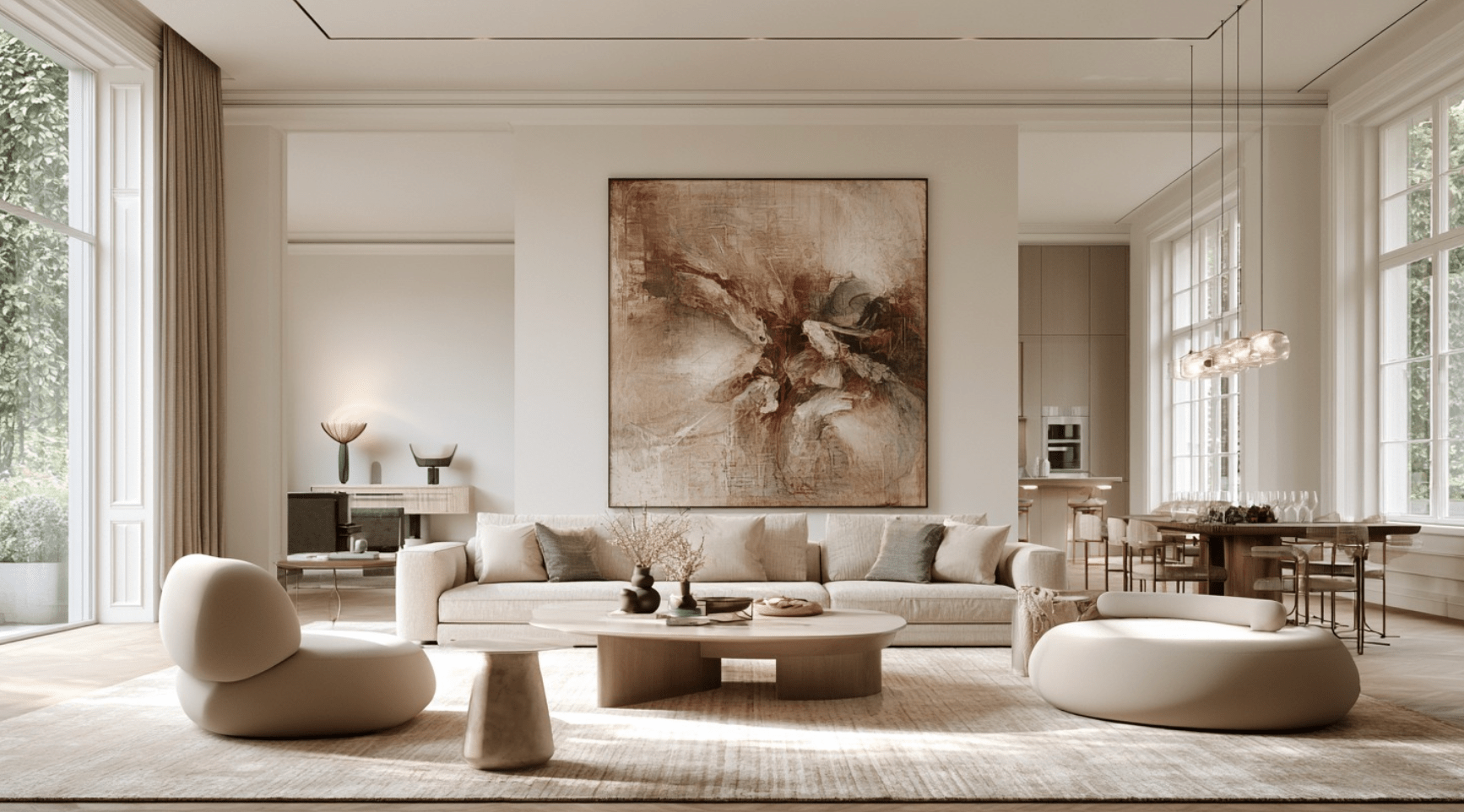
Most people hang art and then decorate around it. The rooms that actually look intentional tend to reverse the order: art first, everything else second.
It sounds obvious. It almost never happens in practice.
The furniture gets bought first because furniture feels practical. The sofa goes against the wall because that is where sofas usually go. The rug fills the open floor. Then someone notices the empty space above everything and starts looking for a canvas that happens to fit.
That sequence produces rooms with furniture that fits and art that visits.
Reverse it and something changes. Art stops being the finishing touch and becomes a design decision. Its scale can influence the furniture below it. Its palette can steer the smaller materials in the room. Even the amount of visual noise elsewhere becomes easier to judge once one element has been given permission to lead.
That does not mean every room should be built around the loudest canvas you can find. It means deciding what deserves attention before everything starts competing for it.
The Living Room: Give One Thing Permission to Lead

The most common living-room mistake happens before the first hole goes into the wall. Someone buys a bold canvas for the space above the sofa, only to realize that the patterned rug, sculptural coffee table, accent chairs, cushions, and lighting are all trying to make separate arguments.
The artwork is not too bold. The room simply never decided what mattered most.
Start with scale.
For an open wall, placing the center of the artwork roughly 57 to 60 inches from the floor is a useful starting point rather than an unbreakable law. Luxury Art Canvas uses the same general range in its current placement guidance. When a piece hangs over furniture, the relationship to the sofa or console matters more than obeying one number mechanically.
Width matters just as much. Luxury Art Canvas currently recommends artwork or an arrangement around 66 to 75 percent of the sofa's width for a balanced living-room composition. On a 96-inch sofa, that points toward roughly 63 to 72 inches of visual width.
That is where many otherwise good rooms lose their nerve. They choose a 36-inch canvas because it feels large in the shopping cart. Once it is floating over eight feet of upholstery, it suddenly looks apologetic.
If the canvas is graphic and high contrast, let the furniture step back. A quiet charcoal sofa or natural linen upholstery gives pop art room to work. Dark wood can ground a bright piece without trying to imitate it. Concrete, metal, and restrained upholstery can do the same.
The goal is not matching. Matching usually kills some of the tension that makes a room interesting.
A black-and-white street-art piece in a warm room can be more convincing than another beige object chosen because it agrees with the rug. The same goes for a fashion portrait in an otherwise restrained space. A room that feels collected needs a little friction.
Pulling color from the artwork still works, but do it lightly. One color may reappear in a cushion. Another can show up in a book spine or ceramic object across the room. The eye notices the connection without seeing a decorating formula.
What does not work is asking everything to perform at once. A bold canvas beside a busy sofa, a heavily patterned rug, and a cluster of decorative objects rarely looks more sophisticated because more decisions were made.
One piece sets the tone. The others decide how loudly to answer.
The Bedroom: Scale Matters More Than Filling the Wall

Bedrooms often inherit whatever design energy is left after the public rooms are finished.
That is backwards.
The wall behind the bed usually carries enormous visual weight. Even a fairly simple room can feel deliberate when that wall has the right proportion, while an expensive bedroom can still look unfinished when a small piece of art is stranded above a wide headboard.
A useful starting point is to make the art substantially narrower than the bed while still giving it enough width to feel connected to the furniture below. The familiar two-thirds guideline works well in many rooms, although the headboard width, ceiling height, bedside lamps, and artwork format can all change the calculation.
This is where cardboard and painter's tape are more useful than confidence.
Mark the proposed dimensions on the wall before ordering. Live with the outline for an evening. Look at it from the doorway and from the bed. The piece that seemed enormous when measured on a table may suddenly feel conservative once the whole wall is visible.
The gap above the headboard matters too. Six to ten inches often creates a stronger relationship than placing the artwork halfway toward the ceiling. Recent designer guidance still treats that approximate range as a useful starting point when art is hung over furniture.
Then decide how much energy the piece should introduce.
A dark fashion portrait can carry a bedroom with a quiet upholstered headboard and restrained side tables. A Japanese-influenced composition with generous negative space can work differently. It does not dominate the room, but the restraint becomes the point.
The instinct to fill every remaining wall is usually the problem.
If the headboard already has height, texture, channeling, or dramatic wood grain, the better decision may be two smaller works above the bedside tables rather than one more large object directly above it. The bed becomes the composition, with the art framing it instead of sitting on top of it.
Some walls need art.
Others need breathing room.
The Bathroom: Design Usually Stops Too Soon

Bathrooms reveal something strange about the way people decorate. A homeowner may spend weeks debating a living-room rug, then choose the bathroom vanity primarily because it fits the plumbing.
That fixed decision affects almost everything that follows.
A floating black vanity against pale tile creates a different visual temperature than warm walnut. A veined stone top creates a different backdrop than a quiet white surface. Brass, chrome, and black hardware each change which artwork feels comfortable nearby.
The art does not have to match the bathroom. It does need to understand what is already permanent.
That is why the vanity deserves to be treated as part of the composition rather than as plumbing furniture. When comparing bathroom vanities and fixtures from BathGems, look beyond whether the dimensions fit. Consider the finish, visual weight, hardware temperature, countertop movement, and how much attention the piece will demand once it is installed.
Then choose art that either supports that decision or pushes against it deliberately.
Warm wood and aged brass can handle ochre, cream, tobacco, muted red, or earthy imagery without the room feeling accidental. Chrome and cool stone tend to make monochrome work, graphite, deep blue, and cooler neutrals feel more natural.
That does not mean brass requires warm art or chrome requires blue art. Rules like that turn rooms into formulas. The better question is whether the contrast feels deliberate.
Bathrooms introduce another issue that living rooms do not: moisture.
Canvas, paper, wood, adhesives, backing materials, and paint layers can all respond to changes in humidity. Conservation guidance from the Canadian Conservation Institute recommends keeping paintings in relatively stable conditions and avoiding humidity that is persistently high or changes rapidly. Smithsonian conservation guidance also identifies fluctuating humidity as a concern for paintings.
So "hang any canvas in a bathroom as long as it is framed" is bad advice.
Keep valuable or moisture-sensitive work away from shower spray, direct condensation, and walls that regularly become damp. A large, well-ventilated primary bathroom may behave very differently from a small bathroom where a hot shower fogs the mirror and walls every morning.
If you are unsure, use less vulnerable artwork or reserve the original piece for a drier room.
That constraint is not a reason to leave bathroom walls empty. It is a reason to design them with the same judgment used everywhere else.
The Home Office: Hang Art for the Person Sitting Down

Home offices tend to be designed from the desk outward.
The monitor gets the preferred position. Storage fills the available corners. The chair gets upgraded after someone's back complains. The wall across from the desk is often whatever remains.
That wall may deserve more thought than it gets.
You look away from a screen constantly, even if only for a few seconds. What occupies the resting sightline can change how finished the room feels. It also gives the office an identity beyond equipment.
Do not automatically hang the artwork at a predetermined standing eye level.
Sit in the chair instead.
Look naturally toward the wall without lifting your chin. That resting sightline is the useful reference point. Depending on the desk, chair, viewing distance, artwork size, and the person using the room, the ideal composition may sit lower than art in a hallway.
This is one of those cases where the standard 57-inch starting point can lose to context. Placement guidance from designers routinely allows the eye-level rule to bend when furniture and the way a room is actually used change the viewing position.
The office also rewards restraint.
A large typographic piece, fashion image, monochrome canvas, or graphic composition can give the eye somewhere intentional to land. Five unrelated small prints may only create another layer of visual information in a room already full of tabs, cables, documents, and screens.
Keep the desk useful. Keep the chair comfortable.
Let the wall provide the part of the room that has nothing to do with productivity.
When Art Should Not Come First

There is one problem with the art-first rule: sometimes the room has already made the decision for you.
A dramatic marble slab is not going to become quieter because a canvas arrived. Neither is historic millwork, patterned tile, a sculptural fireplace, an elaborate headboard, or a vanity with aggressive stone veining.
In those rooms, forcing the artwork to become the main event creates competition rather than hierarchy.
I think the better rule is this: start with the element that is hardest to ignore and hardest to change.
Sometimes that is the art. Sometimes it is architecture.
If the room already has a permanent focal point, the artwork can play a supporting role without becoming timid. A restrained monochrome piece beside dramatic stone may be a stronger decision than adding another explosion of color. A small work in the right position can beat an oversized canvas chosen merely because the wall is large.
This only works if you are willing to leave some walls alone.
The urge to decorate every surface is understandable. Empty space can feel like unfinished work while a room is coming together. Once the major elements are in place, though, that same emptiness may be what gives the important pieces enough room to register.
A Better Way to Build the Room

Before buying the next piece of furniture, stand in the doorway and decide what your eye should find first.
That is the real starting point.
If the answer is the artwork, choose its scale before filling the wall below it. Let the major furniture establish proportion without competing for attention. Repeat color sparingly. Check placement from the position where the room is actually used, not simply from where you happen to be standing with a tape measure.
If the answer is the stone fireplace, the headboard, the vanity, or the architecture, accept it. Art does not become less important because it is not the loudest element in the room.
A good room is not the one with the most statements.
It is the one where somebody clearly decided which statement deserved to be heard.
Leadership Artwork for Offices: Pick the Piece That Commands the Room
How to Layer Statement Canvases in a Gallery Wall