Pop art decor style is a bold interior design approach that uses high-contrast colors, graphic imagery from popular culture, and commercial-inspired visuals to create energetic, personality-driven spaces. Rooted in the art movement that emerged in 1950s Britain and 1960s America, this style translates the visual language of Andy Warhol, Roy Lichtenstein, and Richard Hamilton directly onto walls, furniture, and accessories. Whether you are designing a living room, bedroom, or office, pop art decor delivers one thing no other style matches: immediate visual impact with a sense of playful wit.
What is pop art decor style and where did it come from?
Pop art decor style draws its DNA from one of the most culturally disruptive art movements of the 20th century. Pop art emerged in the 1950s and 1960s as a direct reaction against abstract expressionism, which many artists felt had become too intellectual and disconnected from everyday life. Instead of painting emotions or abstract forms, pop artists turned to the world around them: soup cans, comic strips, billboard advertisements, and celebrity photographs.
Richard Hamilton captured the spirit of the movement in 1957 when he described pop art as popular, transient, and mass produced, as well as witty, sexy, and glamorous. That definition explains exactly why pop art decor works so well in interiors. It is designed to be accessible, immediately understood, and visually exciting rather than contemplative or austere.
The movement’s two most influential figures shaped the visual vocabulary that pop art decor borrows today:
- Andy Warhol introduced repetition, celebrity portraiture, and consumer product imagery. His Marilyn Monroe silkscreens and Campbell’s Soup Cans established the idea that commercial objects could carry the same weight as fine art.
- Roy Lichtenstein adapted comic book panels into large-scale paintings, using Ben-Day dots and bold outlines borrowed directly from commercial printing processes.
- Jasper Johns and Robert Rauschenberg pushed the boundaries further by incorporating flags, targets, and found objects, reinforcing the idea that anything from mass culture could become art.
When you apply this history to interior design, the logic becomes clear. Pop art decor is not just about hanging a Warhol print. It is about adopting the movement’s entire attitude: that bold, graphic, culturally familiar imagery belongs in the spaces where you live and work.
What defines pop art decor: key visual elements and characteristics
The visual identity of pop art decor is specific and recognizable. Pop art interiors anchor rooms with vibrant primary colors and comic-book visuals, using wall art and accessories to build cohesion. Understanding these elements helps you apply them with intention rather than randomly.
Color palette
Pop art decor relies on red, yellow, and blue as its foundation. These are not muted or pastel versions. They are saturated, full-strength primaries that demand attention. Secondary accents in orange, green, and hot pink add depth without breaking the graphic energy. The Architectural Digest feature on a Barcelona pop art apartment demonstrates this well: yellow and blue served as the dominant colors, with green, orange, and red as controlled accents, all grounded by natural materials to prevent visual overload.
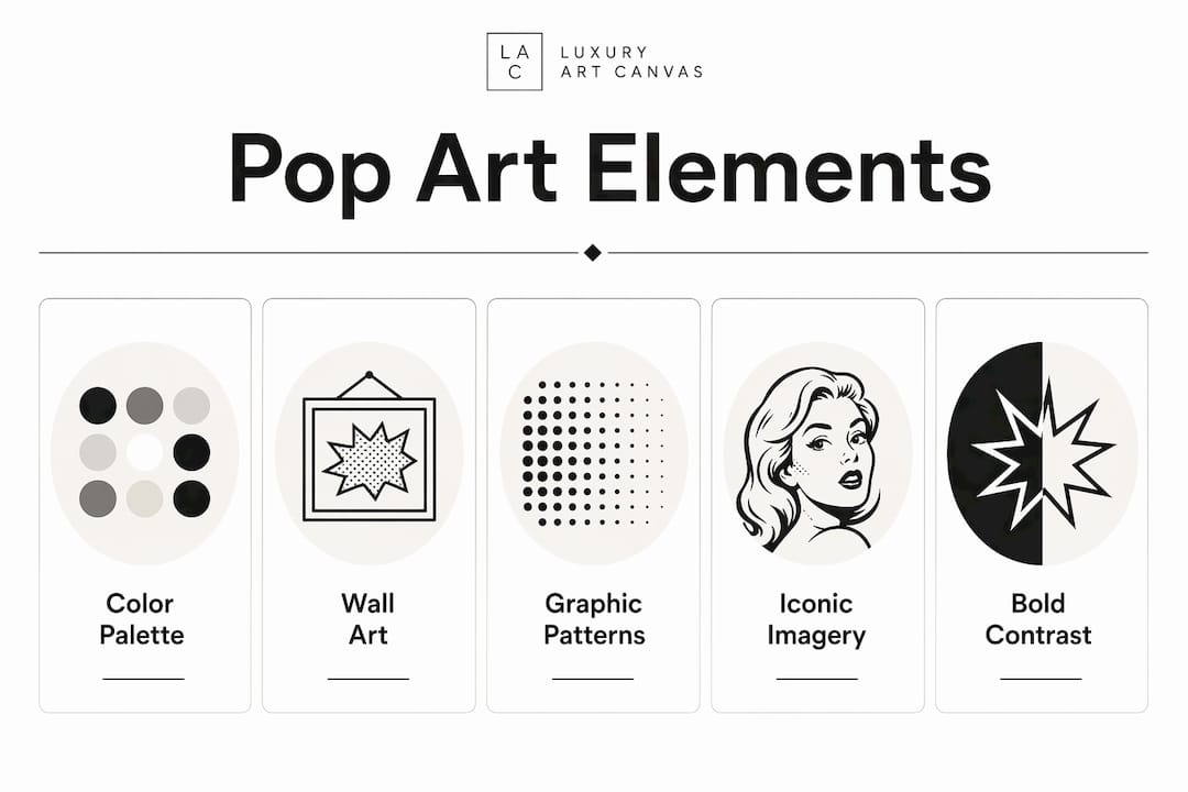
Signature motifs and graphic elements
Authentic pop art decor mimics commercial printing aesthetics. High contrast, clear outlines, and limited palettes are the hallmarks of pieces that feel genuinely rooted in the movement rather than just colorful. Specific motifs to look for include:
- Ben-Day dots: The small, evenly spaced dots Lichtenstein used to simulate newspaper printing. These appear on wallpapers, cushions, and canvas prints.
- Comic book panels: Speech bubbles, action lines, and bold graphic outlines translate directly from Lichtenstein’s work into textiles and wall art.
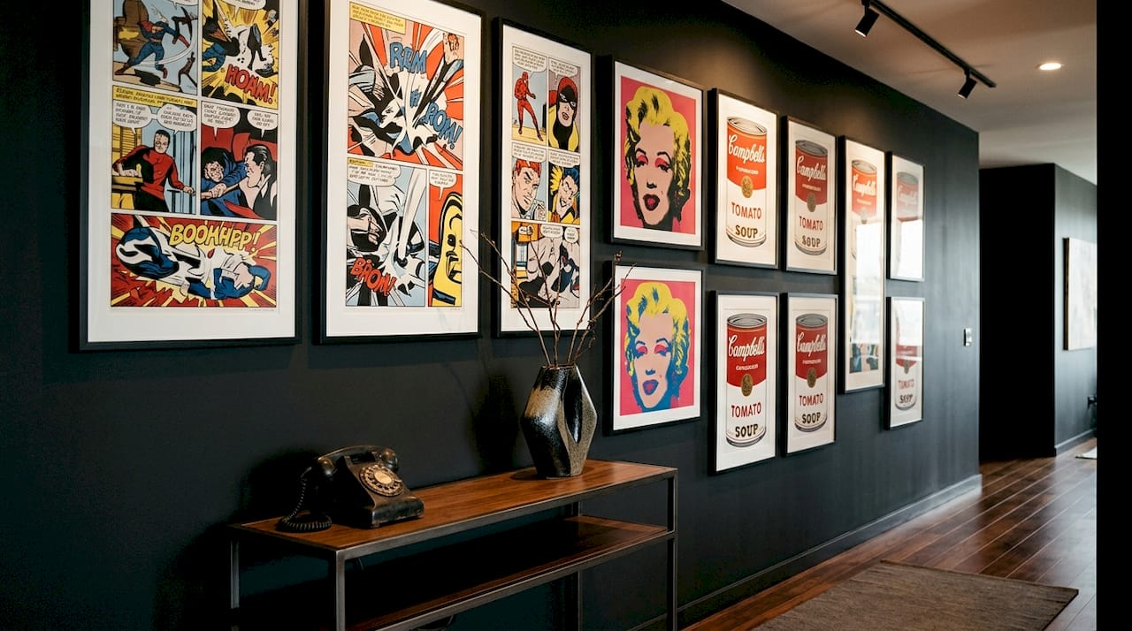
- Celebrity and product imagery: Warhol-style repeated portraits of icons like Marilyn Monroe, Elvis Presley, or Mick Jagger remain the most recognizable pop art decor motif.
- Advertising graphics: Retro product packaging, brand logos, and commercial illustration styles add the consumer culture reference that defines the movement.
Wall art as the primary anchor
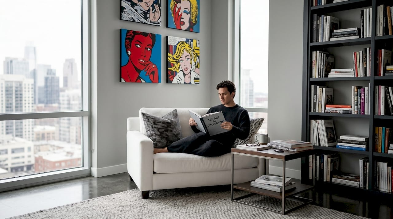
Wall art delivers pop art’s bold message more effectively than any other decor element. A single large canvas print of a Warhol-inspired portrait or a Lichtenstein-style comic panel can define an entire room’s aesthetic. Gallery walls work equally well when you group three to five prints with consistent color themes and graphic styles.
Pro Tip: Pair your pop art wall pieces against white or off-white walls. Neutral backgrounds let the graphic intensity of the art breathe and prevent the room from feeling chaotic.
Here is a quick comparison of pop art decor versus two adjacent styles:
| Feature | Pop art decor | Minimalist decor | Maximalist decor |
|---|---|---|---|
| Color palette | Bold primaries and saturated accents | Monochrome or neutral | Mixed, layered, eclectic |
| Wall art | Large graphic prints, gallery walls | Sparse or absent | Dense, varied, layered |
| Motifs | Comics, celebrities, consumer goods | Geometric, abstract | Patterns, textures, antiques |
| Mood | Energetic, playful, graphic | Calm, ordered, restrained | Rich, theatrical, complex |
| Best for | Statement rooms, creative spaces | Open-plan modern homes | Eclectic, collected interiors |
How to decorate with pop art style in any room
Applying pop art home decor successfully comes down to a layering hierarchy rather than simply adding bright objects. Start with a large anchor piece, then repeat two or three accent colors through textiles, lighting, and smaller accessories to build coherence without noise.
Follow this sequence when decorating any room with pop art design style:
- Choose your anchor wall art first. A large canvas print, ideally 24 by 36 inches or bigger in a main room, sets the color palette and graphic tone for everything else. Browse pop art canvas options to find a piece that establishes your dominant colors before buying anything else.
- Extract two or three colors from the artwork. If your anchor piece features red, yellow, and black, those become your palette. Every subsequent purchase should pull from those same tones.
- Layer accent colors into textiles. Cushions, throws, and rugs in your extracted palette reinforce the color story without adding new visual complexity. A yellow cushion on a gray sofa ties directly back to a yellow-dominant canvas print.
- Add graphic accessories selectively. Neon signs, comic figurines, bright ceramic vases, and patterned lampshades all work as pop art accents. The rule is restraint: two or three graphic accessories per room, not ten.
- Choose furniture that supports rather than competes. White, black, or gray furniture lets pop art pieces lead. Molded plastic chairs in primary colors, a design staple since the 1960s, add period-appropriate character without clashing.
- Control scale relative to room size. Large, vibrant pieces suit large spaces. In a smaller room, one medium print and two smaller accessories achieve the same effect without overwhelming the space.
Pro Tip: Mixing pop art with industrial or minimalist elements creates a more sophisticated result than going all-in on pop. A concrete floor, white walls, and one oversized Warhol-inspired canvas hits harder than a room full of competing graphics.
Pop art interior ideas work across every room type. In a living room, a gallery wall of celebrity portraits above a gray sofa creates an immediate focal point. In a bedroom, a single large comic-style print above the headboard adds energy without disrupting sleep-friendly calm. In a home office, bright graphic prints on one accent wall stimulate creativity while the remaining walls stay neutral and focused.
Familiar, recognizable icons work better than obscure references in pop art decor. Marilyn Monroe, Campbell’s Soup, and Lichtenstein-style comic panels resonate broadly because they carry cultural weight that abstract or unfamiliar imagery cannot match.
What is pop art in commercial spaces and why does it work?
Pop art decor translates particularly well into commercial environments because the movement was always about capturing attention in a crowded visual field. Pop graphics create engagement and memorability in offices, cafes, and studios by leveraging moments when people are naturally open to visual impact.
The functional benefits for commercial spaces include:
- Brand personality expression. Bold, graphic pop art signals creativity, confidence, and cultural awareness. A design agency or tech startup with Warhol-inspired murals communicates a very different brand identity than one with generic stock photography on the walls.
- Employee stimulation. Visually dynamic environments have been linked to higher creativity and energy levels. Pop art’s graphic intensity makes it particularly effective in creative studios, brainstorming rooms, and collaborative workspaces.
- Customer experience enhancement. Cafes, retail stores, and hospitality spaces use pop art decor to create Instagram-worthy environments that extend their reach beyond physical foot traffic.
- Wayfinding and zoning. Large pop art wall panels can define different zones within an open-plan office, replacing traditional partitions with visual anchors that are both functional and aesthetically striking.
For office environments, modern graphic wall art that blends pop art energy with contemporary illustration styles offers a way to bring the aesthetic into professional settings without feeling cartoonish. The key is choosing pieces with graphic clarity and strong color discipline rather than chaotic or overly literal pop art references.
Commercial pop art decor also benefits from the same layering rules that apply at home. Start with one or two large wall pieces per zone, repeat the dominant colors in furniture upholstery or accent walls, and keep the remaining surfaces neutral to give the graphic elements room to breathe.
Key takeaways
Pop art decor style works because it applies a disciplined visual hierarchy to bold, culturally familiar imagery, creating spaces that feel energetic without becoming chaotic.
| Point | Details |
|---|---|
| Start with wall art anchors | Choose one large graphic canvas first to set the color palette for the entire room. |
| Use a limited color palette | Pull two to three accent colors from your anchor piece and repeat them in textiles and accessories. |
| Prioritize recognizable imagery | Warhol portraits, Lichtenstein dots, and consumer culture icons resonate broadly and age well. |
| Apply the same rules commercially | Pop art in offices and cafes builds brand identity and stimulates creativity when applied with discipline. |
| Neutral backgrounds are non-negotiable | White or gray walls let graphic pop art pieces deliver maximum visual impact without overwhelming the space. |
Why pop art decor rewards boldness paired with discipline
I have seen a lot of interiors described as “pop art inspired” that are really just rooms full of bright objects with no coherent logic. The style gets misread as permission to throw every saturated color at a wall and call it done. That is the fastest way to create a space that exhausts rather than energizes the people in it.
What I find genuinely interesting about pop art decor, when it is done well, is that it demands the same design discipline as any restrained, minimal interior. The difference is that you are working with loud materials rather than quiet ones. The layering hierarchy matters just as much here as it does in a Scandinavian-influenced room. You still need a clear focal point, a coherent palette, and a reason for every object in the space.
The rooms that stick with me are the ones where someone made one genuinely brave choice, a floor-to-ceiling Warhol-style print, a single neon sign above a reading chair, a gallery wall of Lichtenstein-inspired canvases in a corporate lobby, and then had the restraint to let that choice lead. Pop art decor is not about filling every surface. It is about making one surface impossible to ignore.
The other thing worth saying: this style ages better than most people expect. Pop art references from the 1960s still feel fresh because they are grounded in cultural icons that have not faded. A room built around Marilyn Monroe portraiture or Campbell’s Soup imagery in 2026 carries the same visual authority it did in 1966. That is a rare quality in interior design.
— James
Bring your pop art vision to life with Luxuryartcanvas
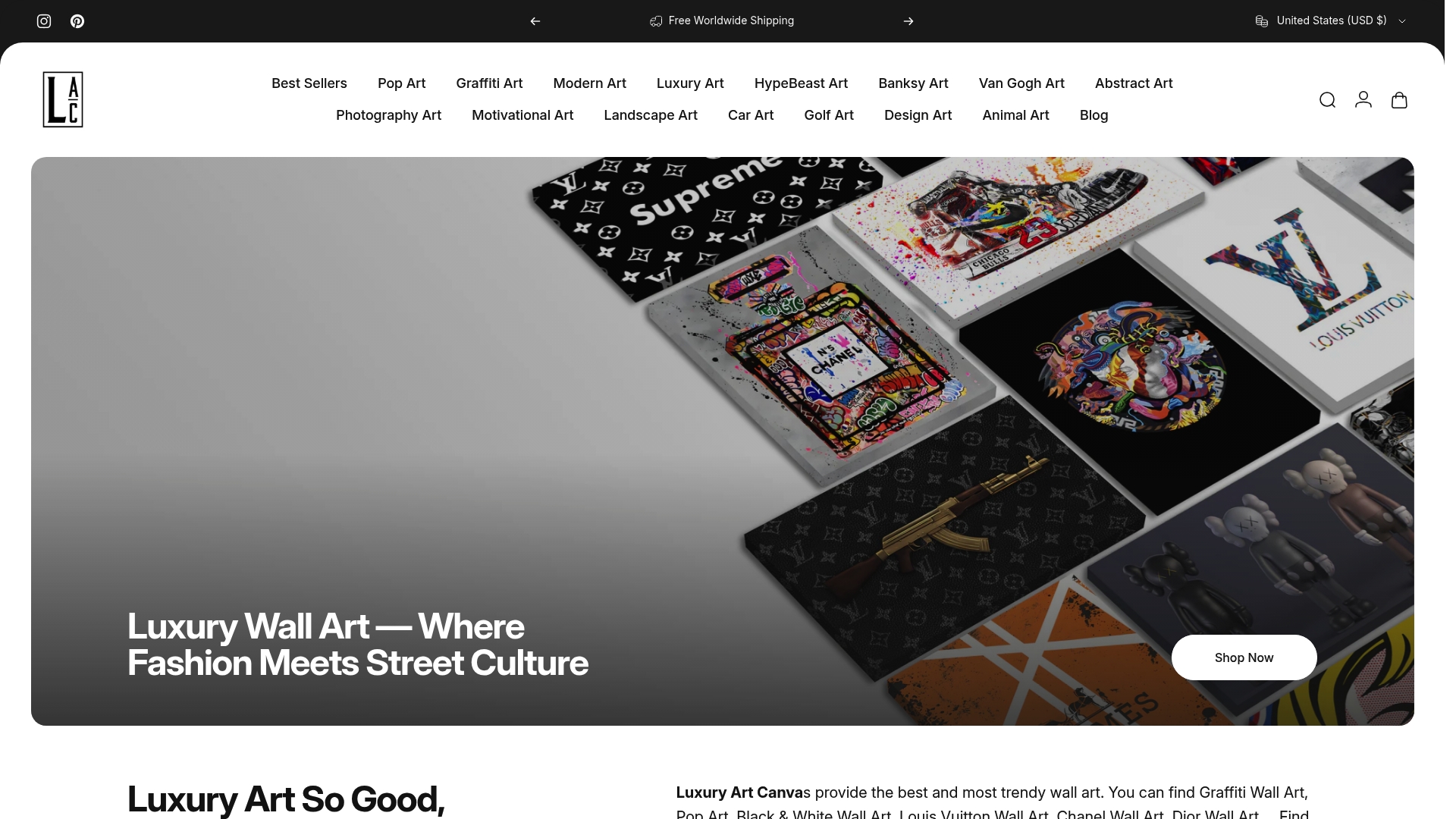
The right wall art is where every successful pop art interior begins. Luxuryartcanvas carries over 1,000 designs that blend pop art energy with high-fashion references, from bold graffiti-inspired canvases to Warhol-style celebrity prints and Lichtenstein-influenced graphic pieces. Every canvas is crafted in the USA with materials built for lasting visual impact. If you are ready to find your anchor piece, explore the pop wall art collection to start building your palette. For a broader selection of graphic statement pieces, the full wall pop art canvas range offers options for every room size and aesthetic direction.
FAQ
What is pop art decor style in simple terms?
Pop art decor style is an interior design approach that uses bold primary colors, graphic imagery from popular culture, and commercial-inspired visuals to create energetic, personality-driven spaces. It draws directly from the 1950s and 1960s art movement associated with Andy Warhol and Roy Lichtenstein.
What are the most iconic pop art elements in home decor?
The most recognizable elements are Ben-Day dot patterns, comic book graphics, celebrity portrait prints, and consumer product imagery. These motifs, combined with saturated red, yellow, and blue palettes, define the pop art design style in residential interiors.
How do you decorate with pop art without overwhelming a room?
Start with one large anchor wall art piece, extract two to three colors from it, and repeat those tones in cushions, rugs, and accessories. Neutral white or gray walls prevent visual chaos and let the graphic elements carry the room.
Does pop art decor work in offices and commercial spaces?
Pop art works well in offices, cafes, and studios because its graphic intensity creates stimulating, memorable environments. Large wall panels, neon accents, and colorful furnishings build brand identity and energize creative workspaces without requiring a full interior overhaul.
Which artists most influence pop art interior ideas today?
Andy Warhol and Roy Lichtenstein remain the dominant influences. Warhol’s celebrity portraits and product imagery and Lichtenstein’s comic-panel style with Ben-Day dots are the two visual languages most directly translated into contemporary pop art home decor.
Types of Wall Art for Living Rooms: 2026 Guide
Types of Art for Office Environments: 2026 Guide