
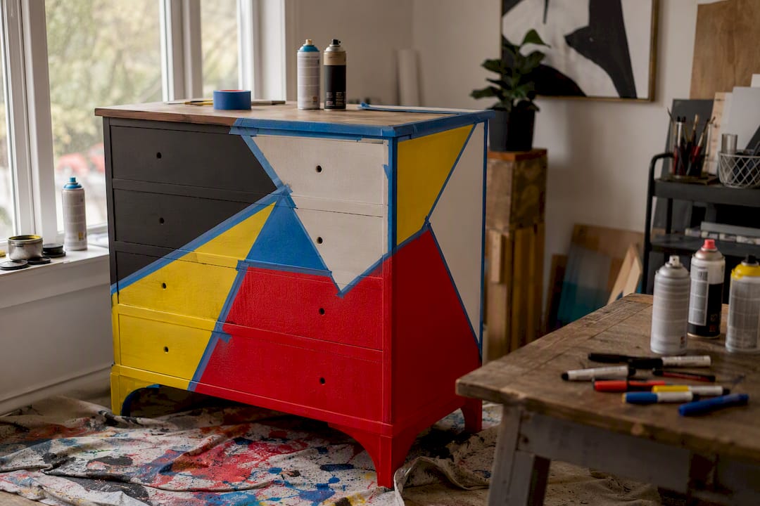
Pop art and thrift-store furniture work together when you follow one simple recipe: pick a single dominant color family, let the boldest piece in the room (usually the art) set the scale, and finish every wood surface with a protective topcoat so the whole thing survives real life. That’s the entire strategy, and everything else in this guide just fills in the details.
Three rules keep the look from turning into clutter:
- Anchor with neutral furniture. Save your loudest color for the art or one hero piece, not everything at once.
- Pick one pop-art color family and repeat it. A red-yellow-blue Lichtenstein palette or a hot-pink-and-black graffiti scheme, not five competing hues.
- Choose a repeated motif or shape (halftone dots, comic panels, a specific silhouette) so pieces from different eras feel like they belong to the same conversation.
Before you shop or start a project, check that you have a fixed color palette in mind, a tape measure for scale, and a plan for sealing whatever you paint.
Key Takeaways
Mixing pop art with thrift-store furniture works best when a single color palette, a clear focal point, and a durable topcoat tie every piece together.
| Point | Details |
|---|---|
| Pick one approach first | Choose cohesive palette, high-contrast eclectic, or curated pairing before shopping. |
| Use the 3-5-7 rule | Limit any vignette to three colors, five textures, and seven objects for balance. |
| Inspect before you buy | Flip canvases for labels, test furniture joints, and skip anything with mold or rot. |
| Prep prevents rework | Clean, sand, prime, and seal every thrifted piece before adding pop-art color. |
| Buy ready-made when speed matters | Luxuryartcanvas offers archival-ink, USA-made canvases sized to match thrifted furniture instantly. |
Table of Contents
- How Do You Choose an Approach for Mixing Pop Art With Thrift Finds?
- Building a Color Palette That Actually Holds Together
- Where to Find Good Thrift Finds and What to Avoid
- Prepping and Restoring Thrift Furniture the Right Way
- Pop-Art Techniques That Turn Thrift Finds Into Statement Pieces
- Arranging the Room So the Mix Reads as Intentional
- When to Buy Ready-Made Pop Art Instead of DIYing It
- Three Small Rooms That Show the Formula in Action
- Frequently Asked Questions
- Sources
How Do You Choose an Approach for Mixing Pop Art With Thrift Finds?
Three distinct paths lead to a good pop-art-meets-thrift room, and picking the wrong one for your space is the most common reason these projects fall flat; for inspiration on mixing eras in furniture, see How to Style a Transitional Home by Mixing Furniture Periods. Design writers who cover eclectic decor consistently point to the same fix: decide what feeling you want before you buy anything, because curating around a clear intention is what separates an intentional mix from a room that looks like a yard sale.
Cohesive palette means every piece, thrifted or new, pulls from the same three or four colors. This is the safest route for small apartments or rentals, since it reads as “designed” even when the furniture is mismatched in style or era. The tradeoff is impact. It’s polished, but it won’t stop anyone in a doorway.
High-contrast eclectic throws a loud pop-art canvas against a battered farmhouse dresser or a mid-century credenza and lets the tension do the work. It’s the highest-impact option and the one that photographs best, but it demands a good eye. Get the proportions wrong and the room feels like two garage sales collided.
Curated pairing sits in between: you choose two or three “hero” items (one major art piece, one standout furniture piece) and let everything else stay quiet. This works well in living rooms and home offices where you want one conversation starter, not an art gallery.
- Cohesive palette: lowest risk, easiest to reverse, best for renters.
- High-contrast eclectic: highest visual payoff, hardest to get right, best for a single statement room.
- Curated pairing: moderate effort, very forgiving, best for shared or multi-use spaces.
Pro Tip: If you’re not sure which approach fits, start with curated pairing. It’s the easiest to adjust later, and you can always push it toward high-contrast eclectic once you’re confident in your eye.
Building a Color Palette That Actually Holds Together
Pop art has strong opinions about color, and thrift furniture often comes in muddy, dated finishes. Bridging that gap starts with a basic three-part palette: one dominant color (usually from your art), one accent color that shows up in smaller doses, and one neutral that carries the heavy furniture. A Warhol-inspired room might run magenta as dominant, mustard as accent, and charcoal as the neutral base for a sofa or sideboard.
The 3-5-7 rule gives you a ratio to work from: three colors max in any given vignette, five materials or textures, seven decorative objects. Applied to a pop-art room, that means your canvas and two furniture accents share the three colors, your textures might be lacquered wood, woven upholstery, glass, metal hardware, and matte paint (five), and your accessories (books, a lamp, a vase, throw pillows) stay under seven so nothing competes with the art.
Scale matters just as much as color. A large-format pop canvas needs a substantial piece of furniture beneath it, like a credenza or a full dresser, or it visually floats. Smaller thrifted side tables and chairs pair better with a cluster of smaller prints rather than one oversized piece, which is one reason gallery-style groupings work so well over narrow console tables and slim bookshelves.
- Dominant color: pulled directly from your main art piece.
- Accent color: repeated in hardware, a lampshade, or a single upholstered chair.
- Neutral: absorbs the bulk of your furniture so the room can breathe.
Pro Tip: Take a photo of your art piece and use the color picker in any free photo editor to pull the exact hex codes. Match paint swatches to those codes instead of guessing at “close enough.”
Where to Find Good Thrift Finds and What to Avoid
Charity shops rotate stock constantly, so visiting the same location weekly beats a single big trip. Estate sales tend to have better furniture construction because they’re often clearing out homes furnished decades ago, before particleboard took over. Flea markets are best for smaller decor and framed art, while online secondhand marketplaces let you filter by dimensions before you drive anywhere, which matters if you’ve already committed to a specific wall size.
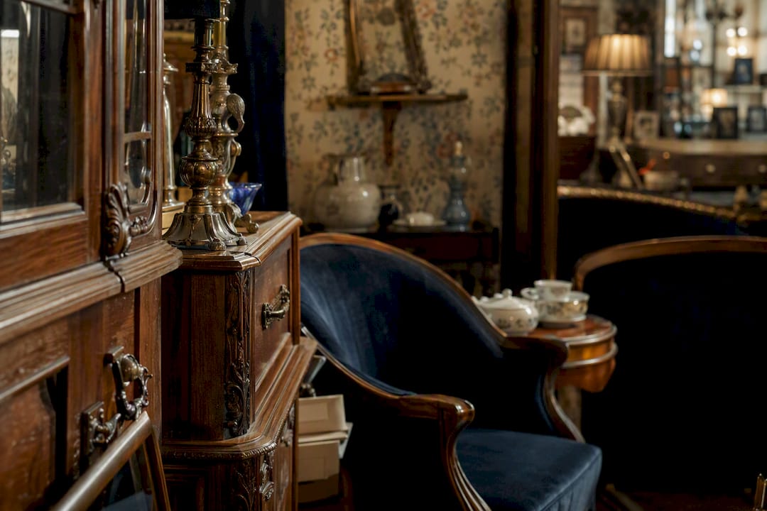
Paintings deserve a closer look than most people give them. Flip the canvas over. Gallery labels, auction house stickers, or a name and date written on the stretcher bar are all worth photographing, because certain clues on the back of a canvas occasionally point to a piece worth far more than its thrift-store price tag, or at least one with a story worth keeping intact rather than painting over. Professional stretcher construction (mitered corners, keyed joints) usually signals a painting made with some care, even if the subject matter is dated.
Furniture inspection takes about sixty seconds if you know what to check: open every drawer, sit or lean on any chair, and run a hand along joints to feel for wobble. Skip anything with a musty smell, since that usually means mold has worked into the wood grain and won’t come out with paint. Extensive water rings that have warped the wood, active rot, or a greasy, unidentifiable finish on old furniture are also reasons to walk away. Some older painted pieces can carry lead-based paint, which is a real hazard once you start sanding.
- Check: drawer function, joint stability, canvas backing, frame construction.
- Avoid: mold smell, structural rot, warped panels, unlabeled hazardous coatings.
Prepping and Restoring Thrift Furniture the Right Way
A pop-art finish only looks as good as the surface underneath it, and skipping prep is the single biggest reason DIY furniture makeovers chip within months. Here’s the sequence that actually holds up:
- Clean thoroughly. Degrease with a mix of dish soap and warm water or a dedicated wood cleaner, then let the piece dry fully before touching it again.
- Inspect for structural problems. Tighten loose joints, replace stripped screws, and re-glue any separated veneer before you think about paint.
- Sand and prime. A light scuff sand followed by a bonding primer gives paint something to grip, especially on laminate or varnished surfaces that would otherwise reject it.
- Paint or apply your base finish. Chalked paint is a common starting point for furniture makeovers because it covers old finishes without extensive stripping, and it’s the base several pop-art furniture projects rely on before adding graphic detail.
- Add your pop-art treatment. This is where stencils, block color, or decals come in, covered in detail in the next section.
- Seal and protect. A satin or matte polyurethane topcoat protects both the paint and any paper elements underneath it from scuffs and moisture.
Your basic materials list: a degreasing cleaner, 120 and 220 grit sandpaper, bonding primer, chalked or acrylic paint, painter’s tape, and a water-based polyurethane. If you’re reupholstering, add a staple gun, batting, and fabric shears.
Pro Tip: If a piece was made before 1978 and still has its original paint, test for lead with a home testing kit before sanding. Wear a properly rated respirator, not just a dust mask, and work in a ventilated space or outdoors.
Pop-Art Techniques That Turn Thrift Finds Into Statement Pieces
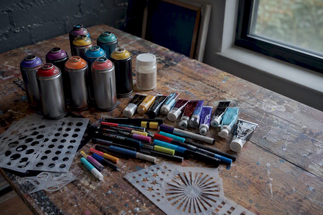
Once your furniture or painting is prepped, the actual pop-art transformation is more approachable than it looks. Your core supply kit covers most projects: acrylic paints in a tight color range, spray paint for large flat areas, paint markers for crisp graphic lines, adhesive stencils, transfer paper if you’re working from a printed design, and Mod Podge or a comparable sealant for any paper-based decoupage.
Project A: The block-color dresser. Sand and prime as described above, then use painter’s tape to divide the drawer fronts into geometric panels. Paint each panel a different color from your three-part palette, let it cure fully, then use a paint marker to add graphic outlines or a repeated dot pattern along the edges. This mirrors the approach behind a well-documented pop-art bookshelf makeover, where limiting the added colors kept a busy shelving unit from feeling chaotic.
Project B: The altered thrift painting. Find a landscape or portrait with a strong sense of depth or an obvious empty space, like a sky or a blank wall in the background. Sketch your pop-culture addition (a cartoon figure, a logo, a comic character) digitally first if you can, matching the original lighting and brushwork, the way one artist behind a viral series of altered thrift paintings plans each insert before ever touching the canvas. Paint the new element directly onto the original surface using acrylics that match the sheen of the existing paint, then varnish the whole piece once it’s dry so old and new sections age at the same rate.
Project C: The stencil comic-panel side table. Mask off the tabletop in a grid, then use halftone dot stencils or comic-style stencils in each square, spraying one color at a time and letting each layer dry before moving to the next. Tutorials built around masking and layered stencil work often finish with a coat of liquid gold leaf or metallic accent on one panel to keep the eye moving across the surface.
Troubleshooting notes worth knowing before you start: bleeding under stencils usually means the tape wasn’t pressed down firmly enough, so burnish every edge before spraying. If acrylic paint looks patchy over a glossy original finish, that’s a primer problem, not a paint problem. And small hardware upgrades, like replacing dresser pulls or adding applied wood moldings around a panel edge, do more to make a piece look “designed” than another coat of paint ever will.
- Materials: acrylics, spray paint, paint markers, adhesive stencils, transfer paper, Mod Podge.
- Best topcoats: water-based polyurethane for furniture, matte varnish for painted canvases.
Pro Tip: Always test your topcoat on a hidden section first. Some water-based varnishes slightly yellow certain white and pastel acrylics, which matters a lot in a pop-art palette built around clean color blocks.
Arranging the Room So the Mix Reads as Intentional
Placement decides whether your pop art and thrift furniture look curated or accidental, and the biggest lever is the focal point. Hang your largest or boldest piece where it’s the first thing you see entering the room, and anchor it above a piece of furniture at roughly the same visual weight, a wide credenza or a low dresser, so the art doesn’t float awkwardly over empty wall.
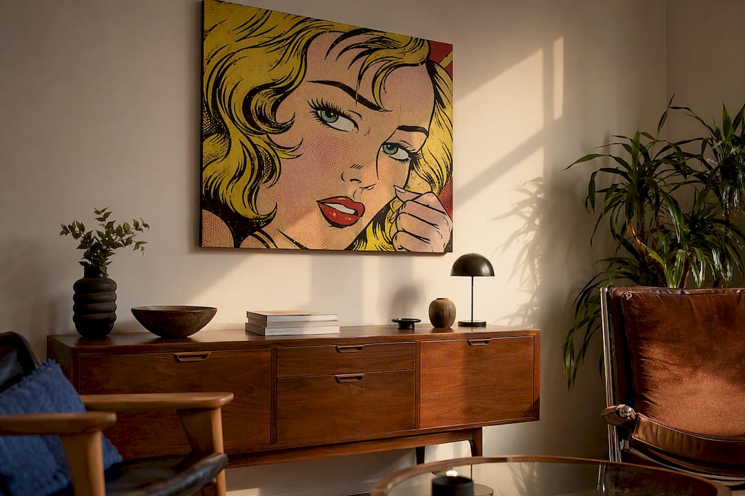
Keep center height around 57 to 60 inches from the floor, standard gallery placement, and check sightlines from the main seating area, not just from the doorway. A canvas that looks perfectly centered when you’re standing can sit too high once you’re sitting on a thrifted sofa across the room.
Lighting changes how pop art reads more than most people expect. Directional lighting, like an adjustable picture light or a track fixture, brings out texture in thick acrylic or spray-paint layers. Keep bulbs at a consistent color temperature across the room; mixing warm and cool bulbs shifts how your reds and blues actually look. Glossy varnished surfaces catch glare easily, so angle any spotlight slightly off center rather than straight on.
For gallery walls that combine framed thrift paintings with modern pop prints, consistency in framing does more work than consistency in subject matter. Repeating a frame color or style across mismatched pieces, or using magnified comic panels alongside smaller portrait prints, lets very different art styles hang side by side without looking random. Leave two to three inches between frames in a tight grouping, and more like four to six inches for a looser, salon-style spread.
- Anchor large art above furniture of similar visual weight.
- Match lighting color temperature across the whole wall.
- Use consistent framing to unify mismatched art styles.
When to Buy Ready-Made Pop Art Instead of DIYing It
Not every project needs to start with a paintbrush. Big-box retailers offer the lowest prices but the thinnest material quality, and sizing options are often limited to a handful of standard dimensions. Independent artists give you originality and often custom sizing, but turnaround times can run several weeks and pricing varies widely by artist reputation. Print-on-demand sites split the difference: reasonable prices, decent turnaround, but print quality depends heavily on which vendor fulfills the order.
Sizing is where most buyers go wrong. A single canvas over a standard sofa should generally span about two thirds of the sofa’s width. For a stairwell or narrow hallway, a vertical triptych reads better than one wide horizontal piece.
A custom print earns its higher cost when you need an exact palette match to a room you’ve already built, when you want a specific scale that off-the-shelf sizing doesn’t cover, or when you’re working around a subject that generic stock art doesn’t offer. Briefing an artist or printer quickly just means sending your palette hex codes, exact wall dimensions, and one or two reference images of the finished room.
- Retail: cheapest, fastest, limited sizing.
- Independent artists: most original, longest wait, widest price range.
- Print-on-demand: middle ground on price and speed.
Three Small Rooms That Show the Formula in Action
The altered landscape over a repainted credenza. A muddy thrift-store landscape got a cartoon astronaut painted into its sky, echoing the sketch-first, paint-second method used in pop-culture painting alterations, then hung over a credenza repainted in matching mustard and navy. Materials: acrylics, varnish, chalked paint, new drawer pulls. Three steps: sketch the addition digitally, paint and blend into the original brushwork, seal both pieces with matching sheen. The tip that would have saved time: buying the exact paint marker color before starting, instead of mixing acrylics to match mid-project.
The dresser as pure focal point. A plain six-drawer dresser became the loudest object in a bedroom using block color panels and a repeated dot motif on the top two drawers. Materials: painter’s tape, four acrylic colors, one paint marker, bonding primer. Three steps: prime, tape and paint panels, add dot detailing once fully cured. The tip: cure time between coats matters more than it seems. Rushing the second color caused visible tape lift on the first attempt.
The bookshelf turned graphic display. A boring particleboard bookshelf got the full pop-art treatment with taped panels and a tightly limited palette, similar to the process behind a well-known pop-art bookshelf project. Materials: chalked paint base, three accent colors, paint markers for outlines. Three steps: base coat the whole frame, tape off panel sections, paint and outline each section separately. The tip: limiting the palette to three colors, not five, was what made the finished piece look intentional instead of busy.
The Real Reward Is Permission, Not Perfection
Mixing pop art with a thrifted dresser gives you something a matched furniture set never will: a room that looks like it was built by someone with actual opinions. I find the most satisfying projects aren’t the flawless ones. They’re the pieces where a slightly crooked stencil line or an imperfect color match ends up giving the whole room personality.
If you’re renting or just not confident yet, start small. A single altered frame or one painted side table costs little, takes a weekend, and can be repainted or replaced without guilt if you change your mind in a year. That low-commitment entry point is exactly what makes this style so forgiving for beginners.
When Ready-Made Pop Art Is the Faster, Better Move
Sometimes the smarter choice isn’t another weekend project. It’s a museum-quality canvas that arrives ready to hang, already color-matched to the palette you’ve spent hours building around your thrifted furniture. Luxuryartcanvas makes that shortcut worthwhile: every piece is produced in the USA with archival inks, so you skip the sealing, curing, and topcoat guesswork that comes with DIY paint jobs, and you get a finish built to outlast whatever furniture surrounds it.

If your room leans toward the high-contrast eclectic approach, the Graffiti Pop Art Canvas collection pairs naturally with rougher, more textured thrift pieces. For a cohesive-palette room, browse Pop Wall Art and pull your accent color straight from the canvas before you buy paint for anything else. Both collections come in multiple sizes, so measure your furniture first and match scale the same way this guide recommends for any DIY piece. Start by browsing the Pop Canvas sizing options and pick the dimension that fits the wall you’ve already planned around.
Frequently Asked Questions
Is it better to start with the furniture or the art when planning a pop-art room? Start with the art. Its color palette and scale should set the direction for every furniture and paint decision that follows, since it’s far easier to repaint a dresser than to find new art that matches an already-finished piece.
Can I mix more than one pop-art style, like Warhol-inspired color blocks and comic-panel graphics? Yes, as long as they share the same color palette. The 3-5-7 rule exists specifically to let different visual styles coexist without competing for attention.
Will painting over a thrifted painting destroy any resale value? If the painting has no gallery labels, signatures, or auction stamps on the back, it’s very unlikely to carry meaningful resale value, which is exactly why altered thrift paintings have become a popular project. Always check the back first.
What’s the safest paint sealant to use over acrylic pop-art designs? A water-based polyurethane in a satin or matte finish protects most acrylic work without yellowing over time, though it’s worth testing on a hidden section first since some varnishes react differently with certain pastel colors.
Do I need special tools to start a pop-art furniture project? No. A basic kit of sandpaper, primer, painter’s tape, acrylic paint, and paint markers covers most beginner projects. Add a respirator and lead-testing kit only if you’re working with furniture painted before 1978.
Sources
- Why Your Next Thrift Store Art Find Could Actually Be Worth — Vivodoc
- DIY Pop Art Inspired Bookshelf Makeover — The Buzzed Artist
- 15 Ways to Use Pop Art at Home | Houzz AU
Presenting Pop Art to Conservative Clients Who Hesitate
What Is an Art-Driven Room Concept? A Homeowner's Guide