
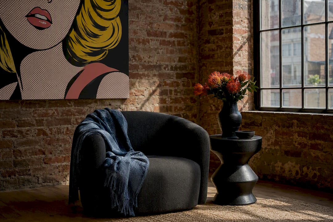
Present the pop-art canvas as a curated, story-driven focal point, not a decorating dare. Show it in the client’s actual room through a rendering or in-room mockup, lead with the bold option, and keep a neutral backup ready. That single sequence, tested repeatedly by working designers, converts more hesitant clients than any amount of persuasion alone.
Use this before your next walkthrough:
- Tie the piece to something specific in the client’s life before you ever mention price or placement.
- Bring a rendering or mockup of the actual wall, not a generic catalog shot.
- Pull 2-3 anchor colors from the canvas and point to where they’ll repeat in the room.
- Offer a reversible, low-stakes spot first: a powder room or entry wall.
- Have a ready-to-hang option from a source like Luxury Art Canvas on hand so the “yes” has somewhere to go immediately.
Key Takeaways
Presenting pop art to conservative clients works best when storytelling, visual proof, and a reversible first step replace pressure and pitch language.
| Point | Details |
|---|---|
| Lead with bold, back up with neutral | Show the daring option first alongside a calmer alternative so clients compare rather than default to caution. |
| Anchor the piece in a personal story | Use a cue-connection-outcome frame built from details gathered in discovery questions. |
| Rendering beats description every time | An in-room mockup with lighting and scale turns abstract risk into a visible, checkable outcome. |
| Start small and make it reversible | Pilot in a powder room or entry with removable hanging before proposing a living-room focal point. |
| Style with anchor colors and texture contrast | Repeat 2-3 canvas tones in accessories and pair glossy art with matte textiles to avoid a parachuted-in look. |
| Source ready-to-hang canvases fast | Luxury Art Canvas offers museum-quality, made-in-USA pop-art canvases that ship ready-to-hang for immediate client follow-through. |
Table of Contents
- What to Say When Presenting Pop Art to Conservative Clients
- How Do You Make Pop Art Feel Personal, Not Random?
- Which Visual Tools Actually Change a Client’s Mind?
- Where Should You Start a Hesitant Client First?
- How Do You Style Pop Art So It Fits a Traditional Room?
- How Do You Respond When a Client Pushes Back?
- What Before-and-After Examples Should You Show?
- Why Listening First Still Wins the Room
- Where to Find Ready-to-Hang Pop Art for Client Presentations
- Frequently Asked Questions
- Sources
What to Say When Presenting Pop Art to Conservative Clients
Designers who succeed with hesitant clients tend to do one counterintuitive thing: they lead with the boldest option in the room, not the safest. Business of Home reports that presenting the daring choice first, alongside a slightly more neutral backup, gives clients room to compare rather than default to caution. It works because it signals confidence. A designer who visibly believes in the piece changes how a client evaluates risk.
Two scripts cover most first meetings:
- Discovery-meeting opener: “Before we talk paint or furniture, I want to show you a piece that could set the tone for this whole room. I’ll also bring a quieter alternative, but I want you to see the strong version first.”
- Presentation-day pitch: “This is my recommendation, and here’s a backup that’s more restrained if it’s not the right fit. I’d rather show you both than assume which one you’d pick.”
Validate before you lead: “I get why bold graffiti art feels like a leap in a room this traditional” lands better than defending the choice outright. Then reframe risk as taste. Phrases like “this creates tension without chaos” or “it’s one strong statement, not a redesign” borrow language Architectural Digest attributes to designers managing the exact same hesitation.
How Do You Make Pop Art Feel Personal, Not Random?
A piece feels inevitable when it connects to something the client already loves. Build it with a simple three-part frame: cue, connection, outcome. The cue is a detail from the client’s own life. The connection is why that detail points toward this specific artwork. The outcome is what changes in the room once it’s hung.
Say a client mentions a favorite trip to Tokyo. A bold graffiti canvas with neon color blocking connects to that memory of Shibuya at night. The outcome: the room finally has a story instead of just furniture.
Ask these in your first meeting to collect raw material for that story:
- Where have you traveled that changed how you see color or design?
- Is there a hotel, restaurant, or space you still think about?
- What’s a piece of clothing, brand, or object you’ve owned that felt like “you”?
- Which room in this house feels the least finished, emotionally?
Pro Tip: Write down the client’s exact words during discovery, not your paraphrase. “It felt alive” from the client is a stronger anchor for your pitch than your own polished description of the same idea.
Which Visual Tools Actually Change a Client’s Mind?
Renderings and in-room mockups do more persuasive work than any script. Business of Home notes that mood boards, 3D renderings, and tactile samples let clients see the finished result instead of imagining it, which measurably increases acceptance of daring choices. A client who can picture the piece already hanging over their actual sofa stops treating it as an abstract risk.
Before the meeting, prepare:
- A scaled rendering of the exact wall, including sightlines from the doorway and main seating area.
- Lighting notes: does the space get direct sun, warm lamp light, or cool overheads?
- Two or three anchor-color swatches pulled straight from the canvas.
- A framing option shown both ways: gallery-style matte black and a warmer natural wood.
- A printed mood board and a fabric swatch or two, for clients who trust touch over screens.
Architectural Digest points out that renderings work because they turn an abstract fear (“this will look chaotic”) into a specific, checkable outcome. Pair a digital rendering with a physical sample when you can. The visual staging approach of showing the piece in context, not isolation, consistently outperforms a simple product photo pinned to a board.
Where Should You Start a Hesitant Client First?
Committing a nervous client to a living-room focal point on day one is asking for a no, since defining the right built focal point like an interior door can set the tone effectively. See why interior doors are the next big home trend. Start where the stakes are lowest and work outward.
- Powder room or half-bath, where fewer eyes will judge the choice daily.
- Entryway or hallway, a transitional space that reads as “accent” rather than “statement.”
- Home office, a room the client controls personally.
- Living or dining room, once trust in the earlier picks is established.
Make the trial reversible on purpose:
- Suggest a removable hanging system so nothing is permanent.
- Offer a 30-day check-in as a built-in exit ramp.
- Frame success simply: “If you catch yourself smiling at it after two weeks, we scale up.”
This mirrors what Business of Home describes as a standard professional move: proving the aesthetic in a low-risk room before asking for a bigger commitment.
How Do You Style Pop Art So It Fits a Traditional Room?
A bold canvas reads as intrusive when it sits alone with nothing else in the room echoing it. The fix is the anchor-color method: pull two or three tones directly from the canvas and repeat them in small, low-commitment pieces like throw pillows, a vase, or a stack of books. The room starts to feel designed around the art instead of interrupted by it.

Framing choices matter as much as color. Matte black frames give a graffiti or pop piece a gallery edge that feels intentional rather than loud. Natural wood softens the same piece for a room heavy in traditional millwork. Scale rules still apply: the canvas should occupy roughly two-thirds the width of the furniture below it, so it reads as anchored rather than floating.
Texture does quiet work too. Pairing a glossy, saturated canvas with matte linen, aged leather, or a nubby wool throw balances the eras in the room and keeps the piece from feeling parachuted in.
- Extract 2-3 anchor colors and place them in at least two accessories nearby.
- Choose matte black for a gallery feel, natural wood for warmth.
- Keep canvas width proportional to the furniture beneath it.
- Contrast glossy or saturated art with matte, aged, or textured fabrics.
Pro Tip: If a client owns a single heirloom rug or antique piece, style around that instead of fighting it. One old, textured object next to one bold canvas reads as curated. Two loud statements next to each other reads as chaos.
How Do You Respond When a Client Pushes Back?
Every objection deserves the same three-step response: acknowledge, reframe, offer proof. Skipping the acknowledgment and jumping straight to proof makes clients feel unheard, and unheard clients dig in.
- “What if I regret it?” Acknowledge that regret is a real fear with any big purchase. Reframe: this is why we’re starting in the powder room, not the living room. Offer proof: show the reversible hanging system and the 30-day check-in plan.
- “It will clash with my furniture.” Acknowledge the furniture is staying, not the art adapting to it. Reframe: the anchor-color method ties the two together visually. Offer proof: hold up the actual fabric swatch next to the rendering.
- “It’s too trendy.” Acknowledge trend fatigue is fair criticism of a lot of decor. Reframe: pop art referencing Warhol-era work has held cultural relevance for six decades, which is the opposite of a fad. Offer proof: pull up a portfolio image of a similar piece in a traditional home that’s aged well.
Keep a small evidence kit ready at every meeting: a portfolio folder of past installs, the rendering for this specific room, a note on reversible placement, and a few customer reviews showing other buyers made the same leap successfully.
What Before-and-After Examples Should You Show?
Two templates cover almost every conservative-client scenario.
Template A, the powder room pilot. Show the “before” as a plain, undecorated wall. Show the “reveal” with a single bold canvas hung at eye level. Mention the timeline (often two to three weeks from install to client comfort) and the client’s own reaction as the metric that matters, not a design award.
Template B, the living room focal point. Show the wall styled with anchor-color accessories already in place, not just the canvas alone. Mention that the client started hosting more once the room had a genuine talking point. That’s the strongest kind of social proof: not a compliment, but a change in behavior.
- Choose images with consistent lighting so the comparison feels honest, not staged.
- Write one-line captions the presenter can read verbatim, not paragraphs.
- Lead each caption with the outcome, not the product name.
Why Listening First Still Wins the Room
The best pitches I’ve seen never start with the art. They start with a question, and the designer actually waits for the answer before pulling out a single rendering. Conviction matters, but it only lands after a client feels heard.
Where to Find Ready-to-Hang Pop Art for Client Presentations
Once a client says yes, momentum disappears fast if you can’t show them something real. Luxury Art Canvas keeps that window open with museum-quality canvases made in the USA using archival inks, shipped ready-to-hang so there’s no framing delay between approval and installation.
For the powder-room pilot, pull from the pop wall art collection, where sizing options fit tight spaces without overwhelming them. For a living-room focal point, graffiti wall art or the large graffiti wall art line gives you scale options to match a bigger wall once the client is ready to commit further. Pair either with a rendering before the meeting, never after.
A few things that lower buyer friction on the spot:
- Sizing runs from powder-room scale to full living-room focal points.
- Ready-to-hang hardware means no separate framing order or delay.
- Return and exchange flexibility gives hesitant clients a safety net if the final placement doesn’t land.
Pull up the pop art canvas product page during your next presentation and let the client scroll it themselves. Seeing real inventory, not just a rendering, is often what turns a maybe into a signed order.
Frequently Asked Questions
What’s the fastest way to start presenting pop art to conservative clients without overwhelming them? Start with a low-stakes room like a powder room or entry, and bring a rendering of that exact wall to the first meeting rather than a generic product photo.
Do conservative clients respond better to digital renderings or physical samples? Both together work best. A rendering removes uncertainty about scale and placement, while a physical swatch or fabric sample makes the choice feel tangible rather than theoretical.
How do I know if a client is ready for a bolder piece? Ask about travel memories, favorite hotels, or objects that felt distinctly “them.” Clients who answer with specific, vivid details are usually more open to a bold canvas than those who default to generic answers.
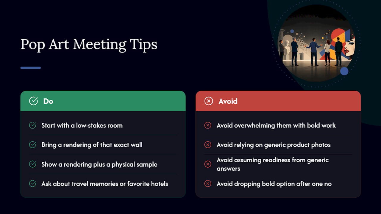
What if the client still says no after all this? Offer the neutral backup you brought to the meeting and revisit the bold option later once trust builds in a lower-stakes room. A no today often becomes a yes after one successful small install.
Art and Furniture Pairing Checklist for a Cohesive Room
Mixing Pop Art With Thrift Store Furniture