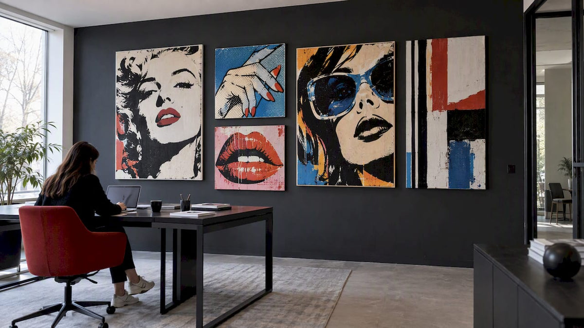
Pop art works in an office when it is treated as a design system, not a single purchase: one large statement piece anchors a zone, and smaller complementary works carry its color and energy through the rest of the floor. Designers at firms covered by Work Design and Architectural Digest treat bold color and graphic art as architecture, not accessory. This guide covers styles, placement rules, palettes, materials, and buying tips, including where Luxury Art Canvas fits in.
Table of Contents
- 1. Pop art styles to shortlist for your office
- 2. Where to place pop art: scale, sightlines, and composition
- 3. Color and mood: zoning energy across the workspace
- 4. Materials and formats: canvas, acrylic, metal, and sculpture
- 5. Sourcing and buying pop art for your office
- 6. What the research and real projects say about pop art at work
- Balancing bold art with employee comfort and brand fit
- How to get a ready-to-hang pop art canvas for your office
- FAQ
- Sources
1. Pop art styles to shortlist for your office
Pop art is not one look. Breaking it into a few practical buckets makes it easier to match a style to a zone and a brand.
- Bold graphic canvases: high-contrast, flat-color compositions that read well from a distance, ideal for lobbies and open floor plans.
- Warhol-style screen prints: repeated imagery and saturated color blocks that nod to the movement’s advertising roots, a connection the curators behind Galerie Boisserée’s Warhol exhibition trace back to Pop Art’s origins in commercial graphic design.
- Comic-strip motifs: playful, narrative pieces suited to casual break rooms or creative departments, less fitting for client-facing conference rooms.
- Neon and acrylic signage: high-impact but needs wall space clear of glare and a dedicated power source if illuminated.
- Sculptural 3D accents: strong focal points for lobbies, but they demand floor or shelf clearance and more complex installation.
Private offices tend to suit a single quieter piece, while collaboration zones can handle the visual noise of a comic-strip wall or a cluster of smaller prints.
2. Where to place pop art: scale, sightlines, and composition
Placement decides whether bold art reads as intentional or chaotic. A few measurable rules remove most of the guesswork.
- Size to the wall, not the piece you love: a single statement canvas should cover roughly 60 to 75% of the available wall width above a console or sofa.
- Center on sightlines, not furniture edges: hang reception pieces so the focal point sits at average eye level, about 57 to 60 inches from the floor to the center of the work.
- Reserve the boldest piece for the first sightline a visitor or employee hits when entering a space, whether that is the lobby wall or the view down a main corridor.
- Choose gallery walls for texture, single pieces for impact: a cluster of four to six smaller works with 2 to 3 inches of spacing between frames reads as curated; anything tighter looks cluttered.
- Light for the finish: matte canvases tolerate ambient light, while glossy or acrylic pieces need angled lighting to avoid glare washing out the image.
Pro Tip: Photograph the wall before buying, then overlay a printed template at the planned size to confirm scale before anything ships.
3. Color and mood: zoning energy across the workspace
Color is the fastest way to shift how a room feels, and pop art gives you a concentrated dose of it in one object. Workplace designers quoted in the Fresha Warsaw office project used bold color and pop motifs deliberately to energize collaboration and brand-facing areas, rather than scattering intensity evenly across the floor.
- Reserve high-energy hues, oranges, yellows, and hot pinks, for collaboration zones, lounges, and brainstorming rooms.
- Use cooler or muted palettes in focus areas: deep blues, greens, and grayscale works reduce visual competition near desks.
- Limit any single zone’s dominant palette to three to five colors and let neutral walls or furniture act as a visual buffer between bold pieces.
A practical palette framework tied to office zoning is laid out by ADT Workplace’s color guidance, which assigns vibrant, saturated tones to high-energy collaboration spaces and more muted schemes to individual focus areas. Pairing one large canvas with a few smaller colorful pop art pieces that echo its accent color is an easy way to apply that framework without overwhelming the room.
4. Materials and formats: canvas, acrylic, metal, and sculpture
Each format carries different tradeoffs once it is actually hanging in a working office, not a showroom.
- Canvas: low glare, forgiving in mixed lighting, and the easiest format to clean with a dry microfiber cloth. Best default for most zones.
- Framed prints: add visual weight and protection but reflect overhead lighting if glazed with glass.
- Acrylic or gloss finishes: deliver a glossy, saturated impact suited to lobbies, but show fingerprints and need glass cleaner rather than abrasive wipes.
- Metal prints: highly durable and resistant to humidity, a solid choice for high-traffic corridors, though they can develop glare under direct sun.
- Sculptural pieces: strong conversation starters but require dusting and careful placement away from foot traffic.
Direct sun exposure fades most formats over time, so placing canvases and prints away from unfiltered windows extends their color life regardless of which material you choose.
5. Sourcing and buying pop art for your office
Buying for an office is different from buying for a living room: you need predictable sizing, delivery timelines, and often multiple matching pieces.
- Confirm size and finish before ordering, since a piece that looks right online can read too small or too glossy once it is on an office wall.
- Check delivery and return policies, especially for large-format canvases that need freight shipping rather than standard parcel delivery.
- Ask about installation support or hanging hardware, which saves time when outfitting multiple rooms at once.
- Request a mockup or color swatch when a retailer offers one, since screen colors rarely match printed ink exactly.
- Compare sourcing routes: large online retailers and specialized canvas sellers now offer ready-to-hang, large-format collections that simplify buying compared to custom gallery commissions, while local artists remain an option for a fully bespoke piece.
6. What the research and real projects say about pop art at work
Workplace studies and design case files back up these placement and palette choices rather than treating them as aesthetic preference alone.
Installing thoughtfully chosen art in the workplace can elevate employee performance, mood, and physical well-being, and bolster interpersonal bonds between employees and clients.
That finding comes from a Bisnow case study on a Philadelphia office project, which also notes that a single pilot installation in a reception area is an inexpensive way to test staff reaction before a full rollout. The takeaway: start with one zone, read the response, then expand the palette and placement rules outward.
Balancing bold art with employee comfort and brand fit
Bold art wins fastest in shared, public-facing spaces. I’d pilot one statement piece in a lobby or lounge, gather staff reactions for a few weeks, then expand from there rather than committing an entire floor at once. A broad catalog and local production can make that kind of staged rollout easier to execute without a long commissioning process.
— James
How to get a ready-to-hang pop art canvas for your office
Once you know the zone, size, and palette you need, sourcing should not be the hard part. Our Pop Art Canvas Prints collection is built around the same checklist outlined above: pieces arrive ready to hang, sized for real office walls, and produced in the USA on archival materials that hold up under office lighting.
- Measure your wall and pick a size that fills 60 to 75% of the available width, as covered in the placement section.
- Choose a matte canvas for low-glare conference rooms or a bolder finish for a lobby focal wall.
- Browse Warhol-inspired options like our Campbell’s Soup canvas if you want a direct nod to Pop Art’s advertising roots.
- Reach out before ordering multiples for a gallery wall so finishes and accent colors stay consistent across pieces.
Start with one statement canvas for your highest-visibility wall and build outward from there.
FAQ
Does pop art actually improve focus or creativity at work?
Research on office art installations links thoughtfully placed pieces to improved mood, performance, and interpersonal connection among employees, according to a case study on a Philadelphia office redesign. The effect depends on placement and zoning rather than the art alone, so pairing bold pieces with quieter color zones tends to work best.
How big should a statement pop art piece be for an office wall?
Going smaller tends to look like an afterthought, while oversizing past the available wall crowds the room.
What is the most practical material for a busy office?
Canvas is the most forgiving format for everyday office conditions because it resists glare and cleans easily with a dry cloth. Acrylic and metal prints offer more visual punch or durability but need more careful placement away from direct light and heavy touch points.
Can I mix pop art with our existing office furniture and branding?
Yes, designers frequently pull one dominant color from a pop art piece and echo it in nearby furnishings or flooring to tie a zone together, an approach described in Architectural Digest’s coverage of pop interiors. Keeping the palette to three to five colors per zone keeps the mix cohesive rather than busy.
Where can I buy ready-to-hang pop art for an office?
Specialized canvas retailers and large online art platforms now offer ready-to-hang, large-format collections designed to simplify office buying compared to custom commissions. Our Pop Art Canvas line is produced in the USA and sized for office walls, with options across graphic, Warhol-inspired, and graffiti-influenced styles.
Sources
- Inspiration, Comfort And Connectivity: Using Pop Art To Design A Different Type Of Office Space
- Fresha’s Warsaw Office Redefines the Modern Workplace with Bold Color, Connection, and Creativity
- A two-story Milan loft with a bold, pop aesthetic
- The Perfect Office Colour Palette
Spot Museum Cues: Ready to Hang Floating Frame Canvas for Buyers
Teach Keith Haring Inspired Art Ethically to Students and Teachers