Start with the art, then build the shelf around it. Put the largest piece in first, cap the ends with taller or heavier objects, add small fillers in front, and leave some empty space so the display can breathe. That order works on a floating shelf and on a picture ledge, and it is the same one designers use for a full wall.
This guide walks through that order step by step, then covers the questions that come up once you start: how big the art should be, when to lean it and when to hang it, and how frame color changes the look.
Table of Contents
- Why the art should come first
- Build the shelf in layers
- Groups of three and uneven numbers
- Picture ledge or hanging: how to choose
- Scale: matching art size to the shelf
- Frame color and finish
- Three shelves you can copy
- Our perspective
- Pick your art, then style the shelf
- Common mistakes to avoid
- FAQ
Why the art should come first
Most shelf styling goes wrong in the same way: people fill the shelf with objects and then try to fit a print in the gaps. Flip that. The artwork is the largest, flattest and most colorful thing you will place, so it decides what else belongs.
A styling guide from a home restoration retailer makes the same point: place the most substantial pieces first, such as artwork, large vases, plants, books or trays. Everything after that supports them.
Before you place anything, answer three questions:
- What is the mood? A bold graffiti piece wants a different supporting cast than a quiet black-and-white photograph.
- What are the two or three colors in the art? Pull from those for your objects. A red in the print can return as a small ceramic bowl.
- How much wall is left? A shelf in a narrow hallway can hold one strong piece. A shelf above a sofa can hold a group.
Let one piece be loud
A shelf can carry one statement piece and several quiet ones. If your art is high-contrast, such as pop art or street art, keep the objects around it simple: matte ceramics, a few books with plain spines, one plant. If your art is calm, you can afford a more sculptural vase or a brass candle holder.
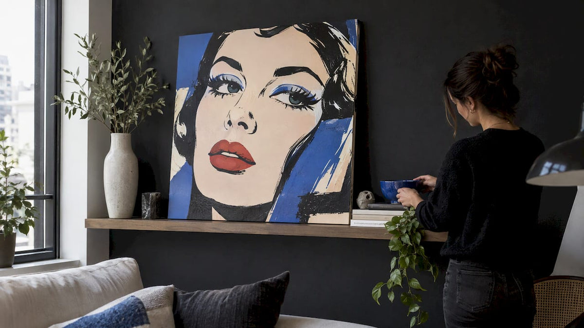
That is where a bold canvas earns its spot. A single pop art canvas leaned at the center of a shelf gives you a focal point, and the objects on either side only need to echo one of its colors.
Build the shelf in layers
Once the art is in, work from big to small. The research on shelf styling agrees on the sequence: start with substantial pieces, cap the ends with taller or weightier objects, then add smaller fillers in front, and keep some negative space.

Step 1: Anchor
Place the artwork. On a single floating shelf, lean it slightly off center rather than dead middle. An off-center anchor feels relaxed, and it leaves room for a counterweight.
Step 2: Bookend
Set a taller or heavier object at one or both ends. A vase, a stack of large books or a sculptural piece works. This frames the display and keeps the eye from sliding off the edge of the shelf.
If your heavier piece is a statue or a collectible figure, weight and stability matter. This guide to displaying large statues safely covers how to support bigger pieces at home. Check your shelf’s load rating and mounting first, since floating shelves vary a lot by bracket and wall type.
Step 3: Layer
Add mid-height items in front of or beside the anchors: a short stack of books, a bowl, a small plant. These should overlap the edges of the art slightly. Overlap is what makes a shelf look styled instead of lined up.
Step 4: Fill
Add the smallest items last: a candle, a small frame, a piece of stone. Use fewer than you think you need.
Step 5: Edit
Step back and remove one thing. Then check the shelf from across the room, not from arm’s length. Shapes should read clearly from a distance.
Groups of three and uneven numbers
Designers lean on odd numbers because they look intentional without looking rigid. One guide on decorating floating shelves points to the rule of thirds and clusters of three as an easy way to add visual interest. Treat it as a starting point rather than a law.
A simple three-part cluster for one shelf:
| Role | Example | Why it works |
|---|---|---|
| Anchor | Leaned canvas or framed print | Sets color and mood |
| Height | Vase with a branch or a stack of books | Adds a vertical line |
| Accent | Small bowl, candle or stone | Adds texture and a second material |
With two shelves, repeat the roles but vary them. Put the art on the upper shelf and the taller objects on the lower one, or the reverse. Avoid mirroring the same arrangement on both, which looks like a store display.
Picture ledge or hanging: how to choose
A picture ledge is a shallow shelf made for leaning art. A standard floating shelf can do the same job if it is deep enough for the pieces you have. The real question is whether you want your art on the wall or on the shelf.
When a ledge is the better choice
A picture ledge fits when art pieces are small, measuring and aligning frames feels daunting, or you want to change pieces without making new nail holes. The same source notes that people who swap art often benefit most, and that postcards and Polaroid strips can join the display.
Designers are also moving this way. Homes & Gardens reported in 2026 that picture ledges let you rotate and rearrange work without repeatedly rehanging frames or patching walls, and that they create a softer, more informal layered look than a fixed gallery wall.
That is also good news for renters. If your lease limits nail holes, a single ledge gives you a changing gallery with one set of anchors. Our guide to hanging canvas art without damaging your walls covers the other low-damage options.
When to hang instead
Hang art when a piece is large enough to be the whole point of the wall, when you want a fixed, formal look, or when the shelf below would be crowded by the frame. A large canvas above a console reads as architecture. A ledge below it can carry smaller companions.
You do not have to pick one. Domino’s ledge guide supports mixing leaning prints with hanging art above the ledge, combining both on one wall. A common formula is one large hung piece above, with two or three smaller leaned pieces on the ledge below, overlapping its lower edge.
Quick comparison
| Picture ledge or shelf | Hung on the wall | |
|---|---|---|
| Changing the art | Swap in seconds | Rehang, possibly patch |
| Best for | Small and medium pieces, collections | One large statement piece |
| Look | Layered, relaxed | Fixed, formal |
| Wall holes | One set for the ledge | One or more per piece |
| Risk | Pieces can slide if the ledge is too shallow | Crooked spacing if you misjudge |
Scale: matching art size to the shelf
Size is where most ledge displays succeed or fail. Domino advises considering print size before hanging ledges: its examples show small-scale prints on a three-tier display and large-scale prints on a two-tier display.
Practical rules:
- Let the art overlap. Leaned pieces should be tall enough to sit well above the shelf’s lip, so they read as art and not as books.
- Vary the sizes. Homes & Gardens describes picture ledges holding varied image sizes, alternating frame sizes and personal mementos within one defined area. The ledge is the boundary that makes the variety look considered.
- Go bigger than your instinct. Small art on a long shelf looks timid. One large piece with two small ones usually looks better than five medium ones.
- Check clearance. Measure the space between shelves so tall art does not touch the shelf above.
If you are building from scratch, measure your shelf length, then plan art that covers roughly half to two thirds of it, with objects filling the rest. That is a rule of thumb from design practice, not a standard, so adjust to your wall.
Frame color and finish
Frame color is the detail that people search for last and notice first. A few principles hold up in practice.
Match the room, then repeat. Choose a frame finish that already exists in the space, such as black metal in your light fixtures or oak in your furniture. Then use that finish on two or three pieces on the shelf, not all of them.
Black frames for contrast. Black frames sharpen the edges of light art and give a graphic look. They suit black-and-white photography, line drawings and minimalist work. Domino’s guide suggests that black-and-white art pairs with a neutral room or a pastel accent.
Wood frames for warmth. Natural or walnut frames soften busy or colorful art and tie the shelf to wood furniture.
White frames for calm. White frames on a white wall almost disappear, so the image seems to float. That suits a clean, gallery-like display, especially in small rooms.
Metal frames for a polished look. Gold or brass lifts dark walls and works with high-fashion subjects. Use it sparingly, and echo it with a candle holder or tray.
Mixing is fine. The same Domino guide shows ledge displays that combine different frame types, rich wall colors and unevenly spaced frames. The trick is a clear dominant finish, then one or two exceptions.

What about frameless canvas?
A stretched canvas has no frame to match, so the image carries the whole look. That makes it easy to mix with framed pieces: the canvas supplies color and the frames supply structure. If you want the framed look in a minimal style, our framed minimalist wall art is a good place to see how a simple frame changes an image.
Three shelves you can copy
These are examples of how the steps combine. Swap in what you own.
The living room statement shelf
One long floating shelf above a sofa. Lean a large graffiti or pop art canvas slightly left of center. Place a tall ceramic vase at the right end, a short stack of art books in the middle, and a small bowl in front. Take one color from the art, such as a hot pink or a bright yellow, and repeat it once in the bowl. Everything else stays neutral.
The entryway ledge
A narrow ledge at eye level. Three pieces of different sizes, overlapping, with a small tray for keys at one end. Use black frames for all of them so a busy entry reads as calm. Add a single plant if there is light.
The home office shelf
Two shelves. On the top, a black-and-white piece, a small plant and a bookend. On the lower, books laid horizontally with a motivational print leaned against them. Keep the colors to black, white and one warm metallic. It feels professional without looking like a waiting room.
Our perspective
We make canvas wall art for people who want a room to look like someone with taste lives in it. When customers ask how to style a shelf, our answer is always to start with the art, because a strong piece does most of the work for you.
Our canvases are made in the USA, arrive ready to hang and come from a catalog of over 1,000 designs, so there is almost always a piece that fits the color story of your room. That variety matters on a shelf. Black-and-white work can quiet a busy space, while graffiti and pop art can turn a plain shelf into the first thing a guest notices.
We also like canvas on a ledge because it is easy to live with. You can lean a piece, swap it for another when the mood changes, or move it to the wall when you want a bigger statement. Start with one piece you love, and let the rest of the shelf follow its lead.
James
Pick your art, then style the shelf
If you are choosing art for a shelf, start with a collection that matches the mood you want. Our graffiti and street art canvases bring energy to a neutral shelf, while the luxury art collection suits a more polished room. Every canvas is made in the USA and ready to hang or lean.

Browse the full range on Luxury Art Canvas, from black-and-white and abstract work to designer-inspired pieces. If you plan to combine several canvases on one wall, our post on mixing and matching canvas art shows how to keep the group cohesive.
Common mistakes to avoid
- Starting with accessories. Without an anchor, the shelf has no hierarchy.
- Lining everything up. Straight rows look like storage. Vary heights and overlap items.
- Matching everything. A shelf where every object is the same color looks flat. Repeat a color two or three times, not ten.
- Crowding. Without negative space, the art stops reading as art.
- Ignoring weight. Heavy ceramics, stone or large figures need a shelf and bracket rated for the load. Check the manufacturer’s rating before you load a floating shelf.
- Forgetting the wall behind. A dark wall makes dark frames vanish. Pick frame finishes that contrast with the wall, or choose white or metal.
FAQ
How many items should I put on a floating shelf?
There is no fixed number, but groups of three and other odd numbers tend to look intentional. Use one anchor, one height piece and one accent per shelf, then add a few small fillers. If the shelf feels busy, remove one item.
Can I lean a canvas on a floating shelf?
Yes, as long as the shelf is deep enough for the piece to stand securely and the load is within the shelf’s rating. Lean the canvas back slightly against the wall and place a heavier object beside it so it cannot slide. In a home with kids or pets, keep large pieces on a lower, more stable ledge.
What color frame is best for a picture ledge?
Choose the finish that already appears in your room, such as black metal, oak or brass, and repeat it on two or three pieces. Black gives contrast, white gives a calm gallery look and wood adds warmth. Mixing a couple of finishes is fine if one clearly dominates.
Is a gallery ledge better than hanging pictures?
A ledge is better when your art is small, you change pieces often, or you want to avoid more nail holes. Hanging is better for one large statement piece or a fixed, formal look. Many designers combine both, with a large hung piece above and smaller leaned pieces below.
Sources
- Floating Ledge Shelf Ideas For Gallery Walls (Domino)
- How to Arrange Three Photo Frames on a Wall (The Spruce)
- Why Designers Are Swapping Rigid Gallery Walls For Picture Ledges (Homes & Gardens)
Graffiti Art for the Living Room: How to Style It Right
How to Prevent Canvas Warping and Fix It if It Happens