
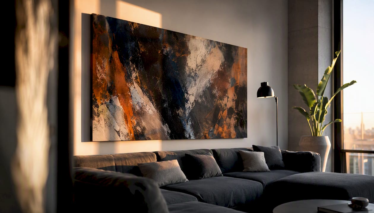
Here’s the short version: size your art to cover 60 to 75 percent of the furniture below it, hang the bottom edge 6 to 10 inches above that furniture, and center any piece on a blank wall at 57 to 60 inches from the floor. Then run it through the 60-30-10 color rule, where art plays the 10 percent accent role against your dominant wall color and secondary furniture tones. That’s the whole art and furniture pairing checklist in one breath. Everything else in this guide is the reasoning behind those numbers and the room-specific tweaks that make them work in your actual space.
Before you buy or hang anything, run through this:
- Measure the furniture piece the art will hang above (width and top-edge height).
- Decide your color strategy: echo the palette, contrast it, or go neutral.
- Pick the artwork’s job: focal point, supporting accent, or quiet blend.
- Choose a frame finish that either matches or intentionally contrasts your room’s metals and woods.
- Confirm your wall anchors are rated for the frame’s weight.
- Mock up the placement with paper before you drill anything.
- Step back and photograph it. A photo catches imbalance your eye tends to miss.
A ready-to-hang option, like the canvases Luxury Art Canvas produces in the USA across more than 1,000 designs, removes a few of these variables since sizing and hardware are already standardized.
Key Takeaways
Pairing art and furniture successfully comes down to three fixed numbers: 60 to 75 percent sizing, 6 to 10 inches of clearance above furniture, and the 60-30-10 color split.
| Point | Details |
|---|---|
| Size to the furniture | Art should span 60 to 75 percent of the furniture’s width below it. |
| Hang at the right height | Bottom edge 6 to 10 inches above furniture; center at 57 to 60 inches on blank walls. |
| Use the color rule | Apply 60-30-10, letting art carry the boldest 10 percent accent color. |
| Assign a role first | Decide focal point, supporting accent, or blend before you shop for size or color. |
| Simplify with ready-to-hang canvas | Luxury Art Canvas ships pre-sized, pre-mounted pieces that fit the two-thirds rule out of the box. |
Table of Contents
- Choose a Color Strategy: Echo, Contrast, or Neutral Anchor
- Should Art Match Furniture Style or Contrast It?
- How Do You Size Art to Fit Your Furniture?
- What Height Should You Hang Art Above Furniture?
- Frames, Mats, and Finishes That Tie the Room Together
- Is Your Art a Focal Point, an Accent, or a Blend?
- Room-by-Room Art and Furniture Pairing Recipes
- The Step-By-Step Pairing Checklist
- Why Ready-to-Hang Canvas Simplifies This Checklist
- Why Getting This Right Changes How a Room Feels
- Browse Ready-to-Hang Canvas Sizes Built for This Checklist
- Sources
Choose a Color Strategy: Echo, Contrast, or Neutral Anchor
Interior designers lean on the 60-30-10 rule for a reason: 60 percent of a room (walls, large furniture) sets the dominant tone, 30 percent (textiles, secondary furniture) supports it, and the remaining 10 percent, usually your art and accents, carries the boldest color. That last 10 percent is where most pairing decisions actually happen.
You’ve got three workable strategies:
- Echo: Pull a color directly from your upholstery, rug, or throw pillows into the artwork. This reads as calm and coordinated, though it can feel flat if every shade matches too closely.
- Contrast: Choose art from the opposite end of the color wheel. A cobalt abstract above a rust-colored sofa creates energy, but it demands confidence and a room that can handle visual tension.
- Neutral anchor: Go black-and-white or grayscale when your furniture already carries strong color. This works especially well against jewel-toned velvet sofas or patterned upholstery that would clash with anything louder.
Echo when you want the room to feel settled. Contrast when the space needs a jolt of personality. Neutral when the furniture is already the star.
Pro Tip: If a contrasting piece feels too jarring once it’s up, add a small pillow or throw in the art’s accent color. That single bridge often makes an aggressive pairing look deliberate instead of accidental.
Should Art Match Furniture Style or Contrast It?
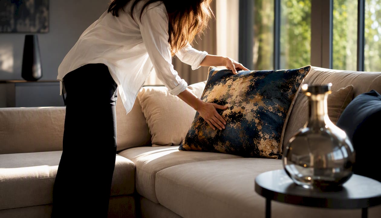
Harmony and contrast send different signals. Matching your art’s style to your furniture’s era and finish creates a calm, unified room. Deliberately breaking that pattern creates energy and makes both pieces more noticeable. Neither is wrong, but pick one on purpose.
A mid-century sofa with clean lines pairs naturally with bold abstract geometrics. An ornate antique chest, by contrast, often looks sharper next to a spare, contemporary landscape than it would beside another traditional piece. The tension flatters both.
Ask yourself three things before you commit:
- What mood am I actually going for: calm or dynamic?
- Is this furniture piece already the room’s hero, or does it need help?
- Does the room already have competing styles I need to unify, not multiply?
If you’re mixing eras, keep something consistent, like frame finish or a repeated color thread, so the contrast reads as intentional rather than mismatched.
How Do You Size Art to Fit Your Furniture?
The two-thirds rule is the backbone of proportion: artwork above a piece of furniture should span roughly 60 to 75 percent of that furniture’s width. A 90-inch sofa calls for art between 54 and 68 inches wide. A 60-inch console suggests something in the 36 to 45-inch range.
Follow these steps to measure correctly:
- Measure the full width of the sofa, console, headboard, or fireplace mantel.
- Multiply that number by 0.6 and by 0.75 to get your target art-width range.
- Measure the furniture’s height from floor to top edge, since this determines your hanging position later.
- For gallery groupings or triptychs, measure the combined width of the arrangement, including gaps, against the same 60 to 75 percent target.
- In rooms with ceilings above 9 feet, size up. A single oversized piece or a taller multi-panel arrangement reads better than a small canvas floating in excess wall space.
The two mistakes that undo an otherwise good room: art too small for its furniture, which looks like an afterthought, and art that overhangs a mantel, window trim, or other architectural feature it should respect.
What Height Should You Hang Art Above Furniture?
The numbers here aren’t negotiable if you want the room to feel professionally done. Professional consensus holds that the bottom edge of artwork should sit 6 to 10 inches above the top of the furniture beneath it, and on blank walls, the center of the piece belongs at eye level, about 57 to 60 inches from the floor. That 57 to 60 inch range is the same standard museums use for gallery installations.
A few adjustments matter in real rooms:
- Low ceilings or oversized furniture: shift toward the 6-inch minimum so the piece doesn’t crowd the ceiling.
- Very tall furniture, like a stacked bookcase or armoire: you may need to break the 57 to 60 inch rule since the furniture itself changes the room’s visual center.
- Built-ins: measure the visible wall segment independently rather than centering on the whole wall.
Use weight-rated anchors, not just a nail, for anything over a few pounds, and favor D-rings over a single wire hook for stability. For gallery walls, keep 2 to 3 inches between frames and cut paper templates to test the full layout on the wall before you commit to a single hole.
Pro Tip: Trace each frame onto kraft paper, tape the templates up, and live with them for a day. What looks right in a photo sometimes feels off in person, and paper costs nothing to reposition.
Frames, Mats, and Finishes That Tie the Room Together
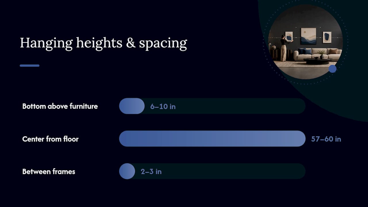
Frame finish is a faster way to connect art to a room than color ever is. Match your frame’s metal or wood tone to your furniture’s hardware, drawer pulls or table legs, and the pairing feels planned rather than coincidental. Want the art to pop instead of blend? Go opposite: a black metal frame against warm wood furniture reads crisp and modern.
Mats matter more than people expect. A wide mat, 3 to 4 inches, makes a small piece “read” larger against a big furniture item, buying you scale without buying a bigger canvas.
- Natural wood: warm, casual, pairs with mid-century and Scandinavian furniture.
- Black metal: sharp and modern, works against nearly any wood tone.
- Gilt: traditional and formal, best with antique or classic furniture.
- Floating frames: contemporary, ideal for canvas pieces that don’t need glass or a visible border.
Is Your Art a Focal Point, an Accent, or a Blend?
Decide this before you shop, because it changes everything else on your checklist. A focal point is a statement piece, usually large and above a sofa, meant to anchor the room. A supporting accent is smaller and echoes an existing textile or color, quietly reinforcing what’s already there. A blend sits somewhere in between, complementing finishes without demanding attention.
Ask yourself: does this wall need a hero, or does it already have one in the furniture itself?
- Focal point: go bigger, bolder in color, and place it where sightlines naturally land.
- Supporting accent: keep it smaller, muted, and closer in tone to nearby textiles.
- Blend: choose finishes and colors that tie the room’s existing elements together rather than introducing something new.
Role determines scale and color intensity before you even walk into a store.
Room-by-Room Art and Furniture Pairing Recipes
Living room, above the sofa: target 60 to 75 percent of sofa width, hang 6 to 10 inches above the frame’s top edge. For a standard 84-inch sofa, that’s roughly 50 to 63 inches of art.
Dining room: center the piece above the table, scaling width to the table’s length rather than the chairs. A long canvas above sofa spot works similarly here since the sizing math is the same.
Bedroom: treat art as a headboard substitute, sizing it to roughly match the bed’s width if there’s no headboard, or narrower if there is one.
Entryway: go vertical. Entry walls are usually narrow, and a tall, slim piece respects sightlines from the front door without crowding a console below it.
Fireplace mantels: leave the mantel surface visible; don’t let art crowd objects displayed there.
Console tables: account for lamps on either side, since they’ll compete with the art’s lower edge if you hang too low.
Lighting matters too: directional picture lights suit focal pieces, while ambient room lighting is usually enough for supporting accents. For more room-specific direction, luxury living room layouts and apartment-scale pairings cover smaller footprints where these numbers need extra flexibility.
The Step-By-Step Pairing Checklist
Work through this in order, and you’ll avoid the two most common failures: art that’s the wrong size and art that’s hung wrong.
- Measure your furniture’s width and the height from floor to its top edge.
- Multiply the furniture width by 0.6 and by 0.75 to get your target art-width range.
- Decide your color strategy: echo, contrast, or neutral anchor.
- Choose the artwork’s role: focal point, supporting accent, or blend.
- Select a frame finish that matches or intentionally contrasts your furniture’s hardware.
- Confirm your hanging hardware is rated for the piece’s weight, using D-rings for anything substantial.
- Cut a paper template to the art’s exact dimensions and tape it to the wall.
- Mark the spot where the bottom edge sits 6 to 10 inches above the furniture, or center at 57 to 60 inches on a blank wall.
- Hang the piece, then step back 8 to 10 feet and photograph it before calling it finished.
Pro Tip: Kraft paper or flattened cardboard boxes work just as well as expensive template kits. Cut them to size, tape them up, and live with the mockup for a full day before you commit to drilling.
Why Ready-to-Hang Canvas Simplifies This Checklist
Every rule above assumes you’re working with a piece of unknown weight, unknown hardware, and a frame you have to source separately. Ready-to-hang canvas removes those variables. Luxury Art Canvas produces pre-stretched, gallery-wrapped pieces across graffiti, pop art, black-and-white, and high-fashion-inspired designs, crafted in the USA with archival materials, backed by feedback from over 10,000 customers.
That consistency matters more than it sounds like it should:
- Every canvas ships with standardized, weight-rated mounting hardware, so you skip the guesswork on anchors.
- Sizes are listed upfront, which makes the two-thirds rule easy to apply before you buy instead of after.
- A floating or gallery-wrapped edge often works without a frame at all, simplifying the frame-finish decision entirely.
When you’re shopping, measure first, then pick a canvas size that already falls inside your 60 to 75 percent target rather than sizing up or down after the fact.
Why Getting This Right Changes How a Room Feels
A room where art and furniture actually talk to each other reads as intentional the second you walk in, even if a guest can’t say why. I’ve seen the same sofa look generic in one photo and striking in another, and the only difference was whether the art above it respected scale and color. Marina Abramović has argued that objects need intrinsic meaning, not just correct measurements. Use this checklist as your starting point, then let your own eye finish the job.
Browse Ready-to-Hang Canvas Sizes Built for This Checklist
Luxury Art Canvas solves the exact problem this checklist is built around: matching art size and hardware to your furniture without guesswork. Every piece ships pre-stretched with weight-rated mounting hardware already attached, so the sizing and hanging steps above take minutes instead of a trip to a frame shop.

If your sofa or console falls in a standard width range, the graffiti wall art collection offers sizes that map directly onto the 60 to 75 percent rule. For rooms with high ceilings or a fireplace wall that needs real presence, the large graffiti wall art sizes are built for exactly that kind of scale. Prefer bold color for a contrast strategy? The pop canvas line leans into saturated palettes that hold their own against neutral furniture. Measure your space, pick your color strategy from this guide, then browse sizes that already fit the numbers.
Sources
Recommended
- How to Make Every Room a Statement: The Interior Design Approach to Ar – Luxury Art Canvas
- Elevate Your Home Decor : Mixing and Matching Canvas Art for a Stunnin – Luxury Art Canvas
- Gallery Walls : Curating the Perfect Living Room Art Display – Luxury Art Canvas
- Wall Art Arrangement Ideas by Room: The Pro Hang Guide – Luxury Art Canvas
What Modern Office Interior Design Really Means
Presenting Pop Art to Conservative Clients Who Hesitate