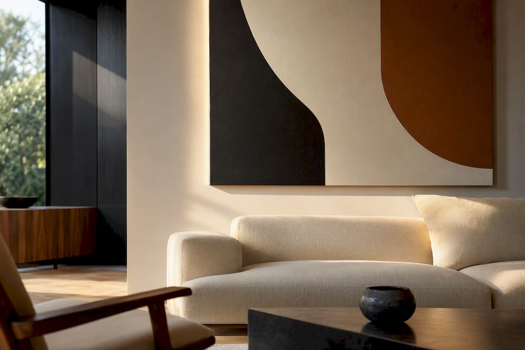
In this context, a mid century modern canvas isn’t a retro geometric print. It’s a luxury pop-art or graffiti museum-quality canvas, printed with archival giclée pigment inks on a properly built stretcher frame, made ready to hang straight out of the box. The smart move is to buy from a source that discloses its ink type, canvas weight, and stretcher bar construction upfront. Luxury Art Canvas builds to that standard in the USA, which makes it a solid starting point if you want the look verified before it ships.
Table of Contents
- What Makes a Canvas Museum-Quality?
- How Do You Style a Bold Canvas in a Refined Room?
- What Should You Ask Before Buying?
- How Do You Keep an Archival Canvas Looking New?
- Where Did Mid Century Modern Art Come From?
- What Themes Show Up Most in This Style of Canvas Art?
- How Does This Art Fit Different Interior Styles?
- Can You Customize a Mid Century Modern Canvas Print?
- Why Archival Builds Matter More Than the Design Itself
- Ready to Bring a Statement Canvas Into Your Space?
- Sources
What Makes a Canvas Museum-Quality?
The term “museum-quality” gets thrown around loosely, but it rests on three verifiable facts, not marketing language. A print earns that label through pigment-based inks, an archival substrate, and professional-grade finishing, not through a seller’s own confidence in the phrase.
Giclée printing uses microscopic droplets of pigment ink, laid down with far more precision and color depth than standard inkjet output. Pigment inks matter because they resist UV breakdown better than dye-based inks, which tend to shift and fade within a few years of regular light exposure. On pop-art and graffiti pieces, where color saturation carries the whole composition, that difference shows up fast.
The canvas itself should be a heavy cotton or cotton-poly blend, treated as acid-free so it doesn’t yellow or degrade from the inside out. Quality suppliers typically work in the 300 to 400 GSM range for premium canvas, a benchmark worth requesting directly from a seller rather than assuming.
Behind the canvas, the stretcher bars do more structural work than most buyers realize:
- Solid, kiln-dried wood resists warping far better than green or untreated lumber.
- Bar thickness matters on large formats. Thin bars flex and bow under tension, especially past 40 inches wide.
- Gallery-wrapped, hand-stretched construction with even tension prevents the rippling and puckering you sometimes see on mass-produced pieces.
- A protective coating adds a layer of defense against dust, humidity, and minor abrasion without dulling the finish.
Done right, a giclée print on archival materials can last 75 to 200 years under proper display conditions. Cheaper dye-based or polyester-blend prints fall well short of that window, sometimes visibly fading within a decade.
How Do You Style a Bold Canvas in a Refined Room?
A graffiti piece or a Chanel-motif canvas can dominate a room if you let it, and in the right space, that’s exactly the point. The trick affluent buyers and designers use is controlled contrast: let the art carry the color and energy, then quiet everything around it.
- Anchor the palette first. Pull one or two colors from the canvas and let them echo in a throw pillow, a vase, or a single accent chair. Don’t try to match everything.
- Size it deliberately. For a single statement piece above a sofa, aim for roughly two-thirds the width of the sofa. For a triptych, split that same footprint into three panels with even gaps of 2 to 3 inches between them.
- Temper the energy with texture. Velvet upholstery, matte plaster walls, and warm brushed metals absorb light rather than compete with it, which lets a loud canvas hold the room without overwhelming it.
- Give it breathing room. Bold pieces need negative space around them. Crowding a graffiti canvas next to busy shelving or patterned wallpaper flattens its impact.
Urban contemporary and graffiti work genuinely succeeds in luxury interiors when it’s used this way, as a deliberate contrast point rather than one more loud element in a loud room.
Lighting deserves its own attention. Canvas has a matte, textile-like surface that scatters reflections far better than glass or plexiglass, so it holds up in rooms with strong natural light without the glare problem framed prints often have. Direct sun exposure is still the enemy of pigment inks over time, so diffused daylight or angled accent lighting protects the piece while showing it off properly.
Pro Tip: Place large-format canvases at least three feet from any window that gets direct afternoon sun. The matte surface won’t glare like glass, but the pigment underneath still ages faster under direct UV exposure.
What Should You Ask Before Buying?
The gap between a genuinely museum-quality canvas and an inflated marketing claim shows up in specifics, not adjectives. Before you buy, get straight answers on five points.
- Ink type. Ask specifically for giclée pigment ink confirmation, not just “high-quality printing.”
- Canvas weight. Request the GSM figure. Sellers who can’t or won’t state it are often working with lightweight, non-archival material.
- Stretcher bar specs. Solid kiln-dried wood, stated thickness, and gallery-wrap construction should all be disclosed without you having to dig.
- Coating and lightfastness. A seller confident in their materials will state a lightfastness rating or fade-resistance claim rather than a vague “long-lasting” promise.
- Country of manufacture. Production location affects both quality control and turnaround time for repairs or replacements.
Ask for a close-up sample image or swatch before committing to a large or custom piece, and confirm return and framing policies in writing. Premium pricing on a well-built canvas reflects real costs. Archival pigment inks, heavier canvas stock, hand-stretching labor, and kiln-dried lumber all cost more than their cheap counterparts, and that cost shows up in the final price. Treating the purchase as an investment first, then comparing style, keeps you from paying premium prices for budget materials.
Vague answers are the biggest red flag. If a seller can’t tell you the GSM, the ink type, or where the piece was made, assume they don’t know, or don’t want you to.
How Do You Keep an Archival Canvas Looking New?
A well-built canvas is durable, but it still needs basic care to hit its full lifespan. The rules are simple and mostly about avoidance rather than active maintenance.
- Keep it out of direct sunlight and away from heat sources like radiators or fireplace mantels.
- Monitor humidity. Swings between very dry and very humid conditions stress both the canvas and the wood stretcher bars over time.
- Hang at eye level, generally with the center of the piece around 57 to 60 inches from the floor.
- Dust gently with a soft, dry cloth or a soft brush attachment. Never use solvents, glass cleaner, or abrasive materials on the surface.
- If you notice sagging or rippling, consult a professional framer about re-stretching rather than attempting it yourself.
Kiln-dried stretcher bars with correct tensioning remain the strongest practical defense against long-term sagging on large-format pieces. Under reasonable indoor conditions, away from direct sun and excess humidity, a properly made pigment giclée canvas can hold its color and structure for 75 to 200 years, a lifespan most furniture and framed prints never approach.
Where Did Mid Century Modern Art Come From?
The style traces back to the design explosion of the 1940s through the 1960s, when postwar optimism collided with new manufacturing techniques and a hunger for clean, forward-looking visuals. Artists and designers of that era leaned into flat color fields, geometric abstraction, and a rejection of ornate detail in favor of confident simplicity.
That same instinct toward bold flat color and confident graphic composition is exactly what carries through into today’s pop-art and graffiti canvas work. Andy Warhol’s screen prints and the commercial-art aesthetic of the 1960s established the template: take an image everyone recognizes, saturate it in unexpected color, and repeat or distort it until it becomes something new. Graffiti art picked up that same energy decades later, trading brand logos and soup cans for street-level symbols, tags, and cultural commentary rendered with the same graphic confidence.
Fashion houses have leaned into this overlap deliberately, translating runway prints and logo motifs into home decor as a legitimate design category rather than a novelty. A Chanel-inspired canvas or a Louis Vuitton-motif piece isn’t retro nostalgia. It’s a direct descendant of the same pop-art lineage, updated for a buyer who wants their walls to say something specific about taste and status.

What Themes Show Up Most in This Style of Canvas Art?
Certain motifs recur constantly across pop-art and graffiti canvas collections, and recognizing them helps you shop with intention instead of impulse.
High-fashion branding sits at the top of the list right now. Logos and motifs from houses like Chanel, Louis Vuitton, Dior, and Hermès get reinterpreted through bold color blocking and graphic repetition, turning recognizable luxury symbols into wall-scale statements.
Street art and graffiti lettering form the second major category, often drawing visual language from tag culture and stencil work, sometimes referencing well-known street artists like Banksy for social or political edge. Cultural icons, from music legends to film stars, get the same pop-art treatment: bright color overlays, halftone dot patterns, and high-contrast repetition.
Motivational and typographic pieces round out the category, pairing bold single words or short phrases with graphic backgrounds for a punchier, more direct statement than traditional framed quotes. Black-and-white photography and abstract compositions also show up frequently as counterpoints, used to balance out brighter, louder pieces elsewhere in a room.
How Does This Art Fit Different Interior Styles?
Bold pop-art and graffiti canvases read differently depending on what’s around them, which is exactly why they work across such a wide range of interior styles.
In a minimalist or contemporary space, a single oversized canvas becomes the entire personality of the room. Keep walls, furniture, and flooring neutral, and let one branded or graphic piece do all the talking. In an industrial loft, graffiti canvases feel native rather than jarring. Exposed brick, black steel fixtures, and concrete flooring already share the same raw, urban energy, so the art fits the architecture instead of fighting it.
Traditional or transitional interiors benefit most from the controlled-contrast approach: pair one bold canvas against classic furniture silhouettes and warm wood tones, using it as the single unexpected note in an otherwise conventional room. A quieter, more minimalist companion piece elsewhere in the same space, like a simple line drawing, helps balance the visual weight without diluting the statement piece.
For corporate or hospitality spaces, oversized branded canvases or graffiti triptychs work well in lobbies and lounges where the goal is a memorable first impression rather than subtlety. Scale and confidence matter more than restraint in those settings.
Can You Customize a Mid Century Modern Canvas Print?
Customization has become standard practice for buyers who want a piece that fits a specific wall, palette, or brand identity rather than settling for whatever ships off the shelf.
Size customization is the most common request, letting a triptych or single panel match an exact wall dimension instead of forcing a room to accommodate a standard size. Color proofing comes next: designers frequently request sample swatches or digital proofs so a canvas echoes specific undertones already present in marble countertops, upholstery, or metal fixtures, rather than clashing with them.
Framing and mounting options add another layer of flexibility, from floating frames to traditional gallery wraps, depending on whether the room calls for a finished, boxed look or a raw canvas edge. Businesses often go a step further, requesting brand-aligned color palettes or custom cropping on licensed-style motifs to match office branding or a hospitality property’s existing design language.
The common thread across all of these requests is the same principle that applies to buying off the shelf: a seller who can execute custom sizing and color matching with real precision is working with real archival materials in the first place. Vague promises don’t survive a custom order.
Why Archival Builds Matter More Than the Design Itself
Everyone gets excited about the image on a canvas, the Chanel motif, the graffiti tag, the Warhol-style color treatment, and almost nobody asks what’s actually holding that image together. That’s backwards. A stunning design on a thin, dye-printed canvas with flimsy pine stretcher bars is a five-year investment dressed up as a permanent one.
Some companies build pieces the way this article recommends buying: archival pigment inks, USA-made production, and stretcher construction meant to hold tension for decades rather than months. That’s not a marketing checklist, it’s the same criteria we’d want you to demand from anyone selling you wall art at this price point. If you’re weighing a bold branded or graffiti piece for a serious space, look at the curated collections and ask about framing options before you commit to a size.
The honest answer to “why does this cost more than the print shop down the street” is almost always material and labor, not markup theater.
— James
Ready to Bring a Statement Canvas Into Your Space?
If you’ve read this far, you already know what separates a piece that holds its color for decades from one that fades by next summer. Some sellers build canvases in the USA with archival pigment inks and hand-finished stretcher bars, so the specs you’d ask any seller for are sometimes the standard rather than an upgrade you have to request.
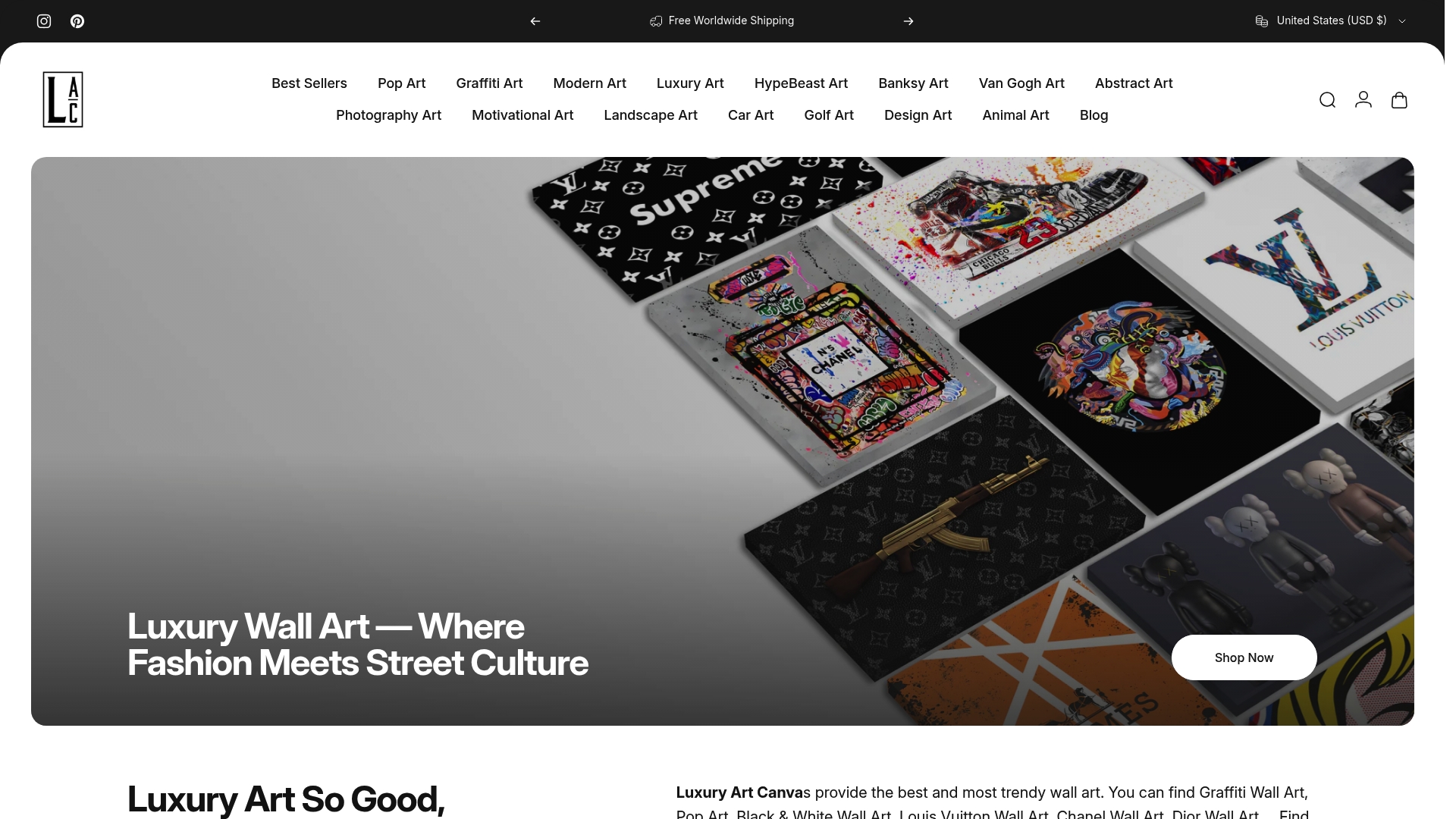
Browse the Louis Vuitton canvas art collection if you want a branded motif with real presence, or head to the graffiti wall decor selection for urban pieces built to anchor a room the way this guide describes. Every listing includes sizing details, and you can reach out directly for swatch samples or custom framing before you buy. Pick your piece, confirm the size against your wall, and place the order. The canvas ships ready to hang.
4 Office Wall Art Ideas for Leased Spaces, Room by Room
4 Checks Before Ordering a Banksy Inspired Canvas