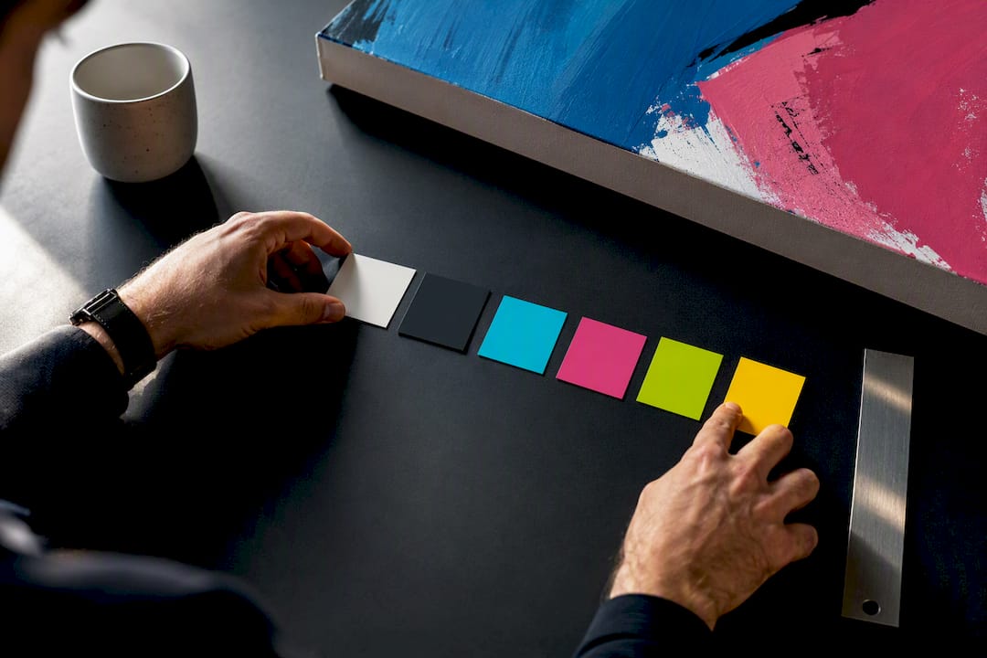
Pop art color palettes pair high-saturation primaries and neons with hard black-and-white anchors, and that contrast is what makes the style instantly readable from across a room. This guide gives you twelve ready-to-use palettes with HEX codes you can drop straight into your design tool, plus the quick rules for applying them to posters, screens, and canvas without losing punch.
Table of Contents
- Pop Art Color Palettes You Can Copy Right Now
- How to Build Your Own Pop Art Color Combinations
- Applying Pop Art Palettes to Print, Screen, and Wall Art
- Luxury Art Canvas Perspective: Palettes That Actually Hang Well
- Sources
Pop Art Color Palettes You Can Copy Right Now
Each palette below lists several HEX codes and a one-line note on where it works best, which is the format most designers actually reach for when they need something fast instead of another mood board. Classic pop art color combinations lean on primaries, neons, and a near-black or white anchor for clarity and readability, so most of these palettes anchor at least one saturated pairing with a neutral.
-
Classic Comic:
#FF0000(fire red),#0057E7(comic blue),#FFDD00(sun yellow),#000000,#FFFFFF. Best for hero posters and cover art where you want instant Ben-Day-dot energy. -
Warhol Neon:
#FF6EC7(electric pink),#39FF14(acid lime),#00BFFF(sky cyan),#F2E900(screaming yellow). Works for portrait-style canvases with repeated grid panels. -
Retro Diner:
#E63946(cherry red),#F1FAEE(cream white),#457B9D(chrome blue),#1D3557(deep navy). A softer option for kitchen or dining-room wall art. -
Neon Bubblegum:
#FF33CC(bubblegum pink),#00E5FF(aqua flash),#FFF200(highlighter yellow),#0D0D0D(near-black). Great for youth-brand branding or accent walls. -
Noir Comic:
#000000,#FFFFFF,#FF1744(accent red),#FFEB3B(accent yellow). Maximum contrast; this is the palette to reach for when legibility matters more than variety. -
Miami Vice:
#FF61A6(flamingo),#00D9C0(teal),#3D2C8D(violet),#F7F3E3(sand white). Fits vaporwave-adjacent canvases and lounge or bar decor. -
Candy Cyan Magenta:
#00FFFF,#FF00FF,#FFFF00,#111111. A CMY-inspired trio for UI accent systems that need instant recognition. -
Studio Bright Basics:
#FFDD00(vivid gold),#FF2366(deep pink),#00C8FF(vivid cyan),#FF6600(pure orange),#000000. This exact five-color combination is a balanced starting point if you want warmth and cool tones in one set. -
Soft-Pop Pastels:
#FFB5C0(blush),#B8E1FF(baby blue),#FFF3B0(butter),#4A4A4A(charcoal, not pure black). A gentler entry point for readers who want pop art energy without the visual shock. -
Atomic Lime on Navy:
#0B1D51(deep navy),#CBFF00(atomic lime),#FF3D68(hot coral),#FFFFFF. Navy replaces black as the anchor here, which reads slightly more sophisticated on large canvases. -
Pop Sunset:
#FF5E5B(coral red),#FFB84C(tangerine),#F9DC5C(amber yellow),#231651(plum black). Suited to warm living-room or loft settings. -
Halftone Remix:
#D7263D(halftone red),#02182B(ink navy),#FAF3DD(paper white),#F9C80E(dot yellow). Built for texture work where dot patterns and grain do most of the visual lifting.
Notice the pattern: nearly every palette pairs two or three loud hues with one quiet anchor. That’s not an accident. It’s the structural rule behind almost every successful pop art color scheme.
How to Build Your Own Pop Art Color Combinations
You don’t need twelve palettes memorized. You need three rules, applied consistently.
- Use the 3-color rule. Pick one hero color (the loudest, most attention-grabbing hue), one secondary color (a supporting saturated tone), and one neutral (black, white, or near-black). Design guides on pop art palettes consistently recommend limiting saturated colors to a small number and letting neutrals carry the structural weight, like type and outlines.
- Apply 60-30-10. Give your neutral roughly 60% of the visual space, your secondary color 30%, and your hero color the remaining 10% as a punch of focus. Flip that ratio and everything competes for attention at once.
- Use outlines and halftone texture to separate colors. Thick black strokes or dot-pattern shading (a direct nod to Ben-Day dots) keep adjacent saturated hues from bleeding into each other visually.
Pro Tip: Limit yourself to one “shock” accent color per composition, like an electric lime or hot pink, and reserve it strictly for highlights. Curated palette lists consistently warn against pairing two vibrating neons side by side without a dark anchor between them; test the combination on both a phone screen and a printed sheet before committing, since screen glow and paper absorption read very differently.
Applying Pop Art Palettes to Print, Screen, and Wall Art
Where you’re outputting the palette changes which colors actually survive.
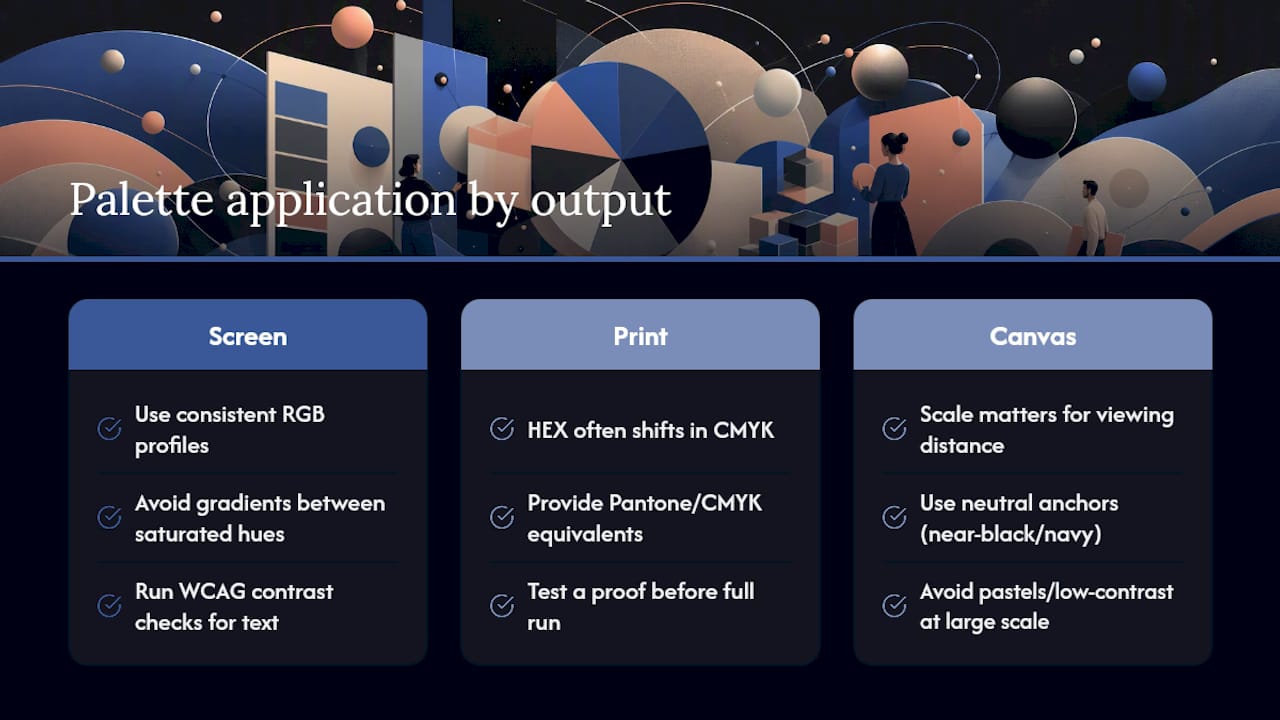
On screen, stick to consistent RGB color profiles and skip gradients between saturated hues. Gradients soften the hard edges that give pop art its punch, and a soft edge undercuts the whole point of the style. Run a basic WCAG contrast check on any text sitting over a bright field. Yellow-on-white or cyan-on-white text fails legibility fast, even when the palette looks great as a swatch.
In print, pure neon HEX values often shift when converted to CMYK, especially electric pinks and limes, which is why some resources publish Pantone and CMYK equivalents alongside HEX for print production. Test a proof before committing to a full run, and be ready to swap the true neon for a slightly muted printable substitute.
On canvas, scale matters more than most people expect. Palettes with strong neutral anchors, like Noir Comic or Atomic Lime on Navy, hold their shape at large sizes and from across a room, because pairing neons with a near-black or deep navy anchor preserves readability even when the piece is viewed from a distance. Pastel or low-contrast palettes tend to wash out on oversized canvases and read better at smaller, closer-viewed scales.
Luxury Art Canvas Perspective: Palettes That Actually Hang Well
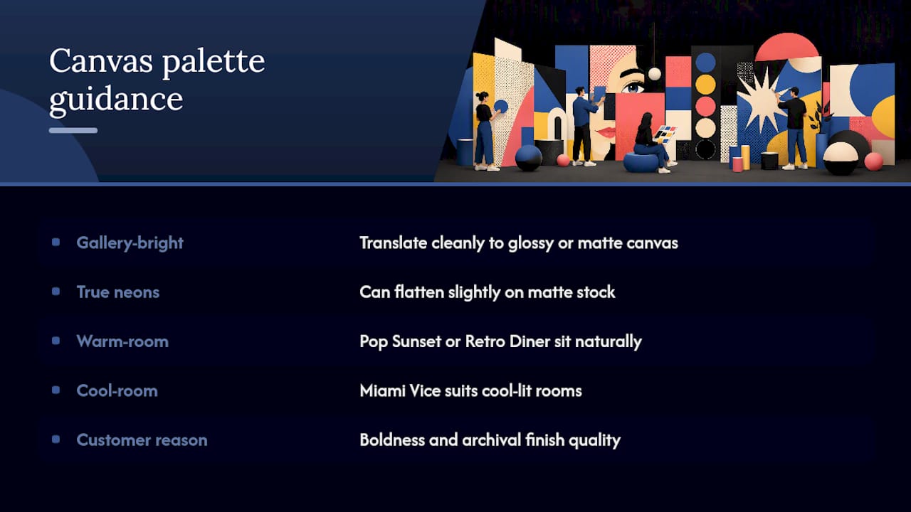
Canvases produced in the USA with archival inks, across many designs, reveal which palette families hold up on a wall versus a screen. Gallery-bright combinations like Classic Comic and Studio Bright Basics translate cleanly to a glossy or matte canvas finish. True neons, on the other hand, can flatten slightly on matte stock, which is worth knowing before you commit a whole wall to one.
If your room leans warm and wood-toned, Pop Sunset or Retro Diner will sit more naturally than a cold Miami Vice palette. Match the room’s light temperature first, then the furniture.
Customers consistently point to the boldness and finish quality of our colorful pop art canvas pieces as the reason they hang one instead of a print.
— James
Ready to put one of these palettes on your own wall? Browse the pop canvas collection or the broader pop art canvas lineup for pieces built around exactly this kind of high-contrast, saturated color work. If you’re planning around a specific room, our notes on pop art decor for small spaces and this rundown of current interior door trends can help you coordinate the palette with the rest of the room before you commit to a size.
Sources
- The 20 Best Pop Art Color Palette Ideas + Hex Codes
- Color palette Pop Art — 5 harmonious colors | Crazy Colors
15 Fashion Logo Wall Art Ideas on US Made Museum Quality Canvas
Photographers: Use 150 PPI, Not DPI, for Sharp Canvas Prints