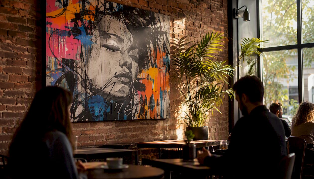
Bold art belongs in hospitality interiors because it creates immediate focal points that strengthen brand identity, shape guest mood, and generate the kind of shareable moments that drive organic marketing. When you specify it correctly, it does more work per square foot than almost any other design element.
Here is the short case for stakeholders:
- Brand anchor: A well-chosen piece communicates brand personality before a guest reads a single word of copy.
- Mood and dwell time: Strong visual stimuli shift emotional tone and encourage guests to linger, which lifts per-visit spend.
- Social shareability: Striking installations become self-generated content; guests photograph and post them without being asked.
- Wayfinding: Large-format works at decision points guide circulation without signage clutter.
- Perceived value: Home-staging research shows that spaces with statement art can achieve 1%–10% higher perceived value, a signal that translates directly to rate positioning in hospitality.
The one-line takeaway for any stakeholder presentation: Bold art is not decoration; it is a brand layer that pays for itself in guest engagement and perceived quality.
Key Takeaways
Bold art in hospitality interiors functions as a strategic brand layer that drives guest engagement, social sharing, and perceived value when specified at schematic phase with correct scale, lighting, and materials.
| Point | Details |
|---|---|
| Specify art at schematic phase | Art integrated early aligns with scale, lighting, and joinery; late procurement produces disjointed results. |
| Scale up for impact | Feature-wall pieces should cover 60%–75% of wall width; single pieces above furniture need at least two-thirds of the furniture’s width. |
| Match material to zone | Use archival canvas for lobbies and dining; acoustic fabric panels for bars; framed acrylic for high-traffic corridors. |
| Commission for permanence, print for flexibility | Originals suit flagship zones; licensed digital masters on archival canvas suit multi-location rollouts and high-wear areas. |
| Luxuryartcanvas for fast-turn hospitality installs | Over 1,000 USA-fabricated designs in graffiti and pop art styles, ready to hang, with reorder capability for ongoing maintenance. |
Table of Contents
- 1. Why bold art works in hospitality: psychology and commercial payoff
- 2. How bold art functions as a strategic brand layer
- 3. Where bold art delivers the most return, and where to pull back
- 4. Design rules for scale, placement, contrast, and breathing room
- 5. Materials, durability, cleaning, and safety for commercial installations
- 6. How to source and budget for bold art in hospitality projects
- 7. Mini case studies: bold art driving measurable outcomes
- 8. Implementation checklist: from spec to handover
- 9. How to commission bold art that reflects local culture and your guest demographic
- 10. Lighting techniques that make bold artwork perform
- 11. Trend longevity versus timeless choices: how to invest wisely
- A specifier’s perspective on bold art in hospitality
- Luxuryartcanvas delivers ready-to-hang art built for hospitality
- Sources
1. Why bold art works in hospitality: psychology and commercial payoff
The mechanism is straightforward. Bold art hijacks the attention economy the moment a guest enters a space. High-contrast color, unexpected scale, or culturally loaded imagery triggers the brain’s orienting response, which means guests form a memory of the space within seconds. That memory is what drives return visits and word-of-mouth.
Focal-point theory explains the rest. A room without a clear visual anchor feels unresolved; guests scan restlessly and leave sooner. A strong piece stops that scan, creates a moment of engagement, and anchors the entire room composition around it. Curated artwork in commercial spaces increases perceived brand value and loyalty, with design agencies citing emotionally resonant art as a driver of guest recognition and repeat visitation, referencing an Ipsos study on experience-driven design.
On the commercial side, the benefits stack up quickly:
- Guests photograph bold installations and post them, generating UGC that reaches audiences the property never paid to reach.
- Statement art raises perceived quality of the surrounding space, which supports premium pricing.
- Distinctive art creates a sense of place that generic FF&E cannot replicate, reducing the risk of brand commoditization.
- Bespoke murals and mixed-media commissions become the most photographed moments in a venue. They drive social sharing and distinctiveness that functions as free marketing.
Pro Tip: Before the next ownership meeting, pull three recent guest reviews and count how many mention a specific visual element. If none do, the space has no memorable anchor — that is the gap bold art fills.
2. How bold art functions as a strategic brand layer
Treat art as a brand layer, not a procurement line item. That shift in framing changes everything about how you specify it.
When art is planned in the schematic design phase rather than procured late, it integrates with scale, lighting, and joinery instead of fighting them. Late-stage art procurement almost always produces pieces that are the wrong size, the wrong tone, or disconnected from the brand narrative the rest of the interior is building.
A practical alignment checklist for schematic phase:
- Brand story extraction: Identify two or three narrative threads the property wants to own (local history, craft heritage, a cultural scene) and brief artists against those threads.
- Motif extraction: Pull recurring shapes, colors, or textures from the brand identity and translate them into art direction notes.
- Provenance and local sourcing: Decide early whether local artists or site-specific references are part of the brand story; this affects commissioning timelines significantly.
- Tone of voice: Map the emotional register (playful, authoritative, raw, refined) so every piece in the collection reads as authored rather than assembled.
For multi-location brands, creating a master library of bespoke works and digitizing them gives consistency across properties while allowing local variations in scale and colorway. A licensed digital master can be reprinted at any size, on any substrate, without re-commissioning the original artist each time.
Commissioned originals and licensed digital masters serve different goals. Originals carry provenance and storytelling weight; they are the right choice for flagship properties where authenticity is a selling point. Licensed masters are the right choice for rollouts where consistency and speed matter more than uniqueness.
Pro Tip: Build an art library document at schematic phase: a shared folder containing high-resolution masters, color profiles, approved substrates, and installation specs. Facilities teams can reorder or replace pieces in hours rather than weeks.
3. Where bold art delivers the most return, and where to pull back
The highest-impact zones in any hospitality property are the ones where guests pause, wait, or make a first impression.
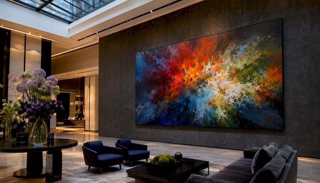
Lobby and arrival path. This is the non-negotiable location. A large-format piece on the primary sightline from the entrance sets the entire emotional tone of the stay. It also gives arriving guests something to photograph immediately, seeding social content before they reach the front desk. For bold wall art statement pieces in lobbies, scale matters more than almost any other variable.
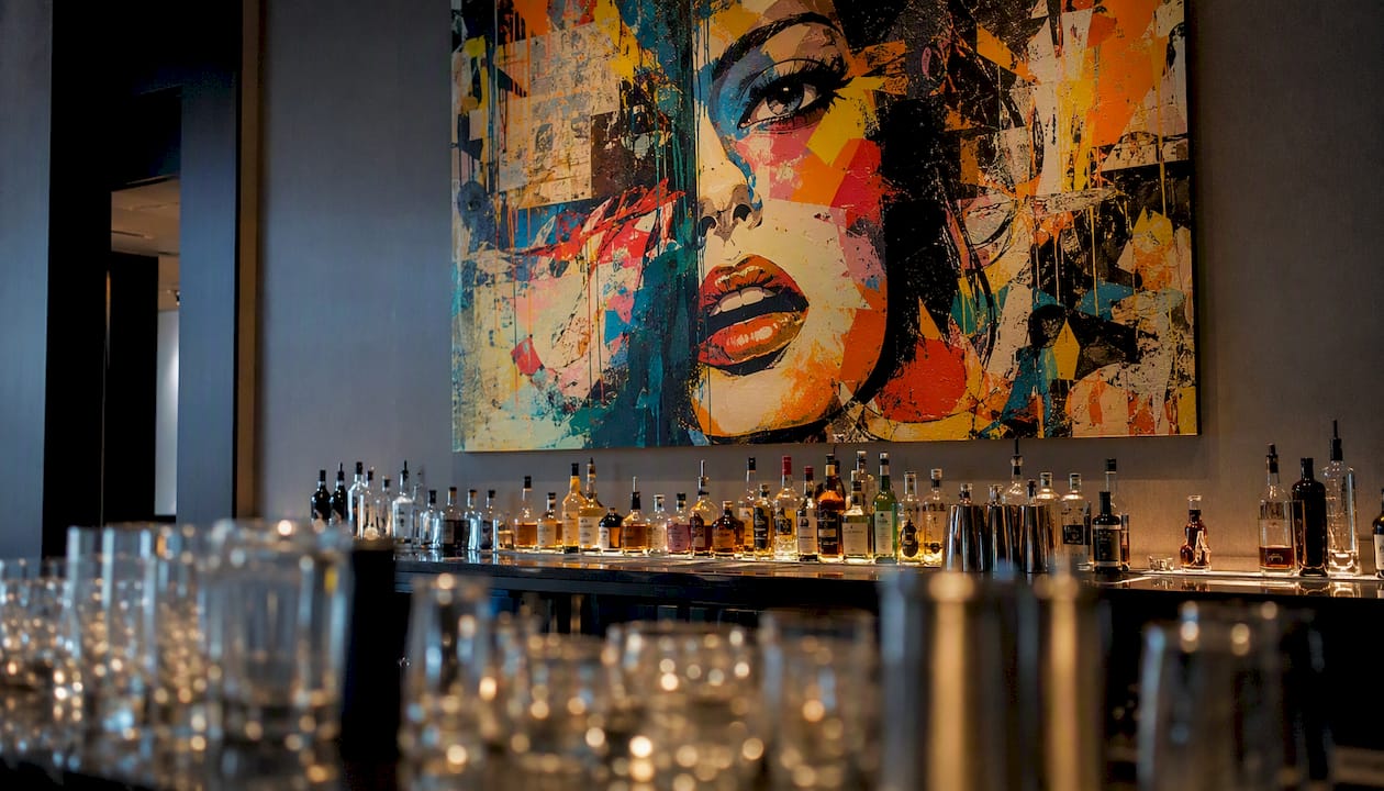
Bar and lounge. Guests at a bar have time to look. A bold piece behind the bar or on the facing wall becomes a conversation starter and a backdrop for every drink photo posted to social media. The bar is also a zone where edgier, more provocative art reads as intentional rather than jarring.
Restaurant feature wall. One strong piece on the wall guests face from the majority of seats does more than a gallery arrangement across four walls. It creates a shared visual experience and a consistent backdrop for food photography.
Photogenic nooks and corridors. Dedicated “moment walls” in corridors or near elevators are low-cost, high-return installations. Guests seek them out specifically for photography, and the resulting posts carry the property’s visual identity into social feeds organically.
When to pull back. Guest rooms, particularly in properties targeting business travelers or wellness-focused guests, benefit from restraint. A room that needs to function as a sleep environment should not compete with a bold piece for attention. Substitute scaled-down works in tonal palettes, or use a single medium-format piece on one wall with three walls left clear. Small, tight foyers with low ceilings are another case for restraint; an oversized piece in a compressed space reads as oppressive rather than dramatic. Culturally sensitive contexts require careful vetting of imagery, particularly in international properties where symbolism carries different weight.
4. Design rules for scale, placement, contrast, and breathing room
Start with the wall, not the artwork. Measure the wall’s width and height, identify the primary sightline from the room’s main seating or entry point, and note any competing visual elements (windows, joinery, signage). Those three inputs determine the correct scale before you open a single catalog.
Scale guidance:
- For a feature wall, a single piece or grouped installation should cover roughly 60%–75% of the wall’s width to read as intentional rather than undersized.
- A single canvas above a sofa or banquette should span at least two-thirds of the furniture’s width; narrower pieces float awkwardly.
- In double-height lobbies, scale up aggressively. A piece that looks large in a showroom will read as small against a 20-foot wall.
Placement height:
- The standard center-height rule for gallery hanging is 57–60 inches from the floor to the artwork’s center, which aligns with average eye level.
- In dining settings where guests are seated, drop the center height to 48–52 inches so the piece reads correctly from a chair.
- In corridors, align the center with standing eye level (57–60 inches) and maintain consistent height across all pieces to create a clean sightline.
Color and contrast:
- Bold art leads visually and requires breathing room; neutral surroundings act as a frame rather than competition. A bold piece on a painted or textured neutral wall reads more powerfully than the same piece surrounded by pattern or competing color.
- Harmonize the art’s dominant hue with one accent in the furniture or textile palette; this creates cohesion without making the piece feel decorative.
- Avoid placing two bold pieces on adjacent walls in the same room; the result is visual noise rather than impact.
Breathing room:
- Leave at least 8–12 inches of clear wall on each side of a statement piece. In larger spaces, 18–24 inches is better.
- Keep the space between a grouped installation’s individual pieces tight (2–4 inches) so the group reads as a single composition rather than a scattered collection.
Pro Tip: *Before committing to a final piece, use a digital mockup tool or a scaled print taped to the wall to test the composition.
5. Materials, durability, cleaning, and safety for commercial installations
Material choice is a function of zone, not aesthetics. A piece that looks identical in two different substrates can have radically different maintenance and longevity profiles depending on where it hangs.
| Material | Durability | Cleanability | Cost Profile | Best Hospitality Zones |
|---|---|---|---|---|
| Archival canvas (gallery-wrapped) | High with UV-resistant inks | Dry dusting; spot-clean with mild soap | Mid to high | Lobby, corridors, dining rooms |
| Acoustic fabric panel (printed) | High; fabric absorbs impact | Vacuuming; limited spot-clean | Mid | Bars, lounges, conference spaces |
| Vinyl mural (wall-applied) | Medium; susceptible to edge lift | Damp wipe | Low to mid | Feature walls, photogenic nooks |
| Framed print under acrylic | Very high; acrylic protects surface | Damp wipe on acrylic face | Mid | High-traffic corridors, restrooms |
| Ceramic or tile mural | Very high; permanent | Standard tile cleaning | High | Pool areas, kitchens, exterior |
High-resolution digital masters printed to acoustic fabrics let designers integrate artwork with sound control, preserve brand color grading, and simplify multi-site rollouts. In a bar or lounge where noise management is a real operational concern, this substrate choice solves two problems at once.
Maintenance schedule basics:
- Dry dust canvas and framed works monthly.
- Inspect mounts and fixings quarterly, particularly in high-humidity zones.
- Spot-clean any surface within 24 hours of a spill; delayed cleaning sets stains permanently on most substrates.
- Schedule a full condition review annually and document it for insurance purposes.
Fire and safety notes: In the United States, commercial installations in public spaces must comply with NFPA 101 (Life Safety Code) requirements for surface flammability. Specify substrates with a Class A or Class B flame-spread rating for any piece in a corridor, lobby, or dining room. Acoustic fabric panels from reputable suppliers typically carry NFPA 701 certification for flame resistance. Mounts must be rated for at least twice the artwork’s weight; in seismic zones, use anti-tip security hardware.
Pro Tip: For sustainable material choices that also meet hospitality durability standards, sustainable interior design approaches increasingly favor recycled-content substrates and water-based inks that hold color without off-gassing in enclosed spaces.
6. How to source and budget for bold art in hospitality projects
The sourcing decision comes down to one question: does this property need a one-of-a-kind story, or does it need a consistent, reproducible brand asset?
When to commission originals: Flagship properties, properties where local cultural narrative is a core brand pillar, and any space where the art will be featured in press or marketing materials. Originals carry provenance that prints cannot replicate.
When to use high-quality prints or licensed masters: Multi-location rollouts, renovation projects with compressed timelines, and spaces where the art needs to be replaced periodically due to wear or brand refresh cycles. A licensed digital master printed on archival canvas at the correct size is indistinguishable from an original to most guests.
Typical budget brackets (U.S. market):
- Ready-to-hang large-format canvas: $200–$800 per piece depending on size and fabrication quality.
- Local artist commission (original): $2,000–$15,000+ depending on artist profile, size, and complexity.
- Site-specific mural (painted): $5,000–$50,000+ depending on wall area, artist, and surface preparation.
- Licensed digital master with multi-site rights: $1,500–$8,000 for the license; print/fabrication costs vary by substrate and size.
Timeline callout: Commissioned originals typically require 8–16 weeks from brief to delivery. Printed canvases from a U.S. fabricator can ship in 2–4 weeks. Painted murals depend on wall preparation and artist availability; budget 4–10 weeks. Sequence art procurement alongside FF&E, not after it; late procurement is the single most common cause of installation delays.
Sourcing options:
- Local artists and art schools for site-specific commissions that build community narrative.
- Online platforms for licensed digital masters with clear commercial-use rights.
- Ready-to-hang retail suppliers for fast-turn installations and budget-conscious projects.
- In-house design teams for properties with strong brand guidelines who want full creative control.
Licensing checklist for facilities teams:
- Confirm the artist retains no moral rights that restrict installation or modification.
- Secure a written commercial display license for any licensed image.
- Clarify reproduction rights if the artwork will appear in marketing photography.
- Confirm the license covers all locations if the piece will be used across multiple properties.
- Document the license term and renewal conditions before installation.
For bold canvas art in hospitality, ready-to-hang options from U.S. fabricators reduce both lead time and logistical risk compared to importing large canvases internationally.
7. Mini case studies: bold art driving measurable outcomes
Lobby feature wall, boutique urban hotel. A 96-inch graffiti-style canvas was installed on the primary sightline from the entrance, replacing a generic landscape print. Within the first month, the piece appeared in guest posts across social platforms without any prompting from the property. The hotel’s marketing team reported a measurable increase in tagged location posts, which they attributed directly to the installation. The piece cost under $1,000 and required no specialist installation.
Bar program, independent restaurant group. A local street artist was commissioned to create a site-specific mural behind the main bar. The brief was tied explicitly to the neighborhood’s cultural history. The mural became the most photographed element in the space and was featured in two local editorial pieces, generating press coverage the property had not paid for. Commercial projects that commission local artists or site-specific murals increase perceived authenticity and drive shareable moments that function as free marketing.
Multi-location hotel brand, art library rollout. A mid-scale hotel group with 12 properties commissioned four original works for their flagship location, then digitized each piece into high-resolution masters. Each subsequent property received printed versions scaled to their specific wall dimensions, with colorway variations to reflect local context. The result was a consistent brand identity across all locations without re-commissioning original art for each site. Facilities teams could reorder replacement prints within days when pieces were damaged.
“Bespoke murals and statement installations become the most photographed moments in a venue, driving social sharing and distinctiveness that no amount of paid media can replicate.” Mix Interiors, on striking hospitality interiors
Corridor wayfinding, conference hotel. A series of large-format pop-art canvases was installed at each elevator bank on four floors, with a distinct color palette per floor. Guests navigated by color without needing to read floor numbers.
8. Implementation checklist: from spec to handover
Every art installation in a hospitality project should follow a documented sequence. This checklist covers the full arc from design intent to ongoing maintenance.
- Schematic phase inclusion (Designer): Add art zones to the schematic drawings with dimensions, sightline notes, and lighting positions. Do not leave art as a post-FF&E decision.
- Brief development (Designer + Owner): Write a one-page art brief per zone covering brand narrative, tone, scale range, substrate preference, and budget ceiling.
- Artist or supplier selection (Designer): Shortlist three options per zone; present with scaled mockups showing the piece in context.
- Digital mockup approval (Owner): Sign off on a scaled digital proof before any fabrication begins. This is the single step most often skipped and most often regretted.
- Material and substrate sign-off (Designer + Facilities): Confirm flame-spread rating, mount type, and cleaning protocol before ordering.
- Rights and licensing (Owner + Legal): Secure all commercial display licenses and reproduction rights in writing before installation.
- Fabrication and delivery (Supplier): Confirm lead times against the FF&E schedule; flag any risk of delay immediately.
- Lighting coordination (Designer): Specify luminaire type, beam angle, and color temperature for each piece before the electrical rough-in is complete.
- Installation (Installer): Use rated mounts; document mount type and load rating for each piece in the as-built record.
- Maintenance handover (Designer + Facilities): Deliver a one-page care sheet per piece covering cleaning method, inspection schedule, and reorder information.
Responsible parties at a glance:
- Designer: schematic inclusion, brief, mockups, lighting, material sign-off.
- Owner: brief approval, digital proof sign-off, licensing, budget authorization.
- Facilities: mount documentation, maintenance schedule, reorder management.
Pro Tip: The most common procurement mistake is ordering art after the electrical rough-in is complete. Lighting a bold piece correctly requires knowing its exact position before conduit is run. Lock the art zones in schematic phase and brief the electrical engineer at the same time.
9. How to commission bold art that reflects local culture and your guest demographic
The most memorable hospitality art programs are not the most expensive; they are the most specific. A piece that references the neighborhood’s history, a local craft tradition, or a cultural figure the guest demographic recognizes creates a sense of place that imported generic art never achieves.
Start by mapping your guest demographic against the cultural landscape of the property’s location. A boutique hotel in a neighborhood with a strong street-art scene has a different brief than a resort in a region known for textile craft. Neither is better; both are specific, and specificity is what makes art feel authored rather than assembled.
When briefing a local artist, give them genuine creative latitude within a defined framework. Prescribing every detail produces illustration, not art. The brief should define the emotional register, the scale, the color constraints, and the narrative thread, then step back. Artists who work with hospitality clients regularly understand how to translate a brand story into a visual language without being directed pixel by pixel.
For properties targeting international guests, consider commissioning work that is legible across cultural contexts. Abstract compositions, craft-based techniques, and material-driven work tend to travel better than figurative or text-heavy pieces that require cultural fluency to decode. Interior design trends consistently show that guests respond most strongly to art that feels specific to a place, even when they cannot articulate why.
Guest demographic research is also useful here. A property targeting design-literate millennials can commission work that references street culture, pop art, or fashion iconography. A property targeting corporate travelers may want something more restrained but still authored, perhaps a large-format abstract or a photographic series tied to the city’s industrial history.
10. Lighting techniques that make bold artwork perform
Lighting is the variable most often specified too late and most responsible for bold art underperforming. A piece that looked powerful in a gallery can read flat and dull under the wrong light.
Accent lighting is the baseline requirement for any statement piece. A dedicated luminaire aimed at the artwork, separate from the ambient lighting scheme, ensures the piece reads at full intensity regardless of the room’s general light level. Adjustable-arm track fixtures or recessed adjustable downlights give the flexibility to dial in the beam angle after installation.
Beam angle and throw distance determine how much of the piece is lit and how evenly. As a starting rule, a 15–25 degree beam angle works for pieces up to 48 inches wide; wider pieces need a wider beam or multiple fixtures. The throw distance (ceiling height minus artwork center height) affects the footprint; calculate it before specifying the luminaire.
Color temperature matters more for bold art than for neutral pieces. Warm white (2700K–3000K) enriches reds, oranges, and earth tones but can flatten cool blues and greens. Neutral white (3500K–4000K) renders a broader palette more accurately. For pieces with high chromatic saturation, a high Color Rendering Index (CRI 90+) luminaire is worth the additional cost; it renders the artist’s intended colors rather than a shifted version of them.
Grazing light works well for textured surfaces, including gallery-wrapped canvas with visible brushwork or raised ink. Positioning a fixture close to the wall and angling it nearly parallel to the surface throws texture into relief and adds dimensionality. For flat printed canvases, grazing light can reveal surface imperfections, so use it selectively.
Avoid direct overhead downlights aimed straight down at a piece hung on a vertical wall; the result is a hot spot at the top and a shadow at the bottom. Angle the fixture at 30 degrees from vertical as a starting point, then adjust on-site.
11. Trend longevity versus timeless choices: how to invest wisely
Bold art is not immune to trend cycles, and a piece that reads as current in 2026 can feel dated in five years if it is tied too closely to a passing aesthetic. The investment decision should account for this.
The clearest distinction is between style-driven bold art and content-driven bold art. Style-driven pieces, those whose appeal depends on a current graphic trend (a particular illustration style, a color palette that is everywhere this season), have a shorter shelf life. Content-driven pieces, those whose power comes from subject matter, cultural resonance, or craft quality, tend to age better.
For hospitality properties with long renovation cycles (10–15 years between full refurbishments), the safer investment is in content-driven work: site-specific commissions, pieces tied to local cultural narrative, or works by artists with an established critical profile. These pieces gain rather than lose meaning over time.
For properties that refresh more frequently, or for zones like bars and restaurants where the design brief changes with the concept, style-driven bold art is a reasonable choice. The key is to specify it on a substrate that allows cost-effective replacement: a printed canvas on a standard-size stretcher can be reordered and swapped in an afternoon.
Pop art and graffiti-influenced work occupy an interesting middle ground. The genre has been commercially and critically relevant for decades, and pieces that reference enduring cultural icons (fashion houses, street-art figures with global recognition) tend to hold their visual authority longer than pieces tied to a more ephemeral trend. Luxury brand art for modern spaces in this genre has demonstrated staying power precisely because the source material (Chanel, Louis Vuitton, Banksy-influenced work) carries cultural weight that transcends a single design cycle.
The practical rule: spend more on pieces in permanent or semi-permanent zones (lobby, restaurant feature wall) and treat high-traffic, high-wear zones (corridors, bar backs) as opportunities for more frequent rotation with lower per-piece investment.
A specifier’s perspective on bold art in hospitality
The conversation about bold art in hospitality usually starts in the wrong place. Owners ask “what should we put on the walls?” when the real question is “what do we want guests to feel, and what story do we want this space to tell?” Those two questions produce completely different briefs.
The most common mistake is scale. Designers who are new to hospitality work consistently underspecify scale, partly because residential instincts carry over and partly because large-format pieces look intimidating in a supplier’s catalog. A piece that fills a wall in a showroom photograph will look modest in a double-height lobby. When in doubt, go larger. The second most common mistake is timing: art specified after the electrical rough-in is complete almost always ends up lit incorrectly, because the luminaire positions were not designed around the art’s actual location.
The trade-off that rarely gets discussed honestly is between authenticity and operational convenience. Commissioned originals are more powerful, but they are harder to replace when damaged and impossible to replicate exactly. Printed canvases from a reliable U.S. fabricator are operationally simpler and can be reordered quickly, but they carry less narrative weight. For most hospitality projects, the right answer is a hybrid: one or two commissioned originals in the highest-visibility zones, and printed canvases everywhere else.
Luxuryartcanvas delivers ready-to-hang art built for hospitality
Hospitality projects need art that ships fast, installs without specialist labor, and holds up in high-traffic environments. Luxuryartcanvas produces museum-quality canvas art in the USA using archival inks and materials, with over 1,000 designs across graffiti, pop art, and high-fashion-inspired styles. Every piece arrives ready to hang.
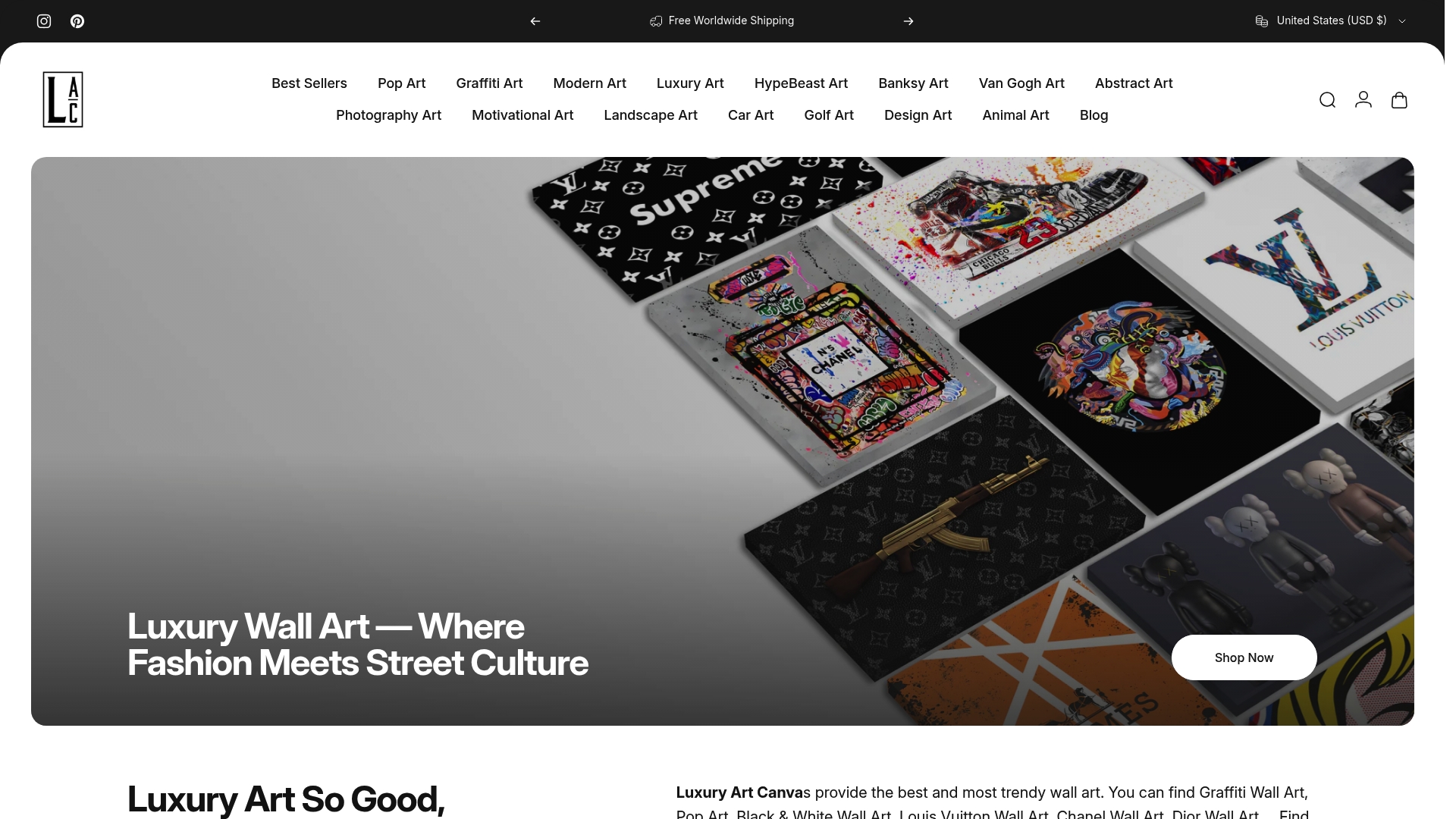
For lobby feature walls, large-format graffiti canvases deliver the scale and visual authority the space demands. For bars, dining rooms, and photogenic nooks, the pop art and graffiti collections offer bold color and cultural references that photograph well and hold guest attention. U.S. fabrication means lead times measured in days, not months, and reorders are straightforward when a piece needs replacing. Browse the full collection at Luxuryartcanvas and specify the pieces your next project needs.
Sources
- Beyond Decor: How Art Creates Identity in Commercial Interior Design — designbar
- Strategic Atmosphere: Aligning Visual Art with Hospitality Branding – Hospitality Art Service
- Why Bespoke Art Is a Strategic Advantage in Hospitality Design
- Bold Wall Art: The Complete Guide to Transforming Your Space with Statement Pieces - the decorholic
- The Home Décor Guide to Choosing Bold vs. Neutral Art — The Reader Stone
- The bold and the beautiful: six striking interiors that don’t …
How Street Art Became Fine Art: History and Market Forces