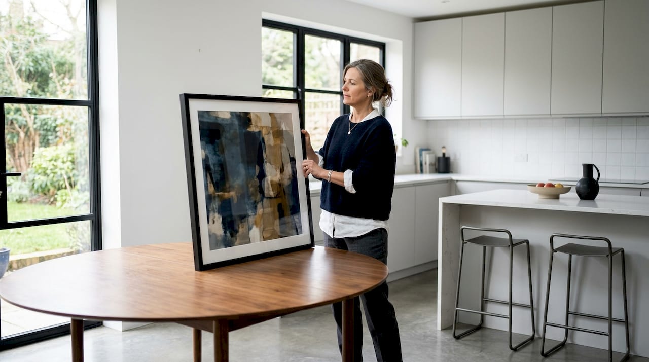
Dining room wall art placement is the practice of positioning artwork in precise alignment with your dining table, at a height calibrated for seated viewers, to create visual harmony across the entire space. Most decorators treat it as an afterthought. The ones who get it right treat it as a structural decision, no different from choosing the right table size. The professional standard places artwork center at 54–57 inches from the floor in dining rooms, which is lower than the general 57–60 inch gallery standard. That difference exists because your guests are seated, not standing. Getting dining room artwork placement right changes how the whole room feels, and this guide gives you the exact measurements, scaling rules, and style principles to do it properly.
What is dining room wall art placement, and why does height matter most?
Height is the single most consequential decision in dining room artwork placement. Hanging art too high disconnects it from the furniture below and fragments the room into two unrelated zones. The fix is straightforward: lower the center of your artwork to 54–57 inches from the floor, not the standard 57–60 inches used in hallways or living rooms.
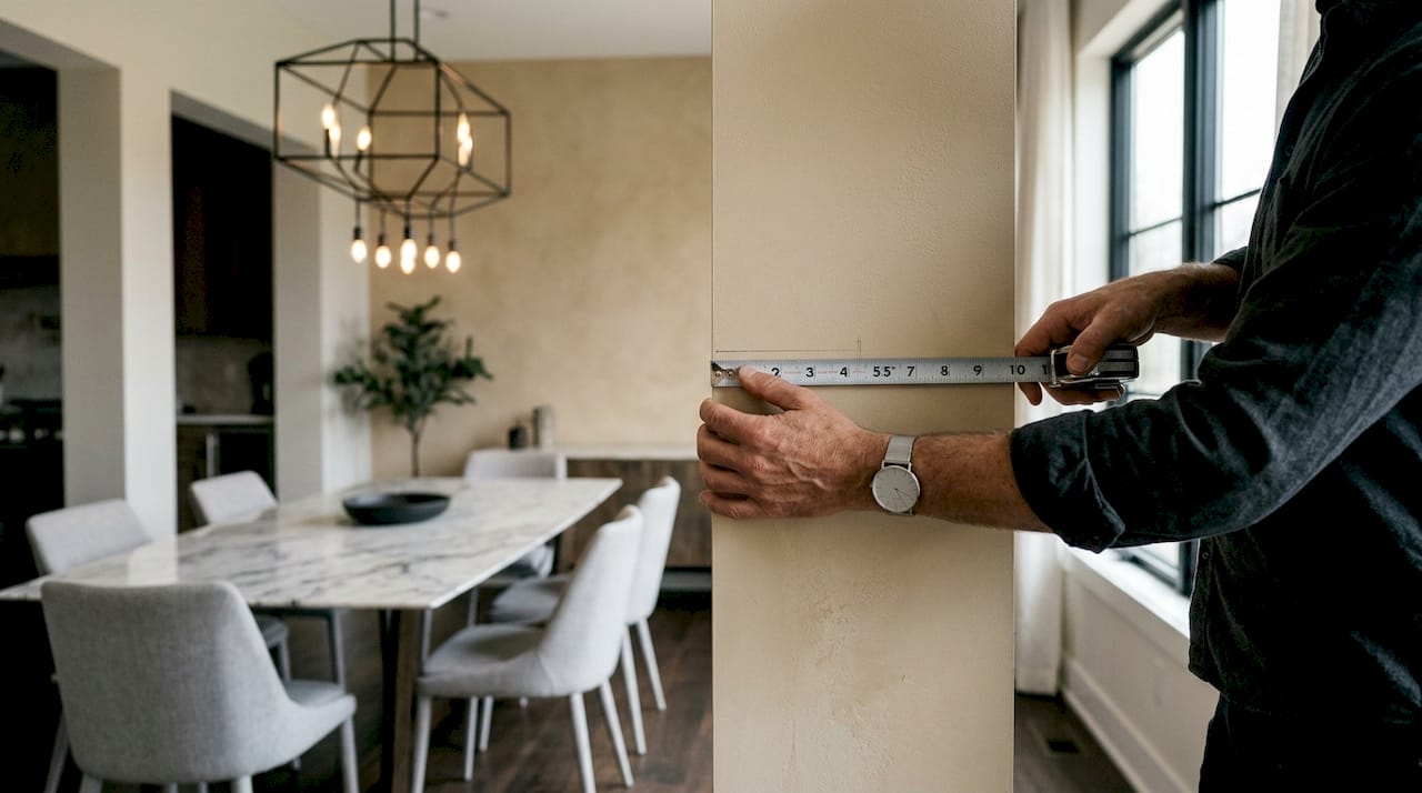
The reason for this adjustment is seated eye level. When your guests sit at the dining table, their sightlines drop by roughly 8–10 inches compared to standing. Art hung at standing eye level ends up above their field of vision, which defeats its purpose as a focal point.
Spacing between the bottom of the artwork and the top of your furniture matters just as much. Maintain 6–8 inches of clear space above the dining table or sideboard. Less than 6 inches feels cramped. More than 8 inches breaks the visual connection between the art and the furniture, making both elements look unanchored.
For gallery walls, the spacing between individual frames follows a tighter rule. Keep frames 2–6 inches apart to maintain cohesion. Spacing smaller than 2 inches feels cluttered. Spacing larger than 6 inches makes the arrangement read as separate pieces rather than a unified display.
Pro Tip: Measure from the floor to 55.5 inches and mark that point on the wall. That is your target center for the artwork. Work outward from there, not from the ceiling or the furniture.
How to size and scale wall art for your dining room furniture
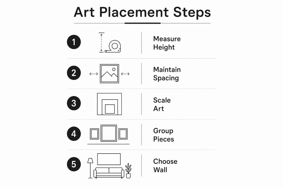
Scale is where most dining room wall decor goes wrong. The rule is direct: artwork should cover about two-thirds to three-quarters of the width of the dining table or furniture below it. A 72-inch dining table calls for art that spans roughly 48–54 inches wide.
What happens when the scale is off
Undersized art looks lost. A small canvas centered above a large dining table reads as an oversight, not a design choice. It pulls attention to the empty wall space around it rather than to the art itself. Oversized art overwhelms the furniture and compresses the room visually, making the ceiling feel lower.
Using groupings to manage scale
When you love smaller pieces, groupings solve the scale problem. Treat a collection of smaller frames as a single unit. The outer boundary of the group should follow the two-thirds rule relative to the furniture below. This approach works especially well for gallery wall arrangements in classic or transitional dining rooms.
Visual weight also plays a role beyond physical dimensions. A dark, heavily framed piece reads larger than its actual size. A light, frameless canvas reads smaller. Factor in frame color and style when assessing whether a piece will feel proportionate on the wall.
Here is a quick reference for scaling art to common dining table widths:
| Dining table width | Recommended art width |
|---|---|
| 48 inches | 32–36 inches |
| 60 inches | 40–45 inches |
| 72 inches | 48–54 inches |
| 84 inches | 56–63 inches |
Key sizing principles to keep in mind:
- Measure the furniture width first, then calculate two-thirds of that number.
- For groupings, measure the total span of the arrangement, not individual pieces.
- Dark or ornate frames add perceived visual weight; account for this when sizing.
- A single large canvas creates a stronger focal point than multiple small pieces at the same total width.
Which wall and position give dining room art the most impact?
The best wall for dining room art is the one your guests face most often while seated. That is typically the wall at the head of the table or directly across from the primary seating side. Centering artwork horizontally with the dining table matters more than centering it with the wall itself. If your table sits off-center in the room, the art should follow the table, not the wall’s midpoint.
Lighting is the factor most decorators overlook. Direct overhead lighting or a chandelier positioned above the table can cast glare on glossy canvas surfaces. Position art slightly to the side of the primary light source, or choose matte finishes that absorb rather than reflect light. Natural light from windows creates the same problem at certain times of day.
Symmetry versus asymmetry is a style decision with practical implications. Formal dining rooms benefit from symmetrical arrangements: matching pieces flanking a central work, or a single centered canvas. Casual dining spaces handle asymmetry well. An off-center grouping or a single large piece positioned to one side of the wall reads as relaxed and intentional rather than unfinished.
Pro Tip: Before committing to a position, tape paper cutouts of your artwork to the wall and live with them for a day. Lighting changes throughout the day, and what looks right at noon may look wrong at dinner time.
Placement above a sideboard or buffet follows the same 6–8 inch spacing rule as above the dining table. The art should center horizontally with the sideboard, not with the wall. Check out oversized art placement principles if you are working with a large buffet and a statement piece.
Additional positioning considerations:
- Avoid placing art directly opposite a window if glare is an issue.
- In open-plan layouts, use art to visually define the dining zone from the living area.
- Symmetrical arrangements suit formal dining rooms; asymmetrical groupings suit casual ones.
- Center art with the furniture below it, not with the room’s architectural center.
How do art styles shape the mood and architecture of a dining room?
Matching art style to your home’s architecture produces a more cohesive room than choosing art based on color alone. A traditional home with crown molding and wainscoting calls for period-appropriate pieces or classic gallery walls. A contemporary space with clean lines and minimal trim works best with a single large canvas or a tightly curated two-piece arrangement.
Style also defines space in open-plan layouts. When the dining area flows into the kitchen or living room without a physical wall to separate them, a bold, large-format canvas anchors the dining zone. It signals “this is a distinct space” without requiring a partition. Interior design trends consistently show that art used as a zone-defining element holds its visual power longer than purely decorative choices.
Color and texture in artwork support the room’s mood directly. Warm tones in the art reinforce an intimate, convivial atmosphere. Cool tones create a calmer, more formal feel. Textured canvas surfaces add depth that flat prints cannot replicate, which matters in dining rooms where guests spend extended time at close range.
Style choices that work across common dining room types:
- Traditional dining rooms: Gallery walls with classic frames, botanical prints, or portrait-style works.
- Contemporary dining rooms: Single large canvas, abstract work, or bold minimalist wall decor with clean edges.
- Casual or eclectic dining rooms: Mixed-media groupings, pop art, or graffiti-inspired canvases that add energy.
- Open-plan dining zones: One oversized statement piece that anchors the space and separates it visually from adjacent areas.
Architects note that art reflecting the home’s architecture improves zone definition without adding visual noise. The art becomes part of the room’s structure rather than decoration layered on top of it.
Key Takeaways
Effective dining room wall art placement centers artwork with the dining table at 54–57 inches from the floor, maintains 6–8 inches of space above furniture, and scales art to two-thirds of the furniture’s width for visual balance.
| Point | Details |
|---|---|
| Height for seated viewers | Center artwork at 54–57 inches from the floor, not the standard 57–60 inch gallery height. |
| Furniture spacing rule | Keep 6–8 inches between the top of furniture and the bottom of the artwork. |
| Scaling to furniture width | Art should span two-thirds to three-quarters of the dining table or sideboard width below it. |
| Gallery wall spacing | Space frames 2–6 inches apart to read as a unified display rather than separate pieces. |
| Style matches architecture | Choose art style based on the room’s architectural character to improve cohesion and zone definition. |
What I’ve learned from getting dining room art placement wrong first
Most decorators, including experienced ones, hang dining room art too high on the first attempt. I did it myself. The instinct is to treat the wall as a canvas and center the art in the open space above the table. The result looks fine when you are standing in the doorway and completely wrong when you sit down to eat.
The fix I now use on every project is the paper template method. Laying out artwork on the floor first, or taping paper cutouts to the wall, removes the guesswork entirely. You see the actual scale and position before you drive a single nail. This step takes 20 minutes and saves hours of patching and rehanging.
The second thing most guides skip is the lighting audit. Walk into your dining room at the time you actually use it most, typically evening, and look at where the light falls. A chandelier that creates beautiful ambiance at the table can throw harsh shadows or glare on art positioned directly behind it. Moving the art 12 inches to the left or right often solves the problem completely.
My honest opinion: the two-thirds width rule and the 54–57 inch height standard are not suggestions. They are the result of professional practice refined over decades. Decorators who ignore them in favor of “what feels right” almost always end up with art that feels slightly off without being able to say why. Follow the measurements first. Then adjust for your specific room and lighting. The measurements give you a foundation; your eye refines it from there.
— James
Luxuryartcanvas has dining room art sized and ready to place
Knowing the rules is one thing. Finding art that actually fits them is another. Luxuryartcanvas carries over 1,000 designs crafted in the USA, spanning bold graffiti, pop art, and fashion-inspired canvases from iconic names like Chanel and Louis Vuitton. Every piece is built for visual impact at the sizes dining rooms demand.

Whether you need a single large statement canvas to anchor an open-plan dining zone or a set of coordinated pieces for a gallery wall, the graffitis canvas collection and pop art canvas selections cover the full range of dining room aesthetics. Each canvas ships ready to hang, so you can apply the placement standards from this guide the same day it arrives. More than 10,000 satisfied customers have already made the upgrade.
FAQ
What is the correct height to hang art in a dining room?
Center dining room artwork at 54–57 inches from the floor to align with seated eye level. This is lower than the standard 57–60 inch height used in hallways and living rooms.
How much space should I leave between art and the dining table?
Leave 6–8 inches between the top of the dining table or furniture and the bottom edge of the artwork. Less than 6 inches feels cramped; more than 8 inches breaks the visual connection.
How wide should dining room wall art be?
Art should span approximately two-thirds of the furniture width below it. For a 72-inch dining table, that means artwork roughly 48–54 inches wide.
Can I use a gallery wall in a dining room?
Yes. Treat the gallery wall as a single piece, centering the entire arrangement at 54–57 inches and spacing individual frames 2–6 inches apart for a cohesive look.
Should dining room art match the room’s architectural style?
Matching art style to the home’s architecture produces stronger room cohesion. Traditional homes suit gallery walls and classic pieces; contemporary spaces work best with large, minimal canvases. You can explore modern wall art styles to find the right fit for your room.
What Is Accent Wall Art? A Guide for Homeowners
Making Small Rooms Feel Bigger with Wall Art