
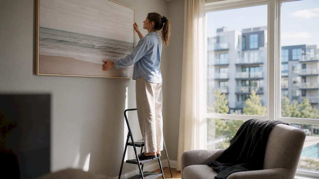
Wall art is one of the most effective tools for making small rooms feel bigger, creating optical illusions of depth and openness without touching a single wall stud. The right piece draws the eye outward, upward, or into a perceived horizon, tricking the brain into reading a compact space as larger than it is. Interior design professionals call this technique “visual expansion,” and it relies on subject matter, scale, color, and placement working together. Done well, a single canvas can do more for a cramped bedroom or studio apartment than a furniture swap ever could.
What types of wall art create the illusion of depth in small rooms?
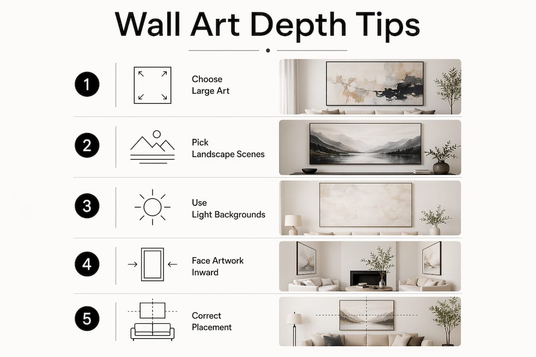
Subject matter is the first decision, and it matters more than most homeowners realize. Art featuring landscapes with skies, water, or pathways creates visual depth that expands perceived room size. A painting of a receding forest path or a wide ocean horizon gives the eye somewhere to travel, which the brain interprets as physical distance.
Restrained color palettes reinforce that effect. Art with soft blues, warm neutrals, or muted greens keeps the wall from feeling crowded. Busy patterns and high-contrast colors pull the eye in multiple directions at once, which makes walls feel closer rather than farther away.
- Landscapes and seascapes: Horizon lines and open skies signal distance. A canvas of the Manhattan skyline at dusk, for example, places an entire city’s worth of visual space on your wall.
- Abstract art with flowing forms: Gentle curves and gradients suggest movement and continuation, which extends perceived depth.
- Minimalist line art: Single-subject pieces with negative space let the wall breathe and avoid the visual noise that shrinks rooms.
- Optical illusion wall art: Geometric pieces that use perspective grids or vanishing points actively push the wall back in the viewer’s perception.
Avoid art with dense, all-over patterns or very dark, saturated backgrounds in small rooms. Those choices absorb light and create a visual barrier rather than an opening.
Pro Tip: Choose art where the subject faces or opens toward the room’s center. A figure or landscape oriented inward draws the eye deeper into the piece rather than toward the wall itself.
How do you choose the right size and orientation of wall art?
Scale is the single most misunderstood variable in decorating small rooms. Most homeowners instinctively reach for small art in small rooms, which is exactly the wrong move. One medium to large piece works better than several small ones because small art makes walls feel disconnected and hesitant. A single confident canvas anchors the room and gives the eye a clear focal point.
Orientation adds another layer of control. Landscape format (wider than tall) makes a wall appear broader. Portrait format (taller than wide) draws the eye upward, which makes ceilings feel higher. Both effects are real and measurable in how a room reads.
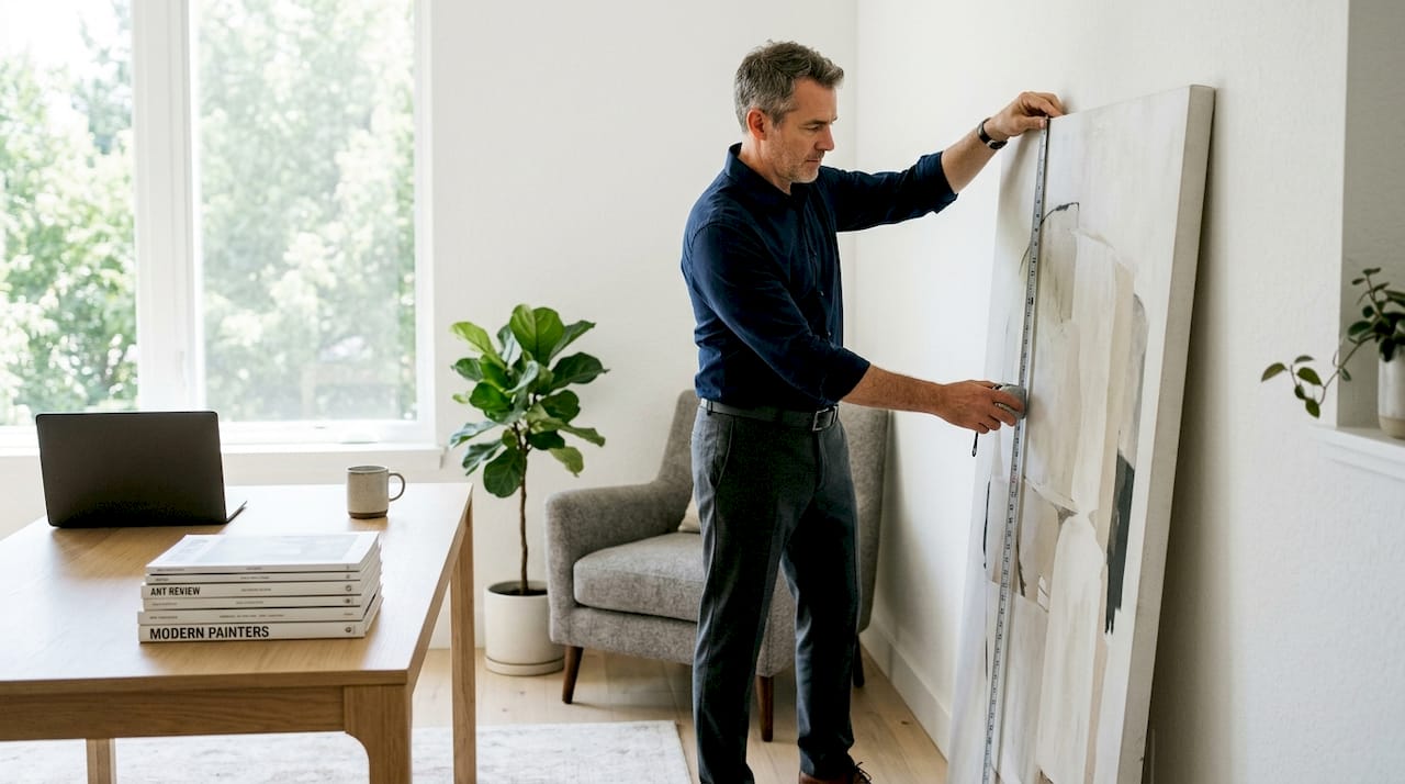
- Measure before you buy. The art should cover roughly two-thirds of the wall width above a sofa or bed. Going smaller creates that “floating” effect that makes rooms feel unresolved.
- Choose landscape orientation for low-ceilinged rooms. A wide canvas stretches the wall horizontally and reduces the sense of compression from above.
- Choose portrait orientation for narrow rooms. Vertical art draws eyes upward, making ceilings seem higher and countering the feeling of narrowness.
- Consider oversized art as a focal wall. A single large canvas on one wall creates a gallery effect that makes the whole room feel more intentional and spacious. See how this works in practice with oversized art placement.
- Resist the gallery wall reflex. Multiple small frames clustered together create visual noise. If you want more than one piece, keep the total count to two or three with clear spacing between them.
Pro Tip: Cut paper templates to the size of the art you are considering and tape them to the wall before buying. Living with the shape for a day tells you more than any measuring tape.
What are the best practices for placement and framing?
Placement and framing are where most homeowners lose the gains they made with good art selection. Art hung at eye level provides balance and calm focus, which is optimal for small rooms. The standard target is the center of the piece at 57–60 inches from the floor, which aligns with average standing eye level.
Frame choice affects perceived room size more than most people expect. Heavy or ornate frames visually shrink rooms. Thin, light-colored frames or frameless canvases with anti-reflective glass keep the art itself as the focus rather than the border around it.
- Use thin metal or natural wood frames in light finishes. Matte gold, white oak, and brushed silver all recede visually rather than competing with the art.
- Choose frameless canvas wraps for the cleanest look. A gallery-wrapped canvas with no frame at all removes one more layer of visual weight from the wall.
- Select non-glare or anti-reflective glass. Glare creates a second, competing image on the wall surface, which adds confusion and reduces the sense of openness.
- Leave breathing room around each piece. Art that touches furniture or crowds into corners feels trapped. A few inches of clear wall on each side lets the piece read properly.
- Avoid hanging art too high. Art placed near the ceiling disconnects from the furniture below and creates an awkward visual gap that makes rooms feel taller in an uncomfortable way rather than an expansive one.
Pro Tip: For renters who cannot make multiple holes, use a single large frameless canvas. One hook, one piece, maximum impact, and minimal wall damage when you move.
How should you coordinate wall art with your room’s color palette?
Color coordination between art and room is about harmony, not matching. Harmony between wall art tones and the room’s palette enhances spaciousness without making the space feel over-curated or sterile. The goal is a subtle connection through tone and texture, not a perfect replica of the room’s colors inside the frame.
A perfect match, where the art repeats the exact wall color or sofa fabric, creates a flat, showroom effect. The room loses personality and the art loses presence. Instead, pull one or two tones from the room into the art’s palette while letting the art introduce something slightly new.
- Match the art’s undertone, not its surface color. A room with warm beige walls pairs well with art that has warm ochres or terracottas, even if the art itself is abstract or figurative.
- Use lighter art tones to brighten small spaces. Pale backgrounds and soft washes of color reflect light back into the room, which physically brightens the space and makes it read as larger.
- Let the art introduce one accent color. A piece that echoes the room’s neutral base but adds a single pop of dusty blue or sage green adds depth without visual chaos.
- Avoid art that fights the room’s temperature. Cool-toned art in a warm-toned room creates tension that makes the space feel unsettled rather than open.
Exploring modern wall art styles that blend bold graphic elements with restrained backgrounds is a practical way to get both personality and palette harmony in one piece.
What mistakes should you avoid when using wall art in small rooms?
The most common error is clutter fatigue from many small frames. A wall covered in mismatched small pieces creates visual noise that makes the room feel busier and smaller. Each additional frame adds a border, a shadow, and a competing focal point.
“Art in small spaces should provide focus, atmosphere, and a sense of ease rather than fill every wall inch. One well-chosen piece does more work than a dozen scattered ones.”
- Do not hang art too high or too low. Art that floats near the ceiling or sits too close to the floor breaks the visual connection between the art and the furniture, making the room feel disjointed.
- Do not ignore scale relative to furniture. Art that is narrower than the sofa or bed beneath it looks undersized and makes both the furniture and the room feel smaller.
- Do not use heavy, ornate frames in tight spaces. The frame becomes the dominant visual element rather than the art itself, adding bulk without adding beauty.
- Plan gallery arrangements on the floor first. Laying out frames on the floor before hanging prevents clutter fatigue and unnecessary wall damage. This is especially valuable for renters.
- Use mirrors and reflective art as a complement, not a replacement. Mirrors and reflective art pieces amplify natural light and add perceived spaciousness. Pairing a reflective piece with a depth-creating landscape gives you two space-expanding effects at once.
Key Takeaways
The most effective approach to making small rooms feel bigger with wall art is choosing one large, depth-creating piece and placing it at eye level with a thin frame and a palette that harmonizes with the room.
| Point | Details |
|---|---|
| Choose depth-creating subjects | Landscapes, seascapes, and pathways give the eye visual distance to travel, expanding perceived space. |
| Go bigger, not smaller | One medium to large canvas anchors a room better than several small frames that create visual noise. |
| Match orientation to the problem | Use landscape format to widen a room and portrait format to raise a perceived ceiling height. |
| Frame light, hang right | Thin frames, frameless canvases, and eye-level placement reduce visual clutter and keep rooms feeling open. |
| Harmonize, do not match | Art that shares the room’s undertone but introduces one new accent color adds depth without tension. |
Why I stopped overthinking small room art (and what actually works)
The advice I give most often contradicts what most decorating guides say. People assume small rooms need small art. That instinct is almost always wrong. Every time I have seen a homeowner swap out a cluster of small frames for one confident, large canvas, the room immediately reads as more considered and more spacious.
The other thing I have learned is that art in a small room carries more emotional weight than art in a large one. There is nowhere to hide a bad choice. A piece that feels off in a studio apartment will bother you every single day. So the standard I apply is simple: choose one piece you genuinely love, make sure it has some visual depth or movement in it, and hang it at eye level with the lightest frame that still suits the style. That combination works in nearly every small room I have seen, from 400-square-foot studios to compact urban bedrooms.
Personalize rather than over-style. The goal is not a magazine spread. The goal is a room that feels like yours and feels bigger than it is. Those two things are not in conflict.
— James
Wall art for small spaces, made easy with Luxuryartcanvas
Luxuryartcanvas carries over 1,000 designs crafted in the USA, and a strong selection of them are built exactly for the visual expansion techniques covered here. Skyline pieces like Manhattan Skyline Wall Art and Times Square Wall Art deliver the horizon depth that makes walls recede. Bold, graphic graffiti wall art gives small rooms a confident focal point without the visual clutter of multiple smaller pieces.

Every canvas ships ready to hang, frameless, and gallery-wrapped, which means no heavy borders and no extra visual weight. With more than 10,000 satisfied customers backing the quality, finding the right piece for your space is straightforward. Browse the full collection at Luxuryartcanvas and filter by size and style to match your room’s palette and proportions.
FAQ
What size wall art works best for a small room?
One medium to large piece covering roughly two-thirds of the wall width above your main furniture works best. Small art in small rooms creates a disconnected, hesitant look that makes the space feel smaller.
Does vertical or horizontal art make a room feel bigger?
Both help, but in different ways. Vertical (portrait) art draws the eye upward and makes ceilings feel higher, while horizontal (landscape) art widens a wall visually. Choose based on whether your room feels too narrow or too low.
What subjects in wall art create the most depth?
Landscapes with skies, water, or pathways create the strongest sense of visual depth. The perspective lines in these subjects give the eye a clear path to travel, which the brain reads as physical distance.
Should wall art match the room’s color scheme exactly?
No. A perfect color match creates a flat, sterile effect. Art that shares the room’s undertone but introduces one new accent color adds depth and personality without visual conflict.
How high should I hang wall art in a small room?
Hang art so the center of the piece sits at 57–60 inches from the floor. Art hung too high disconnects from the furniture below and creates an awkward gap that disrupts the room’s visual balance.
Dining Room Wall Art Placement: A Decorator's Guide
Premium Canvas Materials: Their Role in Fine Art