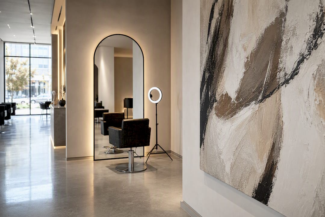
The fastest way to transform a salon is one statement wall paired with a curated area built for client photos. A single mural, oversized canvas, or dense gallery wall gives you the visual anchor, while a mirror or logo backdrop near the styling chairs gives clients a reason to post. Between those two moves, most salons solve the majority of their decor problem, and the rest is placement discipline and material choices that hold up to color bowls and blowout heat.
Table of Contents
- Salon Wall Art Ideas: 12 Approaches That Actually Work
- How To Choose The Right Salon Wall Art For Your Space
- Gallery Wall Layouts And How To Plan Them Without Guessing
- Materials And Finishes That Survive A Busy Salon Floor
- What James At Luxury Art Canvas Has Learned Matching Art To Salon Brands
- Practical Planning: Templates, Sizing, Spacing, And Lighting
- Making Wall Art Reinforce Your Salon’s Brand Identity
- Rotating Your Salon’s Art By Season Without Starting Over
- What Trending Salon Designs Are Getting Right Right Now
- Where To Find Wall Art On A Salon Budget
- The Honest Take On Salon Wall Art Right Now
- Ready-To-Hang Canvas Options From Luxury Art Canvas
- Sources
Salon Wall Art Ideas: 12 Approaches That Actually Work
Every one of these has a specific job. Some exist to get photographed. Some exist to calm a waiting client down before a color correction. A few do both. Pick based on the zone, not just what looks good on a moodboard.
1. Statement Mural or Peel-and-Stick Wallpaper
A single oversized mural behind reception or on the wall facing the entrance does more for brand recognition than five smaller pieces scattered around the room. Peel-and-stick versions are the smarter default for most salons because they’re removable without wall damage, which matters enormously if you’re leasing. Install it on a dry accent wall, never anywhere near the shampoo bowls, and expect a full pattern repositioning during application if the seams don’t line up on the first try.
2. A Large Single Canvas as the Anchor Piece
Sometimes one big canvas beats a mural, especially in smaller salons where wall real estate is tight. A 40 by 60 inch canvas above the reception desk reads as intentional and expensive, even at a modest price point, because scale alone does most of the visual work. The install tip here is simple: hang at 57 to 60 inches to the center point, roughly average eye level, and use a French cleat instead of a wire hanger so the piece sits flush against the wall.
3. Curated Gallery Wall, Salon-Style
The dense, tapestry-like gallery wall (frame after frame, barely any negative space) works especially well behind a row of styling stations where clients spend 30 to 90 minutes staring at something other than their own reflection. This layout style is one of three proven gallery formats designers return to again and again, largely because it hides wall imperfections and gives you room to mix framed prints, mirrors, and small shelves without it looking accidental.
4. The Mirror Selfie Wall
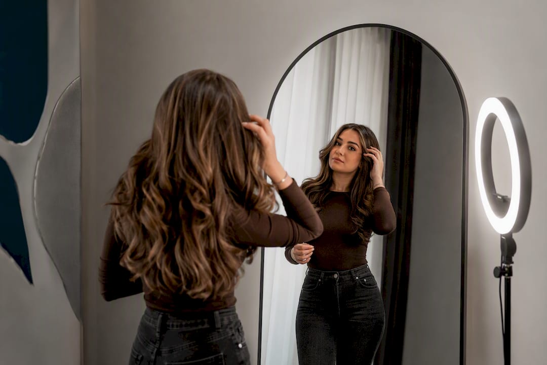
This is the single highest-return square footage in a modern salon. A dedicated wall with a ring light, a graphic backdrop, and a full-length or arched mirror gives every client an obvious, flattering spot to snap a story post right after their appointment. Keep the background simple, one bold color field or a subtle pattern, so the client’s hair stays the visual subject and doesn’t compete with a busy print.
5. 3D Logo Wall or Acrylic Signage
Feature walls built around a dimensional logo or acrylic sign are consistently ranked among the highest-return investments in salon interiors because they anchor every piece of branded photography a client or influencer posts. Backlit acrylic letters mounted on a contrasting paint color cost more upfront than a printed sign, but they read as considerably more premium, and they never fade the way vinyl decals do after a couple of years under salon lighting.
6. Neon or Acrylic Quote Signage
A short, punchy phrase in neon (real or LED) works best near the reception desk or above a retail display, somewhere clients glance at while checking out. Keep the message to four or five words. Anything longer gets ignored, and anything cheesy gets screenshotted for the wrong reasons. LED neon is the practical choice over gas-filled tubing; it runs cooler, costs less to maintain, and won’t need a glass repair after an accidental bump.
7. Botanical or Spa-Style Mural for Treatment Rooms
Large-scale painterly florals and botanical scenes remain a go-to for treatment rooms and spa-adjacent spaces, where the goal is calm rather than a photo op. Soft greens, muted florals, and low-contrast palettes lower the emotional temperature of a room where clients are lying down for a facial or a scalp treatment, not sitting upright checking their phone.
8. Abstract Color Field Canvases for Modern Salons
If your brand leans minimal and modern rather than maximalist, a series of two or three large abstract canvases in a tight color range does more than one busy piece. This works particularly well at wash stations, where clients have their eyes closed half the time anyway, so the art is really for the stylist and the passerby glancing in from the sidewalk.
9. Textured or Sculptural Wall Pieces
Woven wall hangings, metal sculptural panels, and raw wood installations add a tactile layer that flat canvas can’t. These work best in waiting areas and near retail shelving, where clients have a moment to actually touch and notice texture. Durability-wise, metal holds up better than woven fiber in high-humidity zones, so keep fiber pieces away from any wall within splash range of a sink.
10. Typographic or Brand-Quote Walls
A wall dedicated to your salon’s tagline, a founder quote, or even client testimonials rendered in large type gives the space a voice beyond the visuals. This is a strong option for the wall behind the front desk, since it does double duty as a branding statement and a conversation starter while clients wait to check in or out.
11. Ledge-Layered Rotating Displays
Instead of drilling holes for every frame, mount a few floating picture ledges and lean framed art against the wall in layers. This is one of the three reliable gallery-wall approaches worth knowing, and it happens to be the most flexible: swap pieces seasonally, feature a new local artist monthly, or rearrange in ten minutes without a single new nail hole.
12. Affordable, Rotating Small-Art Features
Not every wall needs a $2,000 statement piece. A rotating rail of small framed works from local artists, changed quarterly, keeps a corner of the salon feeling current without a big spend. This is a smart play for a small waiting nook or the hallway near the restroom, spaces too narrow for a full mural but too visible to leave bare.
Pro Tip: *If your lease restricts wall modifications, build your entire decor plan around peel-and-stick murals, ledge-layering, and freestanding art.
How To Choose The Right Salon Wall Art For Your Space
Chasing whatever’s trending on a design blog is how salons end up with mismatched walls that feel like they were decorated in three separate decisions, because they usually were. Work through a short checklist instead, and let your specific space and clientele drive the final call.
- Size and proportion: a piece should cover 60 to 75% of the available wall width behind a desk or station, not float awkwardly in the middle of empty space.
- Color harmony: pull two or three tones from your existing brand palette and require every new piece to include at least one of them.
- Photographic friendliness: choose palettes that flatter skin tones and hair color in the spots where clients are photographed most, since a greenish or overly warm wall tint will show up in every result photo.
- Cleaning needs: anything within a few feet of a bowl, sink, or color mixing station needs a wipeable surface, full stop.
- Installation and removability: know your lease terms before you buy anything that requires drilling.
- Budget tier: decide upfront whether this is a $300 accent piece or a $3,000 anchor investment, because mixing tiers without a plan is how a wall starts to look cheap next to something expensive.
A repeated color thread or a consistent framing material across a collection is what keeps a dense gallery wall from reading as clutter instead of an accident. That single rule does more for cohesion than any individual piece you buy.
Before committing, ask three questions: Does this piece work in photos taken under our actual lighting, not just showroom lighting? Can it survive a splash of developer or a stray blast of hairspray? And if we move locations in two years, does this asset move with us or stay bolted to someone else’s wall?
Gallery Wall Layouts And How To Plan Them Without Guessing
Three layouts cover almost every salon gallery you’ll see: salon-style (dense, frame-to-frame, almost no breathing room), organic spread (an asymmetrical cluster with generous negative space), and ledge-layering (frames resting on floating shelves for easy swaps). Each one is a documented, repeatable format, not a one-off design trick, so you can plan toward a known result instead of improvising with a level and a prayer.
- Measure the wall and mark the exact usable width and height, accounting for outlets, light switches, and trim.
- Cut paper templates to the size of each frame; this is the most reliable way to test a layout before a single nail goes in the wall.
- Tape templates to the wall, photograph the arrangement, and compare a few versions before committing.
- Choose one anchor piece first, usually the largest, then build the rest of the arrangement around it.
- Keep spacing consistent, roughly 2 to 3 inches between frames, so the eye reads the collection as one unit rather than scattered pieces.
- Center the whole arrangement around eye level, typically 57 to 60 inches, and check how mirrors and overhead lighting interact with glossy frames before finalizing anything.
Pro Tip: Ledge-layering is the best option for salons in leased spaces or anyone who rotates art seasonally. No holes, ten-minute rearranges, and you can lean a bigger piece in front for a season, then swap it back.
Materials And Finishes That Survive A Busy Salon Floor
Canvas holds up well almost everywhere except direct splash zones, and it’s the easiest surface to keep matte and glare-free under salon lighting. Metal prints handle humidity better than almost anything else, making them a strong pick near wash stations, though their reflective finish can throw glare under harsh overhead lights. Acrylic and neon signage last for years with minimal upkeep but need a dry wipe rather than any liquid cleaner near the wiring. Peel-and-stick wallpaper is the most forgiving option for rented spaces since it’s removable and repositionable, but it should stay on accent walls, not directly behind sinks or shampoo bowls, where moisture will eventually lift the seams.
- Canvas: dust weekly with a dry microfiber cloth; keep at least three feet from any water source.
- Metal prints: wipe with a damp (not wet) cloth; excellent for humid back rooms.
- Acrylic and neon: dry cloth only; never spray cleaner directly on the fixture.
- Peel-and-stick wallpaper: wipeable finish, spot clean with mild soap; avoid splash-prone walls entirely.
Order a sample swatch before committing to any large wallpaper run. Color shifts under salon LED lighting more than people expect, and a protective matte coating on canvas adds real resistance against accidental sprays.
What James At Luxury Art Canvas Has Learned Matching Art To Salon Brands
The intensity of the art on your walls should match the energy you’re selling in the chair. A trend-led salon doing bold color and editorial cuts can carry high-contrast graffiti or pop art without it feeling out of place. A spa-adjacent salon built around calm, softer services needs botanicals and muted color fields instead, or the walls will fight the service.
Salons that install a single large statement canvas behind reception, rather than a scattered mix of small frames, consistently report more client photos taken in that exact spot. That’s not a coincidence. One bold focal point gives a phone camera something to frame; five competing pieces give it nothing to commit to.
Match the art’s visual volume to your service menu before matching it to a trend. A blowout bar chasing a fast, energetic identity earns the bold graffiti wall. A color-correction specialist selling a slower, more meticulous service earns the quieter palette.
— James
Practical Planning: Templates, Sizing, Spacing, And Lighting
Skip the guesswork phase entirely and go straight to paper templates cut to the exact frame dimensions you’re considering. Label each template with its size and photograph every arrangement so you can compare spacing and balance side by side rather than trying to remember what version three looked like. This single habit prevents almost every regretted hole in a salon wall.
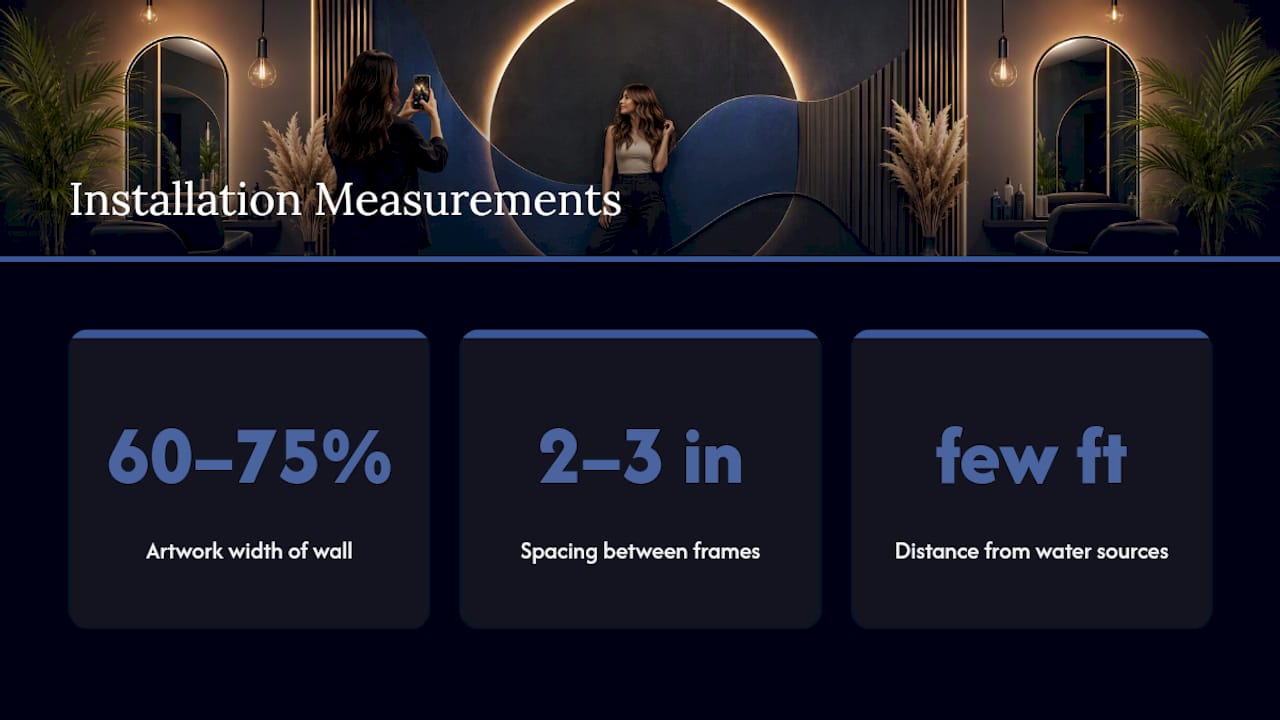
Sizing follows a simple ratio: a piece or grouping should occupy roughly 60 to 75% of the wall’s width for it to read as intentional rather than accidental. Spacing between framed pieces in a gallery should stay in the 2 to 3 inch range, tight enough to feel cohesive, loose enough that each piece still gets noticed on its own.
Lighting changes everything a template can’t predict. Walk the space at the time of day your salon actually operates, and check how overhead LED fixtures interact with glossy canvas coating or framed glass. A piece that looks flawless at 10 a.m. can throw an ugly glare at 4 p.m. when the sun shifts. Test placement under real lighting before the final hang, not just during a quick morning walkthrough.
Maintenance after installation is mostly about dust and distance. Keep every piece at least a few feet from active water sources, and build a monthly wipe down into your closing checklist the same way you’d schedule any other recurring salon task.
Making Wall Art Reinforce Your Salon’s Brand Identity
Wall art works harder when it’s not generic. A logo rendered in 3D lettering, a signature color repeated across three or four pieces, or a quote pulled straight from your salon’s own mission statement all do more for brand recall than a stock canvas from a big box store. The goal is for a client to recognize your salon from a photo alone, even with the logo cropped out.
Repetition is what builds that recognition. If your brand color is a deep emerald, weave it through at least two or three pieces across different zones rather than confining it to one accent wall. Visual storytelling built around a consistent brand thread tends to stick with people longer than a single striking image on its own, because the repetition is what clients unconsciously start to associate with your name.
A branded quote wall or a custom-lettered mission statement near the reception desk does double duty. It reinforces identity for existing clients, and it gives new clients something to read and absorb during the two or three minutes of downtime before their stylist calls them back. Small details like matching frame finishes to your signage font or logo mark also matter more than most owners assume. It’s a subtle cue, but it separates a curated space from a random collection of nice things.
Rotating Your Salon’s Art By Season Without Starting Over
A full redesign every year isn’t realistic for most salons, and it doesn’t need to be. Swapping smaller elements on a seasonal or thematic schedule keeps the space feeling current without touching the anchor pieces that took real thought to place.
Ledge-layered displays are built exactly for this kind of rotation. Lean in warmer, richer tones for fall and winter service pushes, then swap toward lighter palettes and botanical pieces heading into spring and summer. The swap takes minutes because nothing is bolted down.
Small-art rotations from local artists work on the same logic. Featuring a new creator’s work each quarter gives regular clients a reason to look at the walls again, and it doubles as a low-cost community gesture that’s easy to promote on social media. Even something as simple as swapping out throw pillows, vases, or small sculptural objects near a gallery wall changes the room’s feel without touching a single frame.
The one rule worth keeping constant: your statement wall and any branded signage stay put. Rotate the smaller, secondary pieces around that fixed anchor so the space always feels familiar even as details shift.
What Trending Salon Designs Are Getting Right Right Now
The salons getting the most social traction right now share a pattern: one oversized, unmistakable feature wall, paired with restraint everywhere else. Instead of filling every inch with decor, they leave breathing room, then let one graffiti mural, one dramatic color-field canvas, or one dense gallery wall do the talking.
Neon signage paired with a minimalist backdrop is showing up constantly in newer salon builds, particularly in the reception area, because it photographs cleanly under almost any lighting condition. Botanical murals are having a moment in treatment and blowout rooms specifically, a shift toward calm, spa-adjacent visuals even in salons that otherwise lean bold.
The other consistent thread: salons investing in a dedicated selfie zone, separate from the actual service stations, are seeing that specific corner become the most photographed spot in the building. It’s a deliberate design decision, not an accident, and it’s cheap relative to the payoff.
Where To Find Wall Art On A Salon Budget
You don’t need a five-figure art budget to get a salon wall that looks considered. Local art fairs and small-batch print shops are the most affordable route for filling secondary walls and rotating displays, often at a fraction of gallery pricing. Etsy and independent print sellers cover the mid-tier for framed and canvas pieces, though quality and shipping times vary enough that reading recent reviews matters more than usual.
For a statement wall meant to anchor your reception or main styling area, buying directly from a specialist in ready-to-hang canvas art is usually the better move over piecing something together from multiple small vendors. A single well-sourced anchor piece, purchased once and properly sized, tends to outlast and outperform three or four smaller mismatched buys that add up to roughly the same spend anyway.
Whatever the source, order a physical sample or at minimum a high-resolution proof before committing to anything large format. Color that looks perfect on a laptop screen under studio lighting can shift noticeably once it’s hanging under your salon’s actual fixtures.
The Honest Take On Salon Wall Art Right Now
Most of the advice floating around about salon decor treats wall art like decoration first and marketing second. That’s backwards. The salons winning right now built the photo opportunity into the design brief from day one, not as an afterthought once the paint dried.
The overrated move is spreading your budget thin across a dozen small, disconnected pieces because it feels safer than committing to one bold statement wall. It rarely reads as curated. It reads as unfinished.
What actually works is picking one high-impact anchor, matching its intensity to your brand’s actual energy rather than whatever’s trending on a design account, and being disciplined about material choices near water and heat. Cohesion beats quantity every time. Start with the wall clients will photograph most, get that one right, and let everything else support it.
Ready-To-Hang Canvas Options From Luxury Art Canvas
Once you know which wall needs the statement piece, sourcing becomes the easy part. There are alternatives to piecing together art from scattered vendors: one order can get you a museum-quality, ready-to-hang canvas, produced in the USA, with no framing shop detour and no guessing whether a print will arrive warped.

The catalog runs across styles that fit different salon personalities, from bold graffiti wall art built for trend-led, high-energy salons to cleaner minimalist prints for salons leaning quiet and modern, plus large-format pop wall art sized for a reception focal point. Before ordering, measure your wall in inches and check it against the listed canvas dimensions rather than eyeballing it. If glare or lighting is a concern, a matte finish tends to hold up better under overhead salon fixtures than a glossy one. When color accuracy matters, particularly for a piece that needs to match a specific brand tone, request a sample swatch first rather than guessing from a screen photo.
Custom sizing is available for walls that don’t fit a standard canvas ratio, which matters more in salons than almost any other commercial space, since so many walls are broken up by mirrors, outlets, and station equipment. Browse the graffiti canvas collection to start narrowing down a statement piece sized for your specific reception or styling wall.
Sources
The salon decor guidance in this article draws on a handful of trade and design sources worth reading directly. GlossGenius covers a wide range of salon decor concepts with a focus on client experience. Design & Dwelling breaks down gallery wall layout methods in more technical detail than most decor blogs attempt. CostaCover focuses specifically on wallpaper and mural durability for hair and beauty spaces, useful if removable finishes are a priority for your lease.
- Gallery wall ideas: how to style a maximalist salon wall
- 25+ Salon Wallpaper Ideas for Hair & Beauty Spaces – CostaCover
Designing a Home Entertainment Space That Actually Looks Good
Homeowners: Keep Canvas Art at 40–55% RH and Avoid Harmful Swings