Go big, go textured, and stop hanging more than one piece where one would do the job. The 2026 shift in luxury wall art favors oversized statement canvases, tactile mixed media, and edited gallery arrangements, overcrowded print collections. Get the sizing right (the 2/3 rule), hang at eye level, light it properly, and even a modest budget starts reading like a design showroom.
Table of Contents
- Luxury Wall Art Ideas: High-End Style Categories Worth Copying
- Materials And Finishes That Signal Luxury
- Sizing And Placement: The 2/3 Rule Explained
- Lighting And Mounting That Make A Piece Sing
- Gallery Wall Or Single Statement Piece: How To Decide
- How To Make Wall Art Look Expensive On Any Budget
- Vetting Sellers: What To Ask Before You Buy Premium Canvas
- A Design-Led View On Investing In Art That Lasts
- Bring These Luxury Wall Art Ideas Into Your Home
- Sources
- FAQ
Luxury Wall Art Ideas: High-End Style Categories Worth Copying
Every luxury interior leans on a handful of proven art strategies, not a single “look.” The trick is matching the style to the room instead of forcing a trend where it doesn’t belong.
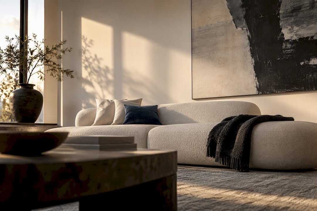
Oversized statement art is the clearest signal of a curated space right now. A single large-format canvas over a sofa or bed reads more intentional than a cluster of small frames, because trend reporting from 1stDibs points to maximalism, texture, and scale as the defining shift for 2026. It works best in living rooms, primary bedrooms, and entryways with at least eight feet of wall height.
Texture-forward and mixed-media pieces bring dimension that flat prints can’t fake. Layered paint, metal leaf, and raised surfaces catch ambient light and shift throughout the day, which is why tactile finishes are central to 2026’s luxury wall art direction.
Modern heritage and character-led pop art use a single bold figure, motif, or brand-inspired graphic as the anchor instead of a busy composition. This works especially well in offices, media rooms, and lofts that want personality without clutter.
Soft modern minimalism uses neutral palettes and quiet, tactile surfaces to feel curated rather than empty. It suits primary suites and hallways where you want calm, not drama.
Where each style fits best:
- Entryway: one oversized statement piece with strong contrast to greet guests immediately.
- Living room: texture-forward or heritage pop art sized to the sofa, not the wall.
- Bedroom: soft minimalism or a single warm-toned abstract above the headboard.
- Home office: character-led pop art or graphic prints that add energy without visual noise.
If you want a deeper breakdown of how these categories translate across different rooms, this style guide to luxury wall art covers the distinctions in more depth.
Materials And Finishes That Signal Luxury
Material choice does more to create a premium presence than subject matter does. The same image printed on canvas versus acrylic can look like two entirely different price points.
Canvas absorbs light rather than reflecting it, which gives depth and a handmade quality that suits nearly every luxury style. Acrylic or plexiglass produces a glossy, gallery-like finish with saturated color, ideal for photography and sleek modern rooms, but it shows fingerprints and glare more readily. Metal prints deliver a cool, reflective surface that reads contemporary and works well under directional lighting.
Framing matters as much as the print itself:
- Float frames add a shadow gap that makes canvas look museum-mounted.
- Gallery frames with wide mats suit photography and fine art reproductions.
- Shadowboxes work for textile or three-dimensional pieces that need depth to breathe.
Textile and fiber art, along with sculptural three-dimensional pieces, add a tactile richness that flat prints can’t replicate. Textured canvas and layered media catch light differently than glossy prints, producing an optical richness that reads as bespoke rather than mass-produced.
Pro Tip: Ask any seller whether they use pigment-based archival inks rather than dye-based ones. Pigment inks resist fading for decades under normal indoor light, while dye-based prints can noticeably shift color within a few years.
For a closer look at how canvas weight and stretcher depth affect the finished look, this guide to choosing canvas art for high-end rooms walks through the technical side.
Sizing And Placement: The 2/3 Rule Explained
Getting scale right solves more design problems than any styling trick. The most reliable formula is the 2/3 rule: your artwork should span roughly two-thirds to three-quarters of the furniture width beneath it.
- Measure your furniture first. A 72-inch sofa calls for an art span of about 48 to 54 inches; a 60-inch sofa or console works with roughly 40 to 45 inches.
- Hang at eye level, not wall-center. Professional installers commonly set the visual center of artwork at about 60 inches (152 cm) from the floor, which keeps sightlines consistent across different rooms and ceiling heights.
- Leave 6 to 10 inches between furniture and frame. Too much gap makes the piece float awkwardly; too little crowds the composition.
- Scale up for tall ceilings and stairwells. Diptychs and triptychs let you fill vertical runs without shrinking the individual pieces.
The one mistake almost everyone makes: choosing art that’s too small. When in doubt, interior professionals size up, because a larger piece absorbs the room’s architecture and looks deliberate, while an undersized piece just looks lost.
Lighting And Mounting That Make A Piece Sing
Even the right canvas at the right size can fall flat without proper lighting. Picture lights mounted directly above a frame give the most flattering, gallery-style wash, while track lighting on a dimmer offers flexibility for rooms with multiple pieces. Recessed accent lighting works well for oversized statement art where a dedicated fixture would look cluttered.

Aim for a warm white color temperature, since warmer light brings out texture and depth in both canvas and dimensional pieces far better than cool white or daylight bulbs.
Mounting changes perceived depth as much as lighting does:
- Standoff mounts create a shadow gap that reads as modern and architectural.
- Float mounts on canvas give a floating, museum-quality edge.
- Shadowboxes add real dimension for textile or mixed-media work.
Keep art 6 to 10 inches above furniture, and space grouped pieces evenly, roughly 2 to 3 inches apart for a tight gallery feel.
Pro Tip: Never hang valuable canvas directly across from an uncovered window. Even archival inks fade faster under direct sun exposure than under any artificial light source.
Gallery Wall Or Single Statement Piece: How To Decide
The 2026 trend line is clear: fewer, larger pieces beat crowded arrangements in almost every room. Oversized single artworks often read more expensive than several smaller works because they provide scale and obvious editing, and a room built around one strong piece feels curated instead of cluttered.
That doesn’t mean gallery walls are outdated. They’re the right call for hallways, stair runs, and personal collections you’ve built over time, where the story is in the mix, not the single image.
If you go with a gallery, three rules keep it from looking accidental:
- Pick one color thread that repeats across every piece, even if the subjects differ.
- Balance scale so no single frame overwhelms the rest by more than double the size.
- Leave real negative space between pieces. Crowding kills the premium effect faster than any mismatched frame.
A few layout templates worth stealing: a matched pair flanking a headboard, a triptych stretched above a long sofa, or a staggered diagonal run climbing a stairwell. For a full breakdown of arrangement logic, this guide to gallery wall ideas for luxury homes covers spacing templates in detail.
How To Make Wall Art Look Expensive On Any Budget
You don’t need a five-figure piece to get a five-figure look. A tight checklist gets you there faster than chasing trends.
- Start with scale, then color. Pick the largest piece the wall can reasonably hold before you even think about subject matter.
- Repeat a secondary tone from the room. Art that echoes an existing accent color feels chosen, not bought at random.
- Invest in framing over quantity. One well-matted, float-mounted canvas beats five unframed prints every time.
- Choose texture when the budget allows it. Dimensional surfaces read as handmade even at a modest price point.
- Let the piece breathe. Simple surrounds and generous negative space do more for perceived value than an ornate frame ever will.
Pro Tip: If a piece references a known artist, brand, or cultural icon, look for clear sourcing or licensing language on the product page. Custom commissions and clearly credited reproductions both signal intentional curation far better than an unmarked stock print.
Vetting Sellers: What To Ask Before You Buy Premium Canvas
Not every “gallery quality” claim holds up once the box arrives. A short list of questions separates the real thing from a marketing label.
Ask any seller directly about substrate weight, stretcher bar depth, and whether they use pigment or dye-based inks, since these specifics determine how well a piece holds up over years, not months. Ask whether frames are solid wood or composite, what the return policy covers, and whether a print is limited edition or open run.
US-made production matters more than it sounds. Domestic archival canvas houses tend to use heavier stretcher bars and museum-grade stretching techniques that resist warping better than budget overseas alternatives.
Quick vetting checklist:
- Substrate weight and stretcher bar depth
- Pigment versus dye-based ink
- Frame material and construction
- Return and warranty policy
- Limited edition versus open-run status
Luxury Art Canvas states that its canvases are crafted in the USA, ready to hang out of the box, available across more than 1,000 designs, and backed by reviews from over 10,000 customers. Treat every seller’s claims, including these, as a starting point for your own questions rather than a final verdict.
A Design-Led View On Investing In Art That Lasts
Most people buy too many small pieces trying to fill a wall, when one confident, well-made piece would have solved the problem in a single purchase. Before committing, tape up a paper mockup at the size you’re considering and live with it for a week. Scale and mood matter more than chasing whatever style is trending this season. A textured, well-proportioned piece you still love in five years beats three trend buys you’ll want to swap out by next spring.
— James
Bring These Luxury Wall Art Ideas Into Your Home
Several art canvas providers turn the ideas in this guide into something you can actually hang this week, without hunting down a custom framer or waiting months on a commission. Canvases often ship ready-to-hang, produced in the USA, across catalogs spanning pop art, graffiti, abstract, and heritage-inspired motifs.
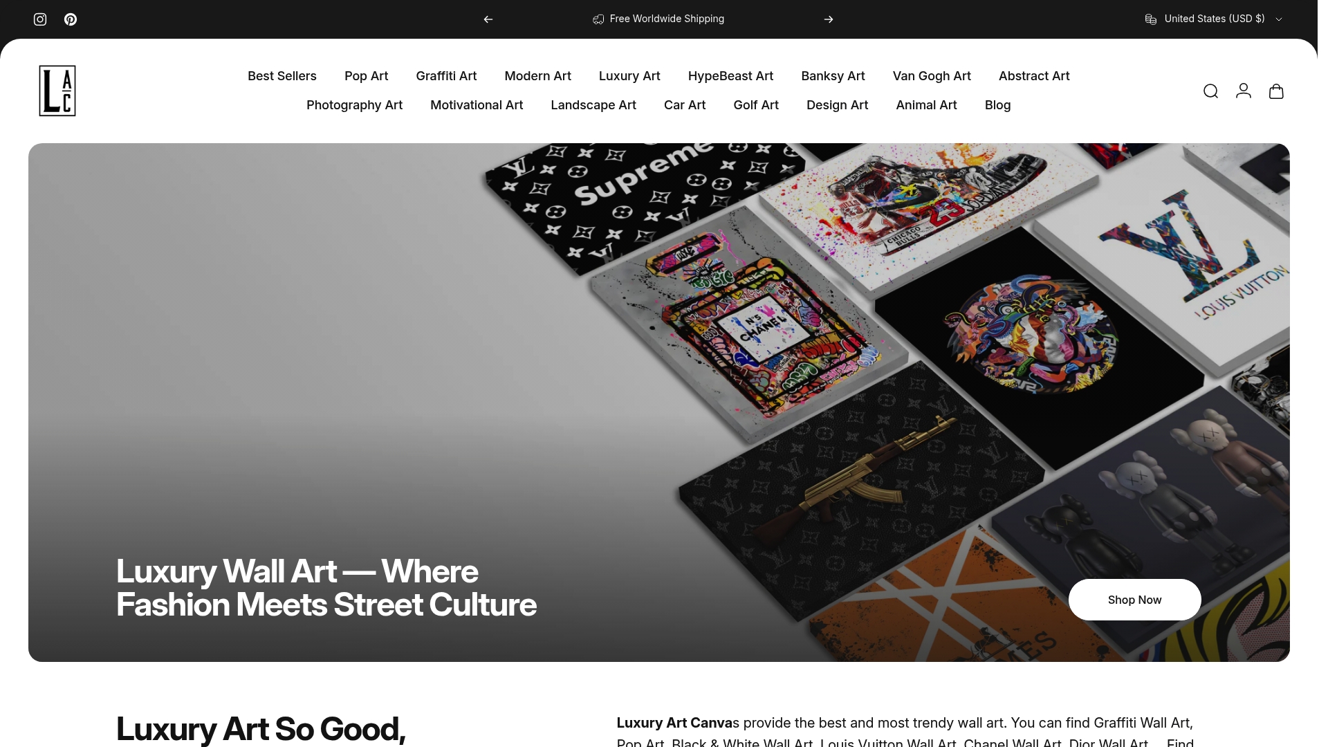
If oversized, texture-forward statement pieces are the direction you want to take a room, the Luxury Art collection is built around exactly that scale and finish. Prefer something bolder and character-led? The Pop Art Canvas Prints and Graffiti Wall Art & Street Art Canvas collections both work as single anchor pieces sized to the 2/3 rule you just read about. Browse the full catalog, measure your wall against the guidance above, and order the piece that fits the space you’re actually trying to transform.
FAQ
How Do You Make Walls Look Luxurious?
Choose one large, texture-forward statement piece instead of several small prints, then hang it at the correct height and light it with warm, directional lighting. Scale and material quality matter more than subject matter. Consistent framing and generous negative space finish the effect.
What Is The 2/3 Rule For Wall Art?
The 2/3 rule means your artwork should span roughly two-thirds to three-quarters of the furniture width below it. A 72-inch sofa calls for an art span of about 48 to 54 inches, keeping the piece visually connected to the furniture rather than floating awkwardly above it.
What Are Some Examples Of Wall Art That Looks Expensive?
Oversized single canvases, texture-forward mixed media, float-mounted framing, and character-led pop art all read as high-end when sized correctly. Pieces from collections like Luxury Art or HypeBeast Art apply this same logic: bold scale, clean framing, minimal clutter.
What Are The Trends In Wall Art For 2026?
The dominant 2026 shift is toward fewer, larger, texture-forward statement pieces rather than crowded print collections. Design surveys point to maximalism, tactile finishes, and oversized scale as the defining direction, alongside a continued interest in modern heritage motifs and bold pop art anchors.
57 Inch Rule Guides Hallway Canvas Art for Homeowners and Renters
Texture Forward, Measured Loft Wall Art Ideas for Oversized Walls