
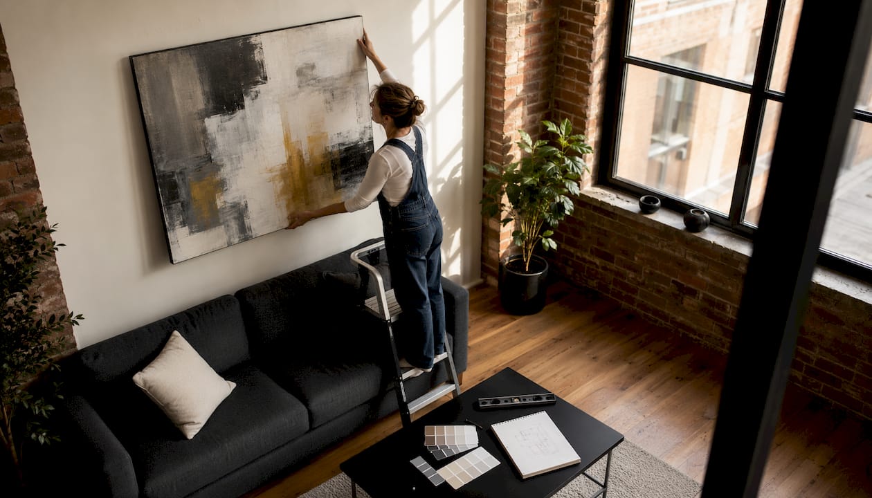
Scale, spacing, and placement are the three rules that govern every successful wall art arrangement. For high-end canvas art, aim for artwork width at 66–75% of your sofa or bed, keep 2–3 inches between grouped pieces (up to 4" for large formats), and center the piece at roughly 57–60 inches from the floor. That last number comes from museum-standard eye-level practice and holds in almost every room.
The short version: Measure your furniture width, multiply by 0.65 for a target art width, tape paper templates to the wall before drilling, and choose your anchor piece first. Everything else follows from those three moves.
- Measure the sofa, bed, or console before you shop — not after.
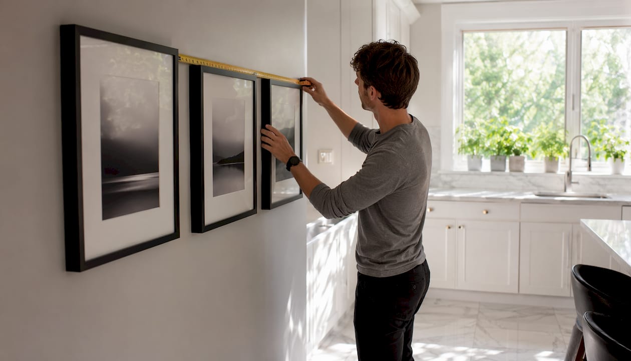
- Mock up with painter’s tape or paper templates to confirm scale on the wall.
- Pick one anchor piece and build any grouping outward from it, following consistent spacing and scale principles.
Table of Contents
- Sizing, scale, and hanging height rules that always work
- Room-by-room wall art arrangement ideas
- Which arrangement template fits your room?
- Color, mood, and curation principles
- Canvas types, framing, hardware, and lighting
- What premium canvas art costs and how long it takes
- How to hang art: a step-by-step checklist
- How art placement affects the way a room feels
- How wall art integrates with modern, traditional, and eclectic styles
- Layering canvas with framed prints and sculptures
- Using art to reshape room proportions and focal points
- What wall surface you have changes everything about how you hang
- Key Takeaways
- The wall as a wardrobe: an editorial perspective
- Luxuryartcanvas brings the anchor piece to you
Sizing, scale, and hanging height rules that always work
A standard sofa calls for artwork or a grouping roughly proportional to about two-thirds to three-quarters of the sofa width. That single calculation prevents the most common mistake: buying a piece that floats like a postage stamp above a full-size sectional. For consoles and sideboards, the target is slightly narrower — 50–70% of the furniture width — because the visual mass of a console is lighter than an upholstered sofa.
Standard center height is around eye level, typically just under five feet from the floor. Lower the center in dining rooms where people sit and view art at a lower sightline. In stairwells or rooms with tall ceilings, raising the center slightly draws the eye up and emphasizes verticality.
| Scenario | Artwork width | Center height | Spacing between pieces |
|---|---|---|---|
| Above sofa | 48–54" | 57–60" | 2–3" |
| Above bed (queen, 60") | — | 57–60" (or 6–10" above headboard) | 2–3" |
| Above console (48") | — | 57–60" | 4–8" (lean or hang) |
| Dining room feature wall | Proportional to wall | 48–54" | 2–3" |
| Narrow hallway | Similar-sized pieces | Eye level | 1.5–2" |
| Large-format single piece | 60–75% of wall width | 57–60" | Up to 4" from adjacent pieces |
Pro Tip: Before ordering, cut kraft paper to your target dimensions and tape it to the wall. Live with it for a day. You’ll catch scale problems that no digital mockup reveals.
Room-by-room wall art arrangement ideas
Living room
Anchor one large canvas or a horizontal triptych above the sofa at 66–75% of the sofa’s width. A single large piece or triptych reads calmer and more intentional than a busy gallery wall when the goal is conversation-focused comfort. Bold pop art or graffiti canvases work especially well here because the scale commands attention without requiring a dozen frames.
Bedroom
Choose restful imagery — soft landscapes, minimal photography, tonal abstractions. Avoid high-energy faces or busy compositions that can feel unsettling at rest. Size at 66–75% of the bed width and leave 6–10 inches above the headboard, adjusting upward for taller headboards.
Dining room
Lower the center to 48–54 inches. A single bold piece or a balanced pair in warm tones encourages the convivial mood a dining room needs. Horizontal layouts visually widen the space.
Entryways and consoles
Lean and layer above a console rather than committing to a permanent hang. Leaning art on a console creates a collected, flexible look and is renter-friendly. Keep the piece at 50–70% of the console width, with a 4–8 inch gap between the bottom frame and the surface.
Hallways and stairwells
Use similar-sized pieces with tight, consistent spacing — 1.5–2 inches in narrow corridors. In stairwells, align the centers along the stair angle rather than forcing a horizontal line. The rhythm of the pieces should guide movement through the space.
Kitchen and bathroom
Choose moisture-tolerant gallery-wrapped canvas or sealed prints. Keep scale modest and avoid hanging directly above a stove or sink. Botanical prints, minimal abstractions, or graphic typography add personality without competing with the room’s function.
Home office
Vertical pieces add perceived height and keep the background clean on video calls. Stick to a limited palette and avoid imagery that pulls focus during work hours.
Pro Tip: Small or minimalist spaces benefit from fewer, stronger pieces rather than busy gallery walls. One well-scaled statement canvas gives the eye a clear place to land and makes the room feel larger.
Which arrangement template fits your room?
| Layout | Best for | Visual effect |
|---|---|---|
| Single statement | Any room with one dominant wall | Calm, authoritative, focal |
| Grid (even rows/columns) | Modern, architectural spaces | Structured, graphic |
| Triptych (3 horizontal) | Above sofas, beds, long walls | Panoramic, cohesive |
| Salon/cluster | Eclectic, collected interiors | Dynamic, personal |
| Horizontal row | Hallways, dining rooms | Expansive, rhythmic |
| Ledge/leaning | Entryways, mantels, consoles | Flexible, layered |
| Asymmetrical cluster | Living rooms, creative spaces | Organic, editorial |
Every layout starts the same way: choose an anchor piece, define the outer bounding box of the grouping relative to the furniture below it, then fill inward with consistent spacing. Mock up on the floor before touching the wall. Photograph it, adjust, then transfer to paper templates.
Color, mood, and curation principles
Art should not slavishly match the room palette. As architect Nicholas Potts put it in Architectural Digest, “art adds depth to a space by allowing for personality quirks and idiosyncrasies to shine through. It shows that a home wasn’t ordered straight out of a catalog.” A single accent color that echoes one element in the room — a cushion, a rug, a lamp base — is enough to tie things together without making the wall feel like a showroom display.
Mood-driven color choices by room:
- Bedroom: Muted, tonal palettes. Soft blues, warm neutrals, desaturated greens.
- Living room: Warmer or more energetic palettes are welcome. Bold color reads well at scale.
- Dining room: Warm ochres, terracottas, and deep reds encourage conviviality.
- Home office: Cool neutrals and low-saturation palettes support focus.
Curation rules worth keeping: limit accent colors across a grouping to 2–3, repeat at least one color across multiple pieces, and control frame finish and matting to unify mixed works. A black float frame on a graffiti canvas and a raw wood frame on a landscape will fight each other. Choose one finish family and stay in it.
Pro Tip: Pick one unexpected piece — something slightly outside the room’s obvious palette or subject matter. That single note of idiosyncrasy is what separates a curated wall from a decorated one.
Canvas types, framing, hardware, and lighting
Canvas finishes: Gallery-wrapped canvas (image wraps around the stretcher bars) works well in modern and minimal rooms because it needs no frame. Linen-texture canvases add tactile depth and suit traditional or eclectic interiors. Museum-grade coatings protect against UV fading and are worth the premium for pieces in sun-exposed rooms.
Framing: A float frame — where the canvas sits inside the frame with a visible gap — adds perceived value and suits contemporary spaces. A traditional frame with matting reads more formal. For a fashion-forward interior, a thin metal float frame in black or brushed brass tends to read the sharpest.
Hardware by wall type: Standard drywall takes picture-hanging hooks rated to the piece’s weight; use two hooks for anything over 20 pounds. Plaster walls require molly bolts or toggle anchors — never rely on a single small nail. Brick needs masonry anchors and a hammer drill. Always locate studs when hanging large or heavy canvases.
Lighting: Adjustable picture lights or directional track lighting at a warm color temperature (2700–3000K) bring out depth in canvas texture. Add a dimmer where possible to shift the mood from daytime viewing to evening ambiance.
What premium canvas art costs and how long it takes
Cost drivers for high-end canvases include size, custom framing, limited-edition status, licensed brand imagery, and specialty finishes. Standard sizes in a gallery wrap are generally the most accessible price point. Custom dimensions, float frames, and licensed collaborations (think Chanel or Louis Vuitton-inspired designs) carry a premium that reflects both materials and rights.
Made-to-order canvases typically require production time before shipping. Plan for production plus transit when scheduling around a renovation or move-in date. Order at least two to three weeks ahead of when you need the piece on the wall — more for custom framing or large formats.
Questions to ask before ordering: What substrate and coating are used? Is hanging hardware included? What is the return or exchange policy for custom sizes? Does the vendor recommend specific lighting?
How to hang art: a step-by-step checklist
- Gather tools: tape measure, level, painter’s tape, kraft paper, pencil, stud finder, hammer or drill, appropriate anchors, and hanging wire or a French cleat for heavy pieces.
- Cut paper templates to the exact frame dimensions and tape them to the wall. Confirm scale and spacing before marking anything permanent.
- Locate studs or select anchor points rated to the piece’s weight.
- Hang the anchor piece first. Level it precisely — every subsequent piece references this one.
- Add flanking or supporting pieces, checking level and spacing (use a ruler, not your eye) after each addition.
- For large pieces, use two hooks spaced across the back to prevent tilting.
- For very heavy canvases (over 50 pounds), consult a professional installer or use a French cleat system rated to the load.
A single medium canvas takes roughly 15–20 minutes once templates are set. A full gallery wall of 8–12 pieces typically runs 2–3 hours including template work.
How art placement affects the way a room feels
Placement is not just aesthetic — it shapes how a room reads emotionally. Art hung too high creates distance and formality; too low, it feels unanchored and casual in a way that reads as an error rather than a choice. Centering a large canvas directly above a sofa creates a visual anchor that makes the seating arrangement feel intentional and complete.
Composition matters too. A vertical piece on a low wall draws the eye upward and makes the ceiling feel higher. A wide horizontal piece above a long sofa reinforces the horizontal flow of the room and makes the space feel settled. As Nicholas Potts noted, you can use “the placement of art to change proportions” — a mirror or canvas above a door in a room with tall ceilings is one of the oldest tricks in interior architecture.
How wall art integrates with modern, traditional, and eclectic styles
Modern interiors favor restraint: one or two large-scale canvases, minimal framing, and a palette that either echoes the room’s neutrals or introduces a single bold accent. Grid arrangements in matching frames suit the clean geometry of modern spaces.
Traditional rooms absorb more complexity. Ornate frames, symmetrical pairings, and subject matter with historical or classical references all read naturally. A salon-style cluster above a fireplace is the traditional room’s signature move.
Eclectic interiors are where the most interesting decisions happen. The rule here is one unifying element — consistent frame finish, a repeated color, or a shared subject matter — that holds a diverse grouping together. Without that thread, a collected wall tips into chaos.
Layering canvas with framed prints and sculptures
Canvas and framed prints can coexist on the same wall when the framing language is consistent. A gallery-wrapped canvas next to a thin-framed print in the same finish reads as intentional. Mixing a heavy ornate frame with a raw gallery wrap does not.
Sculptures and three-dimensional objects add depth that flat art cannot. A small wall-mounted sculpture or ceramic piece placed within a gallery arrangement breaks the flatness and makes the whole display feel more collected. Keep the three-dimensional piece at or near the visual center of the grouping so it anchors rather than interrupts.
Mixing sizes, textures, and finishes works best when you limit the variables: vary size or format, but hold frame finish and palette steady.
Using art to reshape room proportions and focal points
A single large canvas on a short wall makes the wall read as longer. A vertical piece on a low wall pushes the ceiling up visually. These are not tricks — they are the same tools architects use with moldings and paneling, applied through art placement.
Every room benefits from one clear focal point. In a living room, that is usually the sofa wall. In a bedroom, the wall behind the headboard. In a dining room, the wall the table faces. Place your strongest, most considered piece there first. Everything else in the room orients to it.
What wall surface you have changes everything about how you hang
Drywall is the most forgiving. Standard picture hooks handle pieces up to about 20 pounds. For heavier work, locate a stud or use a toggle anchor rated to the load.
Plaster is denser and more brittle. Nails can crack it; molly bolts or toggle anchors distribute the load properly. Drill slowly and use a masonry bit if the plaster has a hard finish coat.
Brick requires masonry anchors and a hammer drill. The anchor must seat fully in the mortar joint or the brick face itself — never rely on adhesive strips on brick for anything heavier than a small print.
Adhesive strips (such as Command strips) work on smooth painted drywall for lightweight pieces, but check the weight rating carefully and never use them on textured, brick, or plaster surfaces.
Key Takeaways
The single most important rule in any wall art arrangement: scale to furniture first, then set spacing and height, and every other decision follows naturally.
| Point | Details |
|---|---|
| Scale to furniture | Target 66–75% of sofa or bed width; 50–70% for consoles. |
| Spacing and height | Keep 2–3" between grouped pieces; center at 57–60" from the floor in most rooms. |
| Mock up before drilling | Paper templates taped to the wall prevent unnecessary holes and confirm scale. |
| Hardware matches the wall | Drywall anchors, molly bolts for plaster, masonry anchors for brick — match the anchor to the substrate. |
| Luxuryartcanvas | Over 1,000 designs crafted in the USA, backed by 10,000+ satisfied buyers — a strong starting point for any room’s anchor piece. |
The wall as a wardrobe: an editorial perspective
The readers who get wall art right treat their walls the way a strong dresser treats a wardrobe: invest in a few signature pieces, give each one room to breathe, and resist the urge to fill every inch. The fashion parallel holds further than it looks. A great outfit has one statement piece — a coat, a bag, a shoe — and everything else supports it. A great wall has an anchor canvas and supporting work that does not compete.
What most guides miss is the value of negative space. Leaving a wall partially empty is not a failure to finish the room. It is the visual equivalent of a clean silhouette. The pieces you do hang read stronger for it.
Luxuryartcanvas collections — graffiti, pop art, fashion-forward brand collaborations — are built for exactly this approach. One large-format canvas from those collections, hung at proper scale above a sofa or bed, does more for a room than a dozen smaller pieces ever will.
Luxuryartcanvas brings the anchor piece to you
If you have measured the wall, taped the templates, and know the scale you need, the next step is finding a canvas worth the space. Luxuryartcanvas offers over 1,000 designs — from large-format graffiti canvases built for hero walls to pop art and minimalist prints that suit restrained living rooms and bedrooms. Every piece is crafted in the USA with materials selected for durability and visual impact, and more than 10,000 buyers have already used them as the anchor piece in exactly the arrangements this guide describes.

Browse the full collection at Luxuryartcanvas and filter by size, style, or room to find the canvas that fits the measurements you already have on hand.
Statement Canvases for Luxury Dining Rooms: Style Guide
What Is Gallery Wall Design Concept for Luxury Interiors