
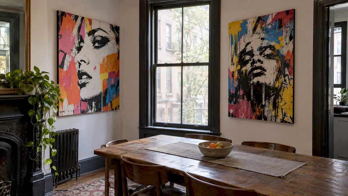
Center your artwork about 57 inches from the floor, the same eye-level baseline museums use, then adjust from there. Around windows, keep 3 to 6 inches between gallery frames and 8 to 10 inches above any sofa or console. Before you commit to a single nail hole, trace your pieces onto kraft paper and tape the cutouts to the wall so you can see the layout in place.
Table of Contents
- Quick placement rules and measurements to use around windows
- Gallery-wall layouts that work with a window in the middle
- Hanging one large piece between two windows: centering and height tips
- Placing art above a window or on shallow window walls
- Scale and balance: pairing sizes, colors, and visual weight around windows
- Tools and installation tips for hanging near windows
- How Luxury Art Canvas supports easy placement
- Seasonal adjustments for art placement related to changing sunlight angles
- Safety considerations for art placement in areas exposed to direct sunlight
- Tips for integrating window shapes and sizes into overall wall art design
- Choosing art styles and colors that complement window treatments and room decor
- Consideration of natural lighting effects on art placement around windows
- A simple principle worth trusting
- Ready-to-hang pieces sized for these placements
- FAQ
- Sources
Quick placement rules and measurements to use around windows
The 57-inch rule puts the center of your artwork at roughly average eye level, and it works as a starting point for most gallery and single-piece hangs. Raise it a few inches in rooms with 10-foot ceilings or lower it slightly in a cozy reading nook where people sit more than stand.
Spacing and clearance numbers do most of the heavy lifting once you know the baseline:
- Gallery clusters: 3 to 6 inches between frame edges, tighter for small prints, wider for oversized canvases.
- Above a sofa: 8 to 10 inches between the sofa top and the frame bottom.
- Above a console or sideboard: leave roughly 6 to 8 inches of clearance.
- Above a mantel: 3 to 6 inches, close enough to read as one grouping.
Window sills and trim throw off the math if you ignore them. A frame that floats a few inches above the sill often looks more deliberate than one jammed against it, and if the trim is wide or ornate, tucking the art slightly inside the casing line keeps the wall from feeling cluttered.
Gallery-wall layouts that work with a window in the middle
Two layouts solve most window-gallery problems. A split gallery puts balanced clusters on either side of the window, treating the glass as the visual center the way a piece of art would. A surround or cloud layout frames the window on three sides, letting smaller pieces trail above and alongside it so the window becomes part of the composition instead of a gap in it.
- Measure the wall and the window’s exact position, then sketch the available space on paper.
- Trace each frame’s outline onto kraft paper and mark the hanger location on each cutout, a method that saves you from guessing twice.
- Tape the templates to the wall and step back from across the room to check balance.
- Adjust spacing until gaps read as consistent, then transfer hanger marks to the wall and drill.
Anchor the layout with one larger or bolder piece near the window and let smaller works distribute the remaining visual weight around it. If you’re not ready to commit, lean a few pieces on a nearby ledge or shelf instead of hanging everything, which keeps the arrangement flexible as seasons or furniture change.
Pro Tip: Odd-numbered groupings of three or five frames tend to read as more intentional than even pairs, especially in a cloud layout around a window.
Hanging one large piece between two windows: centering and height tips
A single statement piece between two windows needs to be centered on that specific span, not on the wall as a whole. Measure from the inside edge of one window’s trim to the inside edge of the other, then find the midpoint.
- Start with the artwork’s center at 57 inches from the floor, then adjust if the window tops or bottoms sit unusually high or low.
- Aim for a combined artwork width around two-thirds of the between-window span, then check it visually since proportions vary by room.
- Use wall anchors or toggle bolts for anything heavier than a few pounds, and drive into a stud when one lines up.
- If furniture sits directly below, factor in its clearance before locking in the final height.
For sizing guidance on a between-window statement piece, our canvas sizes guide walks through how dimensions scale to a given wall span.
Placing art above a window or on shallow window walls
Transoms, bay windows, and narrow strips of wall beside a window call for smaller moves. Slim frames, low-profile canvases, and narrow floating ledges all work in tight footage without crowding the trim.
- Choose a slim or low-profile frame rather than a deep one that competes with the window casing.
- Keep a minimum of 2 to 3 inches between the frame and the trim where space allows.
- Align the bottom of an above-window piece with the top of the trim, or float it slightly higher for breathing room.
- Flank a narrow window with two matching small frames instead of one centered piece if the wall is too tight for a single composition.
Direct sun exposure can fade paper and textile-based art over time, and UV filters or shaded placement reduce that risk for sensitive materials. Canvas prints with archival inks hold up better in bright spots than paper prints without protective glazing.
Scale and balance: pairing sizes, colors, and visual weight around windows
Pick one primary piece to anchor the arrangement, then let smaller works carry less visual weight around it. A tall, narrow wall segment calls for vertical art; a wide expanse above a console or sofa reads better with a horizontal piece or a tight horizontal cluster.
- Apply the two-thirds width guideline above furniture: the combined art width should roughly match two-thirds of the piece below it.
- Scale art to the wall segment, not the room: a slim strip beside a window needs a narrower piece than a full open wall.
- Match or intentionally contrast frame finishes with the window trim so the grouping reads as planned rather than accidental.
Pro Tip: If your window trim is white, a mix of black and natural wood frames nearby usually looks more curated than an exact match to the trim color.
Tools and installation tips for hanging near windows
Good measurements only matter if the installation holds up. Start by measuring the distance from the hanger to the top of the frame, then transfer that exact measurement to the wall from your marked center point.
- Mark the hanger position on the wall using your frame measurement and a level or laser line.
- Choose hardware based on weight and wall type: picture hooks for light frames, D-rings and wire for midweight pieces, and toggle bolts or anchors for anything heavy on drywall.
- Drive into a stud whenever one is available, especially for canvases over a few pounds.
- Have a second person hold the piece in place first, then step back across the room to confirm it looks centered before driving anything in.
- Renters can lean on adhesive strips, but check the rated weight limit before trusting one with a large canvas.
- For windows that get strong afternoon sun, rotate vulnerable pieces seasonally or choose fade-resistant materials from the start.
How Luxury Art Canvas supports easy placement
We offer ready-to-hang canvases with a wide range of designs spanning pop art, graffiti, abstract, and designer-inspired styles, backed by reviews from many customers. For a between-window statement piece, our Pop Art Canvas Prints and Graffiti Wall Art & Street Art Canvas collections both include bold, single-focus pieces built for that kind of placement. For a split gallery or surround layout, coordinating prints in similar palettes fill out the smaller slots without clashing. Check product pages for exact dimensions against your measured span before ordering, since matching the two-thirds width guideline depends on getting the size right.
Seasonal adjustments for art placement related to changing sunlight angles
Sunlight moves through a room differently across the year, and a spot that stayed shaded all winter can sit in direct afternoon sun by midsummer. Windows facing south and west see the steepest swings, since the sun’s angle drops lower in the sky during winter months and pushes light deeper into the room.
If you’ve hung a sensitive piece, paper print, or textile-based work near a window, it’s worth checking in each season rather than assuming the placement is permanent. A quick seasonal walkthrough, standing in the room at different times of day, shows whether a previously safe spot now gets direct light for several hours.
Rotating artwork between rooms or wall positions each season is a simple way to limit any single piece’s total sun exposure. This matters most for works without UV-protective glazing or coating. Canvas prints with archival inks tend to tolerate shifting light better than unprotected paper, which makes them a more forgiving choice for walls near south- or west-facing glass.
If a seasonal light shift reveals that a spot gets harsher sun than expected, consider swapping in a smaller or less light-sensitive piece for the brighter months and moving the original back once the angle shifts again. Sheer curtains or UV window film also soften the intensity without blocking the view, which helps protect multiple pieces at once rather than managing each one individually.
Safety considerations for art placement in areas exposed to direct sunlight
Light exposure can degrade paper, textiles, and some pigments over time, and guidance on protecting works from light damage recommends UV filters or shaded placement for sensitive materials. That doesn’t mean avoiding window walls altogether. It means matching the material to the spot.
For a window wall that gets strong, direct sun for multiple hours a day, canvas prints with archival, fade-resistant inks hold color better over time than uncoated paper prints or inkjet reproductions without a protective layer. If you already have a piece you love in a bright spot, UV-filtering window film or sheer curtains cut the intensity reaching the surface without meaningfully changing the room’s light.
Rotating pieces between a bright wall and a shadier one every few months spreads out exposure so no single piece bears the full seasonal intensity. This is a lower-effort fix than reframing or reprinting work that’s already started to fade.
Framing choices matter too. UV-filtering glass or acrylic adds a layer of protection for paper-based pieces, while canvas work printed with archival materials generally needs less additional protection to hold up in a sunny spot. If you’re placing something irreplaceable, a true heirloom print or an original, a lower-light wall away from direct glare is the safer long-term home regardless of what protective glazing you add.

Tips for integrating window shapes and sizes into overall wall art design
A window isn’t a gap to work around, it’s a shape that’s already part of your wall’s composition. Treating it that way makes layout decisions easier instead of harder.
Tall, narrow windows pair naturally with vertical art on either side, since the proportions echo each other. Wide picture windows or sliding glass doors often look best flanked by horizontal groupings or a pair of matching pieces that extend the window’s horizontal line across the wall. A single large arched or oversized window can act as its own anchor point, letting a smaller symmetrical pair of frames on either side complete the balance without competing for attention.

Bay windows and window seats create natural breaks in a wall, so it often works better to treat each wall segment flanking the bay as its own small composition rather than trying to unify them into one gallery. A narrow transom window above a door or regular window can be echoed with a slim horizontal piece above it, continuing the sightline upward instead of leaving it bare.
When a room has multiple windows of different sizes, consistency in frame finish, matting, or color palette ties the separate groupings together even when the windows themselves are not symmetrical. The goal isn’t to disguise the window’s shape. It’s to let the art and the window read as one planned composition instead of two unrelated elements competing for wall space.
Choosing art styles and colors that complement window treatments and room decor
Window treatments set a color and texture baseline that your art either echoes or deliberately contrasts. Sheer, neutral curtains leave room for bolder, higher-contrast art nearby, while patterned or heavily textured drapes usually call for simpler, more graphic pieces so the wall doesn’t feel busy.
Bright, light-filled rooms tend to suit high-contrast styles well: graphic pop art, black-and-white photography, and bold graffiti-inspired pieces all hold their own against strong natural light rather than washing out. In a room with heavier, darker treatments or deep paint colors, a piece with warmer tones or metallic accents helps balance the overall weight of the space.
Matching frame finishes to window hardware, like black metal frames alongside black curtain rods, creates a subtle thread that ties the window and the art together without being matchy. For readers weighing different styles for a living room wall near a window, our guide on types of wall art for living rooms walks through finishes and styles that tend to work well together.
Color choice matters as much as style. A piece that pulls one accent color from the curtains, rug, or furniture nearby reads as coordinated even if the overall palette is otherwise neutral. If the window treatment is a strong pattern, pulling just one color from it into the art, rather than matching the whole pattern, usually looks more intentional.
Consideration of natural lighting effects on art placement around windows
Natural light changes how colors and textures in artwork actually read, which makes the wall near a window a different visual environment than an interior wall lit only by lamps. Direct, bright light can wash out subtler color variation in a piece, so bolder, more saturated pieces often hold their presence better in a sunny spot than muted or pastel work.
Glare is a practical issue worth checking before you commit to a final position. Glossy canvas finishes or glazed frames can reflect window light at certain times of day, creating a distracting glare when viewed from specific angles in the room. Standing where you’d normally sit or stand and checking the piece at different times of day catches this before the holes are drilled.
Shadows from window trim or nearby furniture can also fall across art placed too close to the frame, so leaving a few inches of clearance, as covered in the placement rules above, helps avoid a piece that’s partly obscured during certain hours. In rooms with limited natural light, placing a reflective or lighter-toned piece near the window can help bounce available light further into the room, while darker, moodier pieces tend to recede in low-light corners away from the glass.
A simple principle worth trusting
Every numeric rule here, the 57-inch center, the 3 to 6 inches of gallery spacing, the 8 to 10 inches above a sofa, works because it mirrors how people naturally scan a wall. Trust the measurements, but always check them with a paper mockup and a walk around the room before you drill. The rules get you close; your own eye gets you the rest of the way.
— James
Ready-to-hang pieces sized for these placements
Once you’ve measured your window span and settled on a layout, the next step is finding art that actually fits it. Our Pop Art Canvas Prints work well as a single statement piece between two windows, while our Graffiti Wall Art & Street Art Canvas collection offers bold options for anchoring a surround or cloud gallery layout. Many canvases ship ready to hang, eliminating the need for framing between your measurements and the wall.

If you’re planning a full room rather than a single wall, readers who are also updating a doorway or closet nearby might find our partner’s interior door design guide useful for keeping finishes consistent across the space. Browse the full collection to check sizing against your measured wall span before you order.
FAQ
How do I place art on my walls?
Start by centering the artwork at about 57 inches from the floor, then adjust for ceiling height and nearby furniture. For groupings, space frames 3 to 6 inches apart and test the layout with paper cutouts before hanging anything permanently.
What is the 70/30 rule in art?
There’s no single widely documented “70/30 rule” tied to art placement in the sources we draw on here. If you’ve seen the term, it likely refers informally to balancing roughly two-thirds visual weight on one focal piece against the remaining space, similar to the two-thirds width guideline used for art above furniture.
What is the best way to decorate a window?
For most rooms, flanking a window with balanced art on either side or using a cloud layout that frames it works better than ignoring the window entirely. Keep at least 2 to 3 inches of clearance from the trim, and use ledges or leaned pieces nearby for a flexible, lower-commitment look.
What is the new trend for window coverings?
Window covering trends shift by season and region, and no single current figure or ranking is confirmed in the sources used for this article. What stays consistent is pairing whatever treatment you choose, sheer, patterned, or minimal, with art nearby that either echoes or intentionally contrasts its color and texture.
How high above a sofa should I hang art near a window?
Leave about 8 to 10 inches between the top of the sofa and the bottom of the frame, adjusting slightly if a nearby window affects the available wall space. Our guide on canvas placement above a sofa covers sizing in more detail.
Sources
- How to Hang a Gallery Wall in 5 Easy Steps — Better Homes & Gardens
- What’s the best way to hang a picture? — Architectural Digest
- 7 Ideas for How to Decorate a Large Wall — Better Homes & Gardens
Bar Wall Art: 7 Styles, From Neon Signs to Vintage Posters
Art Above Your TV: 8 Ideas and a Sweet Spot of 8 to 10 Inches