
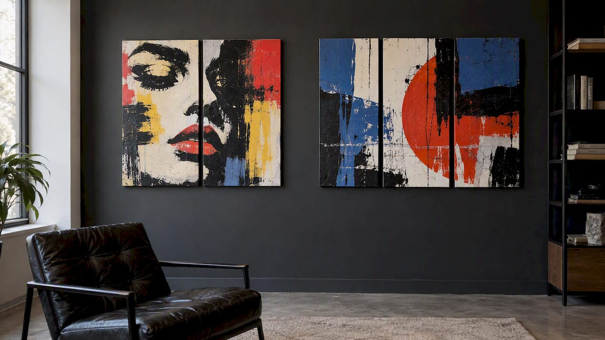
A diptych is an artwork in two panels. A triptych is an artwork in three. That is the whole definition, but the choice between them is about your wall: two panels give you a calm, balanced pair, while three give you a center and two flanks that can cover a wider space and tell a longer visual story. Below you will find what the words mean, how the two formats behave in a real room, the spacing and height rules designers use, and how to decide.
Table of Contents
- What the words mean
- Where the formats came from
- Diptych vs triptych at a glance
- How a diptych behaves in a room
- How a triptych behaves in a room
- Spacing: the mistake that ruins both
- Hanging height: treat the set as one piece
- Sizing: measure the wall and the furniture first
- Perspective: how we think about panels
- Matching format to style
- Renters, small spaces and flexibility
- Find the right set
- Common mistakes to avoid
- FAQ
- Sources
What the words mean
Both terms come from Greek. Diptych comes from the Greek for “two-fold” and is pronounced DIP-tick. Triptych comes from the Greek for “three-fold” and is pronounced TRIP-tik. If you were wondering how to say them out loud, that is it.
The Cambridge Dictionary describes a diptych as a piece of art made of two paintings, photographs or similar images, usually joined at their inner edges so they can fold toward each other.
A triptych follows the same logic with three sections. Wikipedia notes that a triptych is usually a panel painting divided into three sections, or three carved panels hinged together that can be folded shut or displayed open.
What about four panels or more?
Once you go past three, the family name is polyptych. Works with four or more panels are collectively called polyptychs. Four panels are technically a quadriptych or tetraptych, five a pentaptych and six a hexaptych. So a four-piece canvas set is not a “triptych for four”, though people do search for exactly that. In decorating, most people simply call it a four-panel set.
Where the formats came from
That history explains why the formats still feel deliberate. Splitting an image into panels turns one picture into a composition with edges, rhythm and pauses. You are not just hanging a picture, you are designing how the eye moves across it.
Pendants versus true diptychs
Collectors sometimes draw a line between a pendant and a diptych. Pendants are two separate paintings hung side by side that share a theme, while a diptych historically meant panels physically joined by hinges, according to a scholarly overview of early Netherlandish painting. In home decor, nobody expects hinges. A “diptych” on a canvas retailer’s site means a two-piece set designed as one image. Knowing the distinction is still useful if you talk with a gallery or an art-minded guest who is picky about the word.
Diptych vs triptych at a glance
| Diptych | Triptych | |
|---|---|---|
| Panels | 2 | 3 |
| Visual effect | Balanced pair, calm, direct | Sequence with a center, more movement |
| Best wall shape | Narrow or tall walls, between windows, hallways | Wide walls, above sofas, beds and sideboards |
| Best image type | Portraits, symmetrical designs, two-part contrasts | Panoramic scenes, patterns, bold typography, progressions |
| Risk | Can feel like it is missing a piece if hung wide | Can overwhelm a small wall |
| Hanging effort | Two fixings to align | Three fixings to align, a center to find |
The table is a starting point. The real decisions come from your wall, your furniture and the image.
How a diptych behaves in a room
Two panels create a left-and-right relationship with no true center. The seam sits in the middle, which gives the eye a rest point. That makes diptychs feel orderly and architectural. They suit spaces where you want presence without noise.
Good places for a diptych:
- Narrow walls and alcoves. A pair of tall panels fills a vertical space without stretching sideways.
- Above a console or a bedside area. Two panels fit comfortably over furniture that is not very wide.
- Hallways and entryways. The pair is easy to read in passing.
- Between windows or beside a door. Two modest panels can respect the architecture around them.
- Offices and meeting rooms. A two-panel black and white or abstract image reads as polished and unfussy.
A diptych also works well when the image itself has two halves: a portrait split across the seam, a before-and-after contrast, or a graphic design with a strong vertical line. If the image has a clear focal point, think about where the seam will fall. A face or a logo sliced down the middle by a gap can be striking or awkward depending on the artwork, so look at how the design was composed for panels.
How a triptych behaves in a room
Three panels give you a center and two supporting sides. That structure is what makes triptychs feel confident. The middle panel anchors the image, and the outer two extend it. Because the set spans more width for the same panel size, triptychs are the natural answer to a wide, empty wall.
Good places for a triptych:
- Above a sofa. This is the classic spot. A wide set can match the proportions of the furniture below it. We explain the proportion guideline in our piece on the 60 to 75 percent sofa rule for triptych canvas layouts.
- Above a bed or headboard. Three panels give a hotel-like horizontal band.
- Open-plan living areas. A long set helps define a zone from across the room. See our guide to types of canvas art for open plans.
- Dining rooms and long sideboards. Three panels follow the length of the furniture.
- Feature walls in offices and lobbies. A wide triptych is a fast way to make a statement without a single oversized, hard-to-handle canvas.
Triptychs suit images that unfold: skylines, abstract color fields, a repeating pattern, a sequence of three related images, or a bold piece of graffiti lettering that runs across the full width.
Spacing: the mistake that ruins both
The most common error with multi-panel art is leaving too much room between the pieces. Denver interior designer Aneka warns that over-spacing makes panels feel disconnected and “floating”, and that the panels should read as one unified composition, not a collection of separate images.
The practical rule from the same source: a gap of 2 to 4 inches keeps pieces feeling connected, and going beyond 4 inches often makes the arrangement feel disjointed. A few notes on applying it:
- Pick one gap and keep it identical. Between panels 1 and 2, and between 2 and 3, the distance should match to the eighth of an inch.
- Match the gap to the image. Photographic or continuous images often look best with a tighter gap. Graphic or pattern-based pieces can take a little more.
- Use a paper template. Cut kraft paper to each panel size, tape it to the wall with your chosen gap, and live with it for a day before drilling.
- Level the top edges, not just the bottom. If your panels are the same size, both work. If the sizes differ, align to the center line.
Hanging height: treat the set as one piece
The museum-standard guideline is to put the vertical center of the artwork 57 inches from the floor. With a multi-panel set, that rule applies to the entire arrangement as a single unit, not to each panel individually. Measure from the floor to your target center, then mark the overall height of the set, gaps included, and work outward.
If you hang above furniture, the rule has a limit. A set that sits too far above a sofa looks stranded, so leave modest breathing room above the furniture and let the center height flex a little. Our guides on canvas hanging height and how to hang canvas art go through the measuring and the hardware step by step. For rooms with soaring ceilings, the two-story wall art guide explains why the usual center height is only a starting point.
Sizing: measure the wall and the furniture first
The number of panels matters less than the total footprint of the set. Before you choose, measure:
- The width of the wall space you want to fill.
- The width of the furniture underneath, if any.
- The ceiling height and how much empty wall sits above the furniture.
- The viewing distance. A set seen from across an open-plan room can be bolder than one seen in a hallway.
Then compare the total width of the set, including the gaps. Add up panel widths plus two gaps for a triptych or one gap for a diptych. For help with dimensions, see our canvas sizes guide. If the room is compact, the thinking in making small rooms feel bigger with wall art helps you avoid overwhelming it.
A worked example
Say you have a sofa wall and a three-seat sofa. You want a triptych above it. Decide the total width of the set first, then divide: subtract two 3-inch gaps from the total, and split what remains by three. Each panel width follows from the total, not the other way around. For a diptych in the same spot, you would use wider panels to fill the same total, which makes each image larger and the seam more prominent. That is sometimes exactly what you want, and sometimes it feels heavy. Mock both with paper before you buy.

Perspective: how we think about panels
We sell canvas wall art built around graffiti, pop art, black and white work and designer-inspired pieces, so we see how images behave when they are split. Here is our honest view.
Bold, high-contrast images forgive almost any format, but they reward a deliberate choice. A graffiti lettering piece or a pop art portrait has a strong center of gravity. In a triptych, that center sits in the middle panel and the outer panels carry the color and texture. In a diptych, the image has to carry its weight across a seam, so the composition matters more.

We lean toward triptychs for living rooms and statement walls, because most homes have a wide sofa or bed wall that two panels struggle to fill without becoming enormous. We lean toward diptychs for narrower spots and for people who prefer restraint. We do not think either is more luxurious. A well-proportioned, well-hung pair beats a badly spaced trio every time.
Our practical advice: decide on the wall and the footprint first, pick the image second, and only then count panels. And hang the set as one object, with tight, even gaps. That single habit does more for the look than any amount of spending.
— James
Matching format to style
Style changes the answer slightly.
- Graffiti and street art. Energy and scale are the point. Wide triptychs let lettering and color run across a wall. Browse our graffiti wall art and street art canvas collection.
- Pop art. Portraits and icons often suit a diptych, where two images can talk to each other, or a triptych for a repeated motif. See pop art canvas prints.
- Black and white. Monochrome rewards simplicity. A diptych feels crisp and gallery-like, a triptych feels cinematic. Take a look at luxury black and white wall art.
- Fashion and luxury themes. Brand-inspired and high-fashion imagery usually reads best with plenty of wall around it. Start with our luxury art collection.
- Minimal and abstract. Multi-panel sets let color fields and shapes flow. Our minimalist wall art set is a good place to see how clean sets look on a wall.
Renters, small spaces and flexibility
If you rent, a diptych needs fewer fixings and is quicker to adjust. A triptych is not much harder, but you will drill more holes if you get the spacing wrong, so the paper template step pays off. Whichever you pick, mark with painter’s tape and a level before you touch the wall.
If the room is small, remember that a lighter, narrower set can make the space feel taller and calmer. Too much wall coverage in a tight room can feel crowded. When in doubt, go slightly smaller and keep the gaps tight.
Find the right set
Our canvases are made in the USA with archival inks, arrive ready to hang, and come from a catalog of more than 1,000 designs across graffiti, pop art, black and white, abstract, motivational and high-fashion themes. If you already know your wall dimensions, start at our full collection and check the size and panel options on each product page. If you are unsure about proportions, read the canvas sizes guide first, then pick the image that you will enjoy walking past every day.
Common mistakes to avoid
- Gaps that are too wide or uneven. Keep them between 2 and 4 inches and identical.
- Hanging each panel to its own height. Treat the set as one unit around the 57-inch center.
- Buying by panel count. Choose by total width and the image.
- Ignoring the seam. Check where the image splits, especially on faces and logos.
- Skipping the mock-up. Paper templates cost almost nothing and prevent most regrets.
FAQ
What is the difference between a diptych and a triptych?
A diptych has two panels and a triptych has three. Both are single artworks divided into sections. The diptych reads as a balanced pair, while the triptych has a center panel with two sides, which gives it a wider, more rhythmic feel.
What do you call a set of four panels?
Four panels are technically a quadriptych or tetraptych, and any work with four or more panels falls under the broader term polyptych. In everyday decorating, most people just say four-panel set. The naming continues with pentaptych for five and hexaptych for six.
How far apart should the panels be?
Keep a gap of 2 to 4 inches between panels, and make every gap the same. Wider than 4 inches and the set often starts to look like separate pictures instead of one artwork. Hang the whole set as a unit, centered around 57 inches from the floor where the wall allows.
Is a diptych or a triptych better above a sofa?
The triptych is the more common choice because three panels can cover a wide sofa wall without any single canvas becoming huge. A diptych works above a loveseat or a narrower sofa, or if you prefer a simpler look with larger panels. Measure the sofa width and size the set to it before deciding.
How do you pronounce diptych and triptych?
Diptych is pronounced DIP-tick and triptych is pronounced TRIP-tik. Both end in the same “tick” sound, and the “p” is pronounced in each.
Hallway Art Spacing: Heights, Gaps and Layouts That Work
Interior Designer Art Sourcing: A Practical Playbook